Shadcn Login Block Two
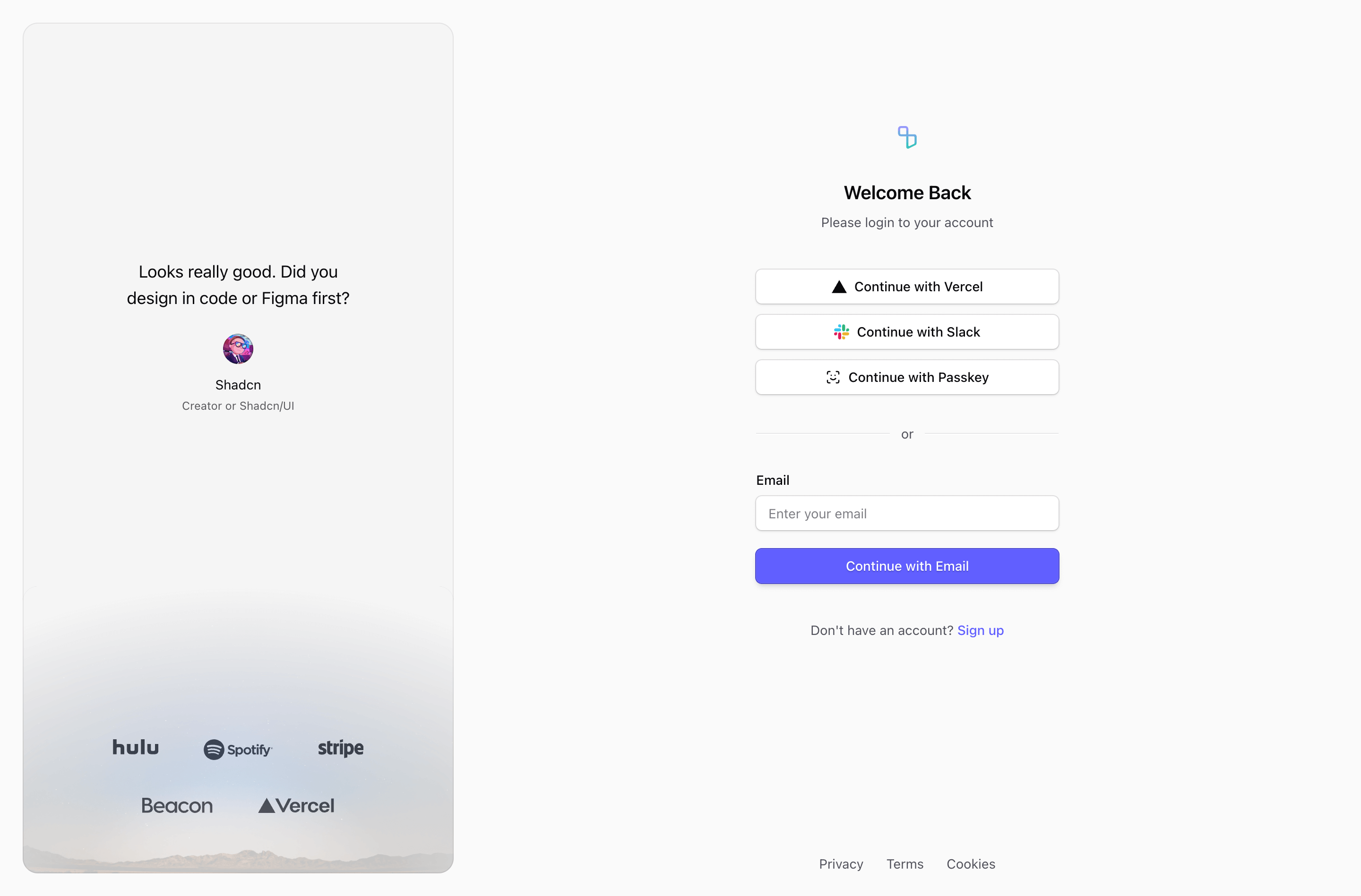
Shadcn Login Block Two is a returning-user auth surface for React and Next.js products. The source combines a centered login block with Vercel, Slack, and Passkey options with a left testimonial panel with customer logos, then uses Tailwind CSS utilities and shadcn-style primitives to keep the login block consistent with the rest of the app.
How the login flow is structured
This variant mirrors the side panel to the left and keeps the login form centered on the right side of the desktop grid. Across the variants, the useful source details are the same: clear return-user copy, an email path, optional password or magic-link behavior, social provider buttons where included, and links toward sign up or password recovery.
Where this variant fits
Use this login block when the interaction model matches your auth stack. A password field needs recovery and password-manager testing; a magic-link path needs resend and inbox guidance; social login buttons should only name providers that are actually enabled.
What to wire before shipping
- Connect email, password, passkey, and provider controls to your real authentication flow.
- Add pending, validation, invalid-credential, and rate-limit states.
- Replace demo testimonials, quotes, logos, legal links, and background images with product-approved content.
- Test browser autofill and password-manager behavior in the final Next.js route.
Frequently asked questions
Does this login block support password recovery?
Several variants include a forgot password link or action in the source. Keep it connected to your forgot password form so users are not trapped after a failed sign-in attempt.
Can I customize the providers?
Yes. The provider buttons are React UI elements. Swap Vercel, Slack, Linear, Figma, Passkey, or fingerprint placeholders for the providers your auth system supports.
Which login variant should I use?
Pick the variant that matches the amount of trust and context the page needs: split panels for brand-heavy auth, cards for app-like login, compact email-first layouts for low-friction access, and password variants when credentials are required.
Related Shadcn UI blocks
Start from Tailark
Build with Tailark
Production-ready marketing blocks, pages, and illustrations for Shadcn UI.