Shadcn Integration Block Two
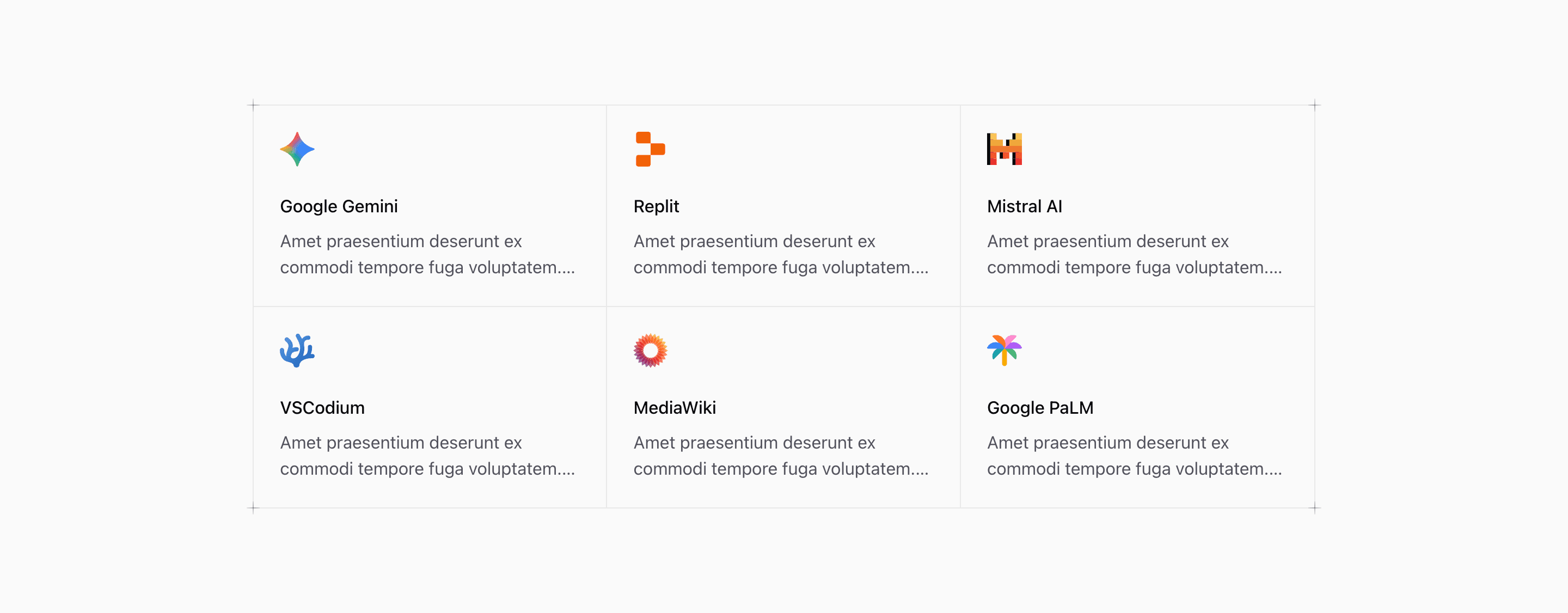
Shadcn Integration Block Two takes the same six demo integrations as the first variant and gives them a more editorial frame. The source uses a divided grid with border lines, hover backgrounds, and PlusDecorator elements at the corners.
The tool names are concrete, but the card descriptions and default link are placeholders. Use real partner names, product categories, and routes when you adapt the integration section.
Bordered Grid
The grid uses container queries: @md:grid-cols-2 and @2xl:grid-cols-3. Extra nth-child border utilities remove double borders at different breakpoints, so the section keeps a crisp matrix feel across sizes.
Visual Details
The plus decorators are purely presentational and marked aria-hidden. They reinforce the technical grid style without adding interactive noise.
Customization Notes
This shadcn UI block works best when all integrations are peers. If some integrations are more important, change the order or use a variant with a headline and larger center area.
Frequently Asked Questions
Are the logo cards accessible links?
The title link covers the card with an absolute before layer. Keep each title descriptive and point it to a real integration page.
Should the placeholder descriptions stay?
No. Replace the Latin-style demo copy with practical descriptions of what each integration does.
Related Shadcn UI Blocks
Start from Tailark
Build with Tailark
Production-ready marketing blocks, pages, and illustrations for Shadcn UI.