Shadcn Integration Block Seven
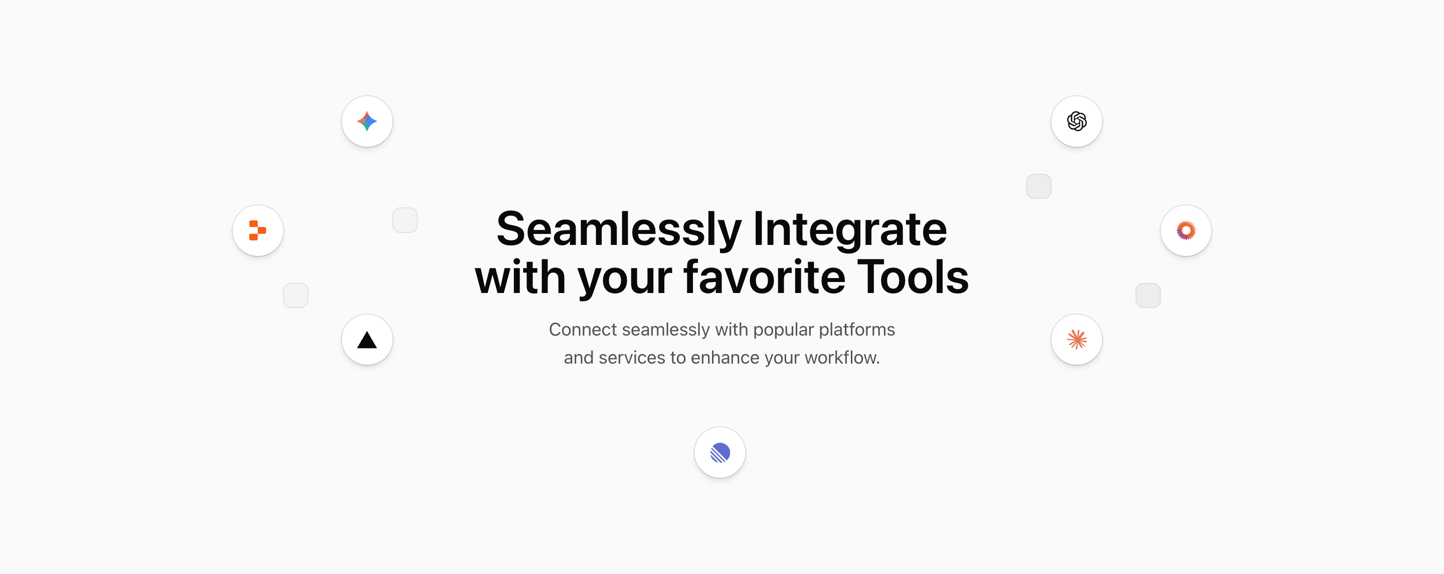
Shadcn Integration Block Seven arranges integration logos around a centered message. The source uses a large grid, decorative muted squares, and circular logo cards for Gemini, Linear, Replit, Vercel, OpenAI, MediaWiki, and Claude.
The headline and paragraph are demo integration copy. Keep the spatial idea, but replace the logos and message with tools your product actually supports.
Spatial Layout
The center copy is absolutely positioned on medium screens and above the grid on smaller screens. The surrounding logo nodes use explicit column and row starts, which creates a constellation effect without JavaScript animation.
Best Use
Use this integration section when the main point is breadth and compatibility rather than feature-by-feature explanation. It works well as a visual break between product sections.
Customization Notes
Do not overload the grid. The layout depends on open space around the center copy, so too many logos will weaken the composition.
Frequently Asked Questions
Are the logo nodes interactive?
No. The source renders decorative logo cards, not links.
What should be checked after editing logos?
Preview mobile and desktop. The explicit grid placement means a new logo count may need new Tailwind CSS coordinates.
Related Shadcn UI Blocks
Start from Tailark
Build with Tailark
Production-ready marketing blocks, pages, and illustrations for Shadcn UI.