Shadcn Integration Block Five
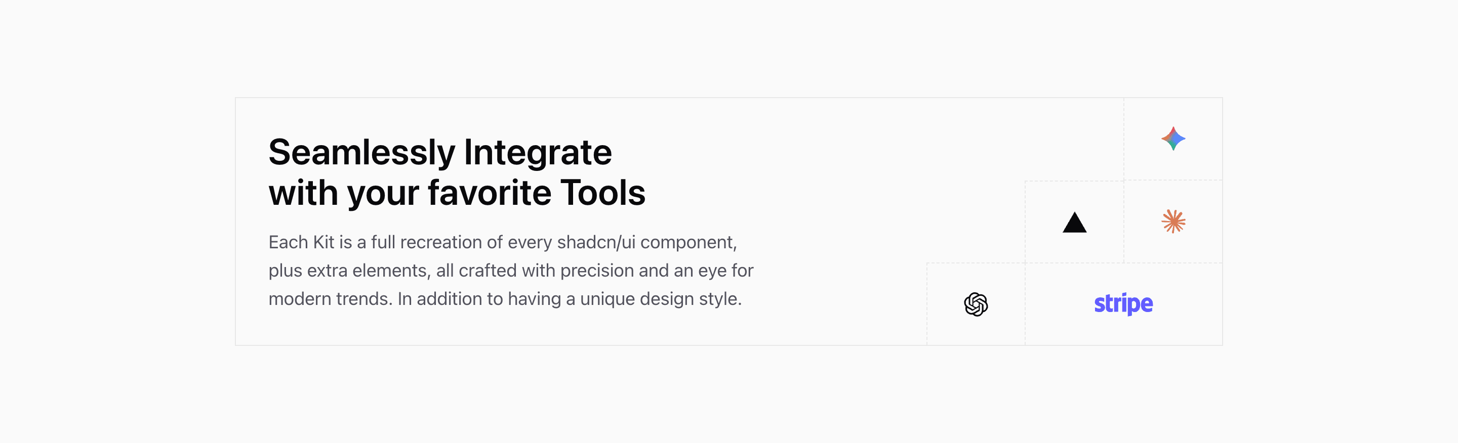
Shadcn Integration Block Five is closer to a graphic lockup than a directory. The source creates a 4-by-6 grid on small screens and a 10-by-3 grid on larger screens. The headline and paragraph occupy the large left area, while Gemini, Vercel, Claude, OpenAI, and Stripe sit in dashed logo cells.
The paragraph currently describes shadcn/ui kits rather than a real integration catalog. Treat it as demo copy and rewrite it around your product ecosystem.
Grid Composition
This integration section uses borders and dashed cell lines to make the layout feel like a product diagram. Logo placement is explicit with col-start and row-start utilities, so adding or removing logos means revisiting the grid coordinates.
Best Use
Use this variant when the integration message is more important than individual partner descriptions. It is a good fit for a SaaS landing page section that says, in one glance, that the product works with familiar tools.
Customization Notes
Keep the logo count small. If you need names, links, or longer descriptions, choose a card-based integration section instead.
Frequently Asked Questions
Does this section link to integrations?
No. The source renders logo cells only. Add links intentionally if each logo should navigate.
How should the copy change?
Replace the kit-focused demo paragraph with a short explanation of what your integrations connect, automate, or sync.
Related Shadcn UI Blocks
Start from Tailark
Build with Tailark
Production-ready marketing blocks, pages, and illustrations for Shadcn UI.