Shadcn Hero Section Block Two
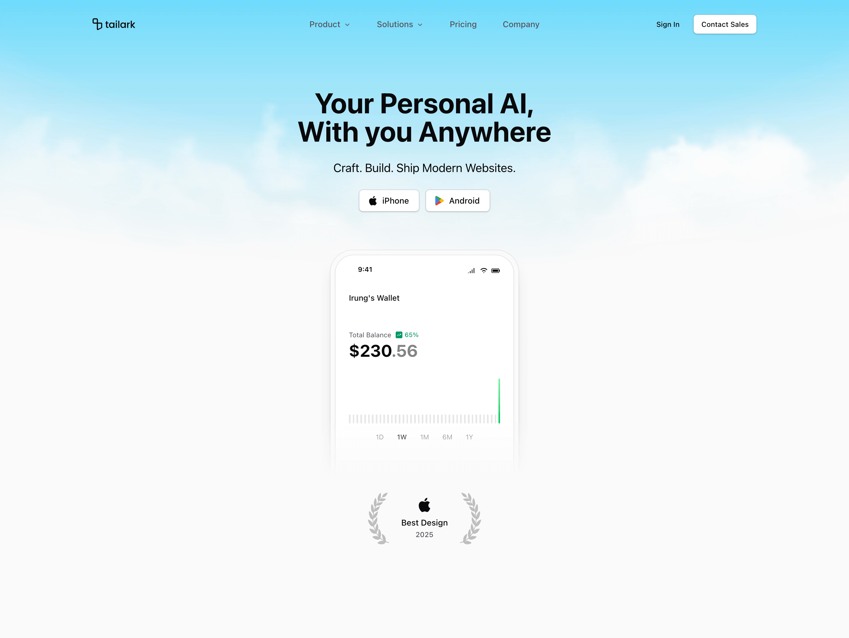
Hero Section Block Two is built like an app launch page. The first screen has store-style CTAs for iPhone and Android, a soft cloud backdrop, and a large mobile wallet illustration that carries the actual product story.
Design and layout
The background is a masked parallax layer. Light mode uses a bright cloud image; dark mode switches to a darker atmospheric image at reduced opacity. Under the headline, the MobileWalletIllustration anchors the page, followed by an Apple-style award badge and two mirrored botanical SVG ornaments. The result feels more like a consumer fintech or mobile AI app than a standard B2B SaaS dashboard hero.
Where to use it
Use this variant for mobile wallets, personal finance apps, consumer AI tools, wellness apps, travel apps, and any product where download actions matter more than a sales demo. It is also a good fit for landing pages that need to signal polish before showing feature grids.
Implementation details
- It is a client component using
useScrollwith a negative parallax factor, so the sky layer moves against the scroll direction. - It uses
next/imagefor light and dark cloud backgrounds. - The main product artwork comes from
MobileWalletIllustration. - The Apple and Google Play icons are inline SVG components, so the platform buttons stay self-contained.
What to customize first
- Replace the iPhone and Android links with real app-store URLs.
- Swap the wallet illustration data for your product screens, card states, or account visuals.
- Change the award badge only if you have a real rating, badge, launch year, or press mention.
- Keep the headline short; the visual already carries a lot of information.
Frequently asked questions
Does Shadcn Hero Section Block Two support dark mode?
Yes. It uses separate light and dark background images and theme-aware text/button styling.
Is Shadcn Hero Section Block Two responsive?
Yes. The mobile wallet illustration, app buttons, and badge sit inside a centered responsive layout. The background image also changes aspect treatment across breakpoints.
Can I customize this Tailark block?
Yes. You can replace the app buttons, wallet illustration, award badge, cloud images, and copy directly in React and Tailwind.
What is the best use case for this hero section block?
Use it when the product is primarily mobile, personal, or app-like, and the visitor needs to understand the product through a device-led visual.
Related Shadcn UI blocks
Start from Tailark
Build with Tailark
Production-ready marketing blocks, pages, and illustrations for Shadcn UI.