Shadcn Bento Block One
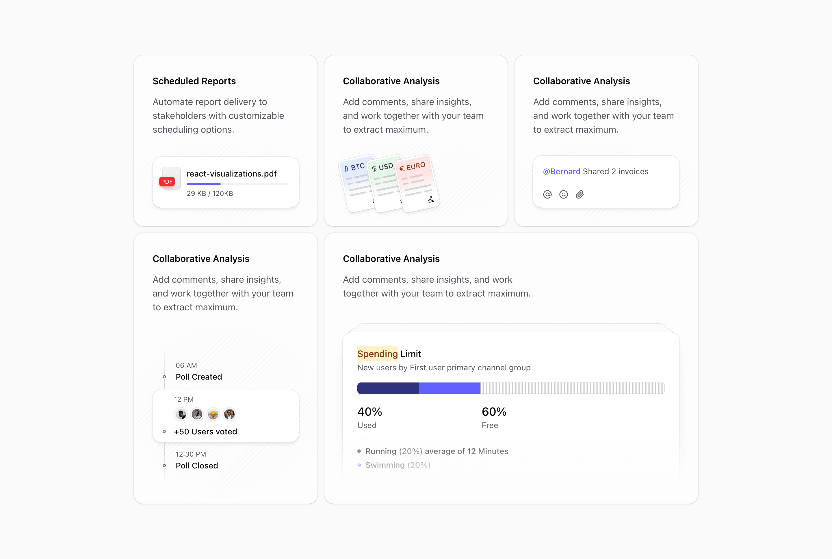
Bento block one is a compact SaaS feature grid. It uses five cards inside a six-column container: four smaller feature cards and one wider dashboard card that takes more visual weight at the bottom.
The code imports NotificationIllustration, CurrencyIllustration, ReplyIllustration, PollIllustration, and VisualizationIllustration. That mix makes the block a good fit for products that need to show several product surfaces at once: scheduled reports, financial activity, collaboration, feedback, and analytics.
What makes this variant useful
The layout gives every feature its own card, but it does not make every card equal. The first four cards use the same structure: copy at the top, a decorative striped image area below, and a rounded Card wrapper from Shadcn UI conventions. The last card spans four columns on large screens and carries the larger visualization illustration.
That hierarchy is the point. Use the small cards for supporting capabilities. Use the wide card for the feature that needs the most proof.
Best fit
This bento variant works best for SaaS homepages, analytics products, productivity tools, and workflow platforms. It is especially useful when the product has several modules but one flagship view.
Do not keep the demo labels unless they match your product. The current copy is placeholder content. Replace each title with a real product outcome, then map the illustration to the feature it supports.
Implementation details
The section uses @container, @xl:grid-cols-2, and @3xl:grid-cols-6, so the grid adapts through container queries rather than only viewport breakpoints. The cards also use not-dark:*:bg-card/50, theme tokens, muted text, foreground colors, and CSS masks for the stripe treatment.
What to customize first
- Replace the five feature titles with product-specific outcomes.
- Give the widest card to the strongest capability.
- Connect each visual to real product proof instead of decorative filler.
- Keep the six-column structure unless your product needs fewer cards.
Frequently asked questions
Does Bento Block One support dark mode?
Yes. The block uses Tailwind and Shadcn theme tokens such as bg-card, text-foreground, and text-muted-foreground, with not-dark styling for light-mode card treatment.
Is Bento Block One responsive?
Yes. It uses container queries to move from a single-column stack into two columns and then a six-column bento grid.
Can I customize the illustrations?
Yes. The illustrations are imported React components. You can replace them with product screenshots, charts, icons, or your own SVG components.
When should I use this bento block?
Use it when one feature deserves a wider card, but the page still needs four supporting proof points around it.
Start from Tailark
Build with Tailark
Production-ready marketing blocks, pages, and illustrations for Shadcn UI.