Shadcn Hero Section Block Sixteen
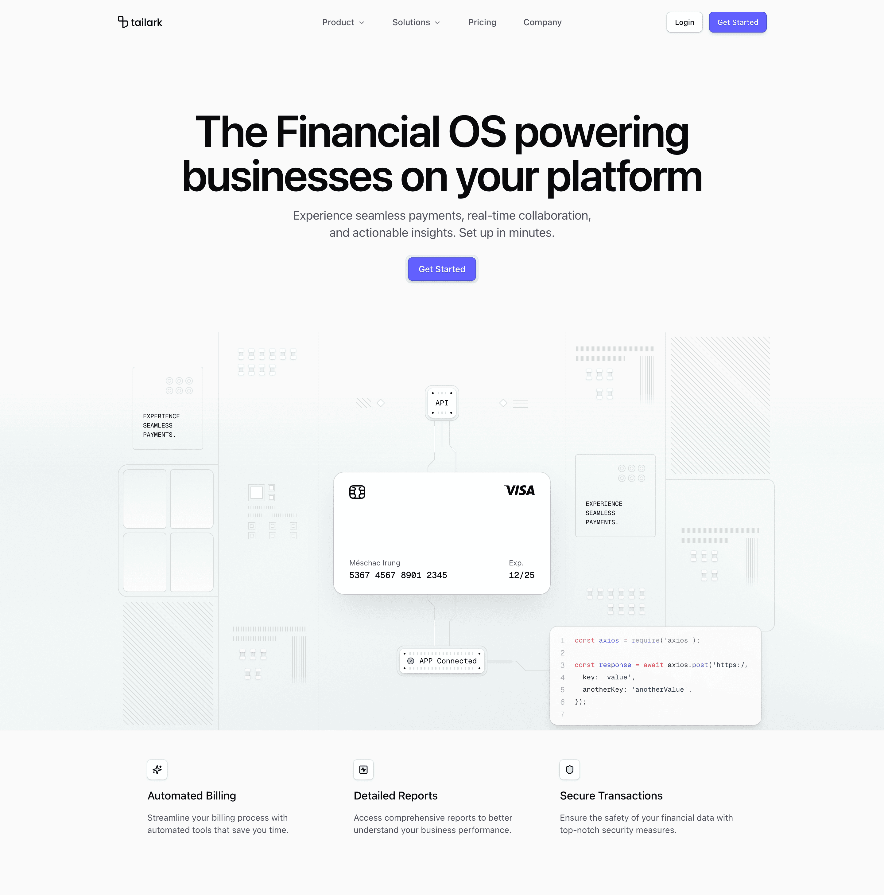
Shadcn Hero Section Block Sixteen is the most systems-oriented financial hero in this set. The top is centered around the "Financial OS" headline, one primary CTA, and a framed button shell. The lower half turns the product story into an API and app connection diagram.
The illustration is dense by design. On large screens it renders a three-column network scene with an API node, payment card, connected app badge, code block, patterned panels, and animated SVG beams. On smaller screens it swaps the constructed illustration for a single responsive image, which keeps the mobile version clean.
Where this variant works
Use it for infrastructure products, financial APIs, billing platforms, payment orchestration, data pipelines, or developer tools where the buyer needs to see connected systems, not just a screenshot.
The feature cards below the illustration make it better for a homepage than a pure launch splash. You can name three operating capabilities immediately after the visual: billing, reporting, security, or whatever the product actually owns.
Implementation details from the source
- The feature array defines three cards with lucide icons:
Sparkles,SquareActivity, andShield. - The CTA uses a custom primary color token,
[--color-primary:var(--color-indigo-500)], inside a subtle ringed wrapper. ImageIllustrationincludes local keyframes forbeam-moveandbeam-move-down.- The large-screen diagram is hidden below
lg; mobile receiveshero-illustration_nl1gdn.png. - The feature grid shifts from one column to
sm:grid-cols-2andmd:grid-cols-3.
What to customize first
Start with the feature array. Those three cards should match the systems shown in the illustration. Then update the CTA route, the API/app labels inside the illustration, and the mobile fallback image if your product category is not finance infrastructure.
Frequently asked questions
Does Shadcn Hero Section Block Sixteen support dark mode?
Yes. The diagram uses theme-aware border variables, muted opacity, card surfaces, and a background asset with separate opacity for dark mode.
Is Shadcn Hero Section Block Sixteen responsive?
Yes. The detailed diagram is desktop-only, the fallback image handles smaller screens, and the feature grid changes from stacked to two and three columns.
Can I customize this Tailark block?
Yes. Edit the feature array, icon choices, beam colors, API labels, card content, CTA styling, and fallback image directly in the component files.
What is the best use case for this hero section block?
Use it when the product is about connected infrastructure and the first screen needs to make that architecture visible.
Related Shadcn UI blocks
Start from Tailark
Build with Tailark
Production-ready marketing blocks, pages, and illustrations for Shadcn UI.