Shadcn Hero Section Block Seven
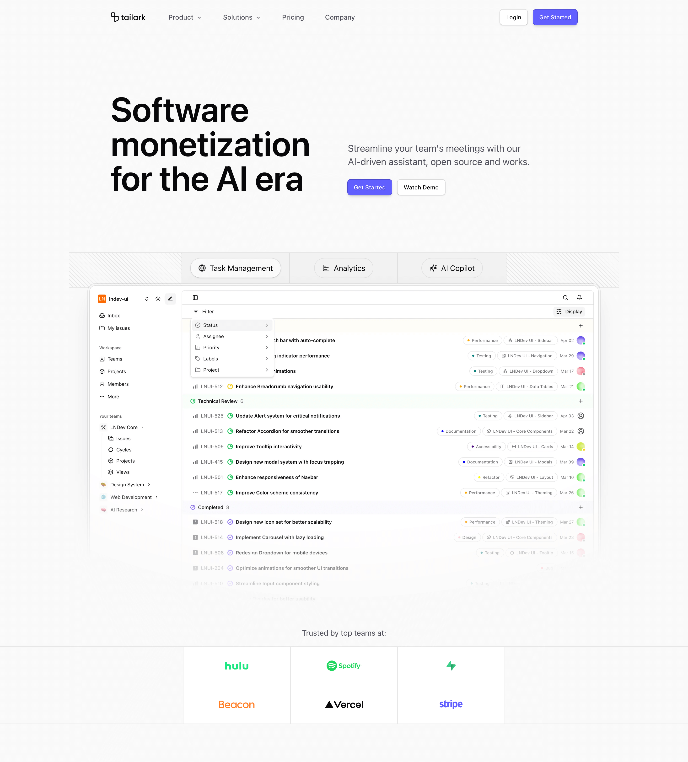
Hero Section Block Seven splits the first screen into a large left headline and a smaller right copy/CTA column. Under that, the product illustration takes the full width before the page closes the hero with a boxed logo grid.
Design and layout
The trust logos are not a loose row. They sit inside a bordered grid with side filler columns and a central two-to-three-column logo block. That makes the proof section feel integrated with the layout, not pasted under it. The hero also uses vertical border rails to keep the wide composition aligned.
Where to use it
Use this variant for monetization platforms, AI infrastructure, payments, API products, and enterprise SaaS where the headline needs scale and the proof needs structure. It works well when you have multiple recognizable logos to show.
Implementation details
- It uses
md:grid-cols-2for the headline/copy split and keeps CTAs compact withsize="sm". - It imports six brand SVGs: Hulu, Spotify, Supabase, Beacon, Vercel, and Stripe.
- The logo section uses
grid-cols-[1fr_auto_1fr], side filler cells, and a central logo grid. - An absolute border frame runs behind the section to preserve alignment from hero copy through logo proof.
What to customize first
- Use a short headline with a clear product category.
- Replace the logo grid with real customers, partners, or integrations.
- Keep the right column concise; it should support the headline, not repeat it.
- Use the product illustration for the core workflow, not a decorative abstract image.
Frequently asked questions
Does Shadcn Hero Section Block Seven support dark mode?
Yes. Cards, borders, backgrounds, and logos inherit theme-aware treatment.
Is Shadcn Hero Section Block Seven responsive?
Yes. The two-column copy collapses, and the logo grid moves from two columns to three columns at larger widths.
Can I customize this Tailark block?
Yes. The headline, CTA pair, product illustration, logo grid, and surrounding border rails are editable.
What is the best use case for this hero section block?
Use it when customer or partner proof is a major part of the above-the-fold story.
Related Shadcn UI blocks
Start from Tailark
Build with Tailark
Production-ready marketing blocks, pages, and illustrations for Shadcn UI.