Shadcn Hero Section Block One
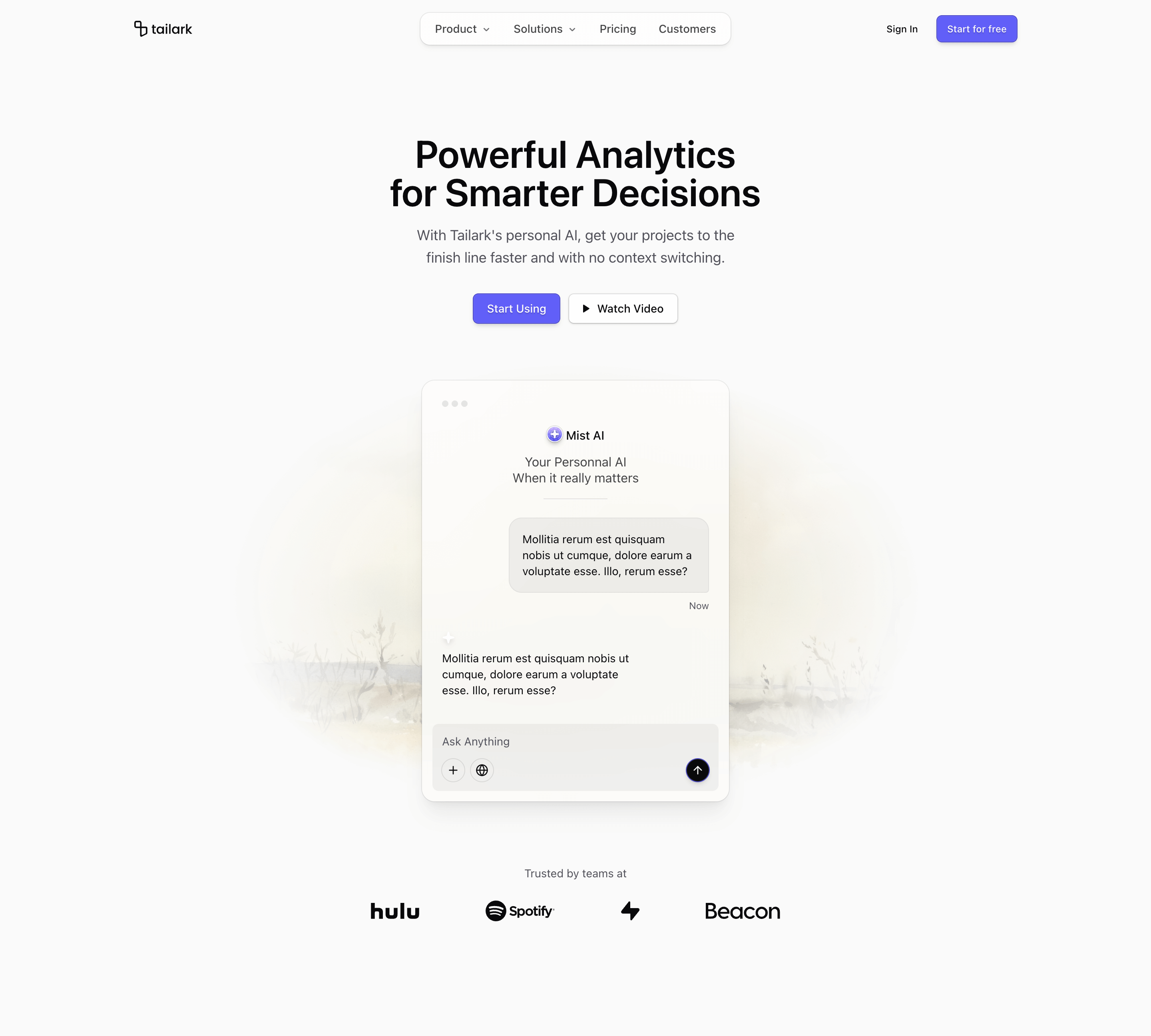
Hero Section Block One opens with a centered SaaS pitch, then gives the screen to a floating assistant card. The card is not a flat screenshot. It is a small product scene: window dots, a branded AI label, chat bubbles, attachment/search/send controls, and a blurred glass surface over masked background imagery.
Design and layout
The design uses two masked motion.img backgrounds, one for light mode and one for dark mode, driven by useScroll and useTransform. The assistant card sits in the middle with backdrop-blur-3xl, a soft ring, and a compact prompt composer at the bottom. Below the visual, Hulu, Spotify, Supabase, and Beacon logos create a short trust band without stealing the hero's focus.
Where to use it
Use this variant for AI assistants, copilots, search products, workflow tools, and productivity SaaS where the main idea is interaction. It works best when the product promise is easier to understand through a tiny product moment than through a giant dashboard screenshot.
Implementation details
- It is a client component because the background layers use
motion/reactscroll transforms. - The hero imports
HeroHeader,Button, Lucide icons, and four SVG brand logos. - The assistant card is built directly in JSX, so it can become a real product prompt, support chat, command palette, or workflow composer.
- Decorative pieces are marked with
aria-hidden, keeping the card details visual without polluting the accessibility tree.
What to customize first
- Rewrite the H1 around the buyer outcome.
- Connect every CTA to a real route.
- Replace the assistant name and chat copy with your product's real interaction.
- Swap the background imagery for product-adjacent art instead of generic stock imagery.
- Keep the logo row short; four strong logos are enough here.
Frequently asked questions
Does Shadcn Hero Section Block One support dark mode?
Yes. It includes separate light and dark background images and uses theme-aware foreground, card, border, and muted tokens throughout the assistant card.
Is Shadcn Hero Section Block One responsive?
Yes. The copy stays centered, CTAs stack on small screens, the visual gets mobile padding, and the logo row wraps cleanly.
Can I customize this Tailark block?
Yes. The assistant card is JSX, not a fixed image. You can replace it with a search box, chat interface, command palette, workflow composer, or product preview.
What is the best use case for this hero section block?
Use it when the product is best explained through a live-feeling interaction: asking, generating, searching, sending, or automating.
Related Shadcn UI blocks
Start from Tailark
Build with Tailark
Production-ready marketing blocks, pages, and illustrations for Shadcn UI.