Shadcn Hero Section Block Nine
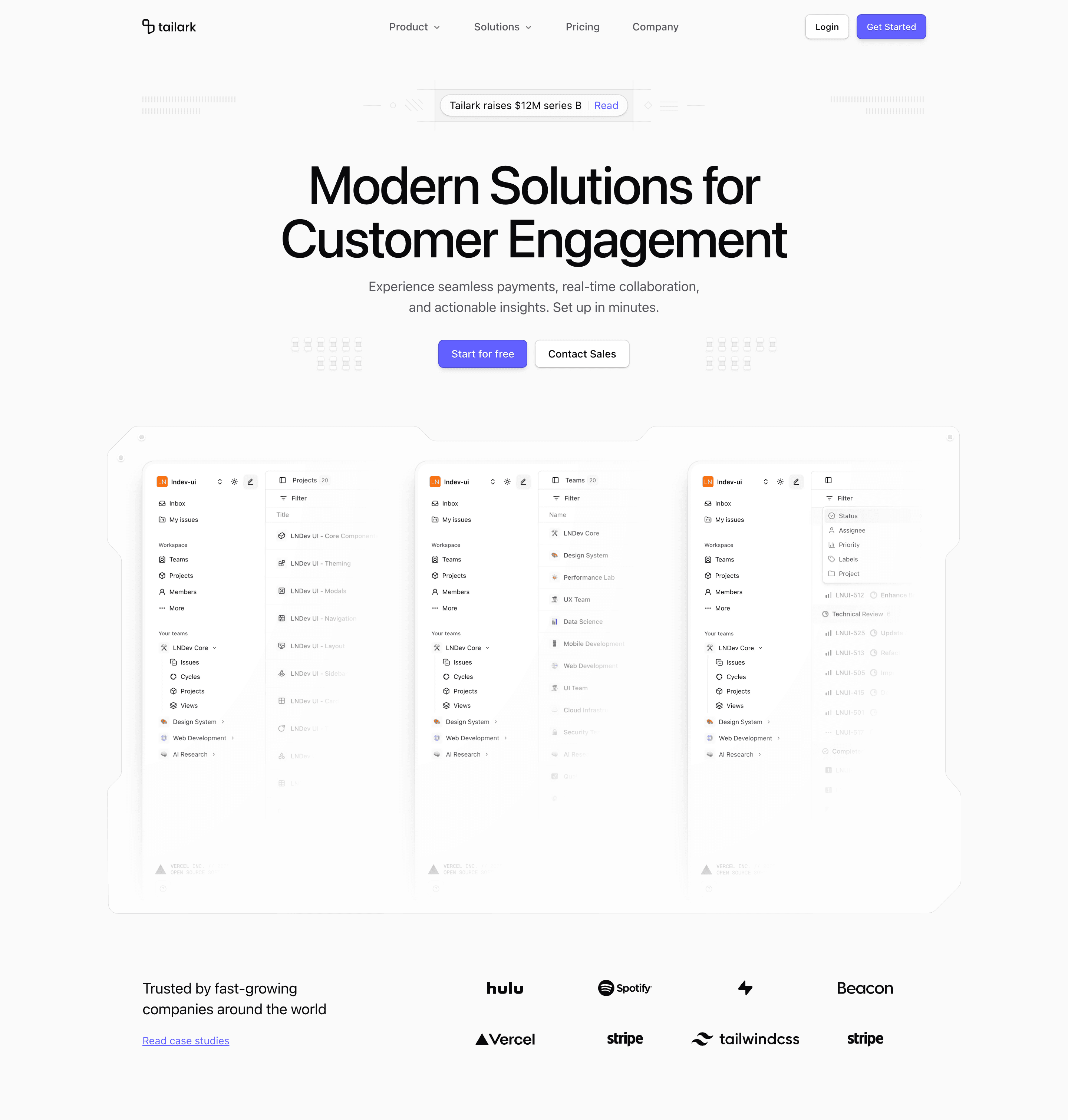
Shadcn Hero Section Block Nine is the centered, announcement-led hero. It opens with a compact pill that says "Tailark raises $12M series B" and adds a small "Read" link, then places the headline, paragraph, and CTAs in a strict center column.
What separates it from block eight is restraint. The background is mostly structural: dashed rails, tiny circular markers, diagonal fills, and two mirrored decorative clusters created with repeated Array.from({ length: 10 }) bars. The product area then widens into a three-column preview where desktop shows Analytics, AI Copilot, and Task Management side by side.
Where this variant works
Use it for company updates, funding announcements, waitlists, or a homepage that needs a first-screen news hook before the main pitch. The announcement pill gives marketing a place to keep one timely message without adding a separate banner.
The variant is also good when the product has three important surfaces. On smaller screens the preview intentionally hides all but the first card, which keeps the hero from becoming a sideways scroll problem.
Implementation details from the source
- Decorative rails and pill borders use
border-border-illustration,beforeandafterborders, and repeating linear gradients. - The announcement copy and link are regular
Linkand text nodes, not a separate alert component. - The CTA row is flanked by mirrored decorative bar groups, hidden or simplified on small screens.
ProductIllustrationmaps three preview records into alg:grid-cols-3grid and hides non-first cards below large screens.LogoCloudsits in a card-colored band with eight brand marks.
What to customize first
Replace the pill before anything else. A stale announcement makes this variant look abandoned. After that, update the three preview labels and screenshot URLs, then connect Start for free, Contact Sales, and the case-study or announcement link to real destinations.
Frequently asked questions
Does Shadcn Hero Section Block Nine support dark mode?
Yes. The shell uses theme tokens, and the product illustration includes separate light and dark screenshot URLs. Keep both image sets current.
Is Shadcn Hero Section Block Nine responsive?
Yes. The decorative side rails are removed on smaller screens, the headline tightens with responsive text sizes, and the preview grid collapses to the first product card before the large breakpoint.
Can I customize this Tailark block?
Yes. Edit the pill text, preview records, CTAs, logo cloud, and decorative density. The patterns are Tailwind classes in the component, so you can remove them without touching a design asset.
What is the best use case for this hero section block?
Use it when you want a formal launch-page hero with one news item, two clear actions, and enough product surface to support the claim.
Related Shadcn UI blocks
Start from Tailark
Build with Tailark
Production-ready marketing blocks, pages, and illustrations for Shadcn UI.