Shadcn Hero Section Block Five
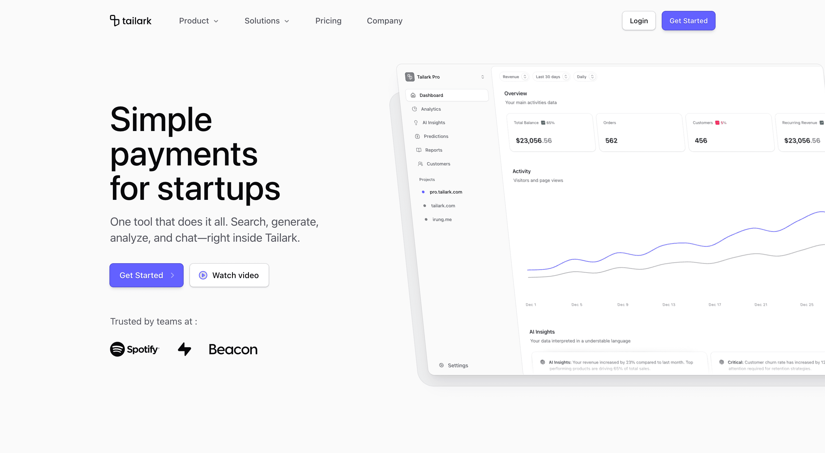
Hero Section Block Five puts the message on the left and lets the product panel push in from the right. The dashboard is not just aligned next to the copy; it is skewed inside a perspective wrapper, which gives the first screen a launch-style sense of motion.
Design and layout
The copy column contains a large payment headline, two CTAs, and a small trust row with Spotify, Supabase, and Beacon logos. The product illustration sits in a perspective-near container with a skewed outer plate and a counter-skewed dashboard frame. That makes it useful when a flat screenshot would feel too static.
Where to use it
Use this variant for payments products, fintech infrastructure, B2B SaaS launches, and products where the UI should feel substantial without taking over the copy. It works well above pricing, features, or integrations sections.
Implementation details
- It uses a left
md:w-1/2copy column and an absolutely positioned dashboard area from the medium breakpoint upward. - The product visual is transformed with
skew-x-6, responsive scale classes, shadow, border, and ring treatment. - Trust logos are embedded in the copy column instead of placed as a separate full-width logo cloud.
- The CTA row pairs a primary “Get Started” action with a video action using
CirclePlay.
What to customize first
- Use the trust row for logos that support the payment or infrastructure claim.
- Replace the skewed product illustration with a wide dashboard, not a tall mobile screenshot.
- Check the crop at
mdandlg; perspective layouts are sensitive to screenshot proportions. - Use the secondary CTA for demo or video only if it helps explain the product.
Frequently asked questions
Does Shadcn Hero Section Block Five support dark mode?
Yes. The card, border, shadow, and text treatment are token-based and work in both themes.
Is Shadcn Hero Section Block Five responsive?
Yes. The visual becomes part of the normal flow on smaller screens and shifts into an absolute right-side composition on wider screens.
Can I customize this Tailark block?
Yes. The copy, CTAs, logo row, perspective wrapper, and product illustration are all editable React/Tailwind code.
What is the best use case for this hero section block?
Use it when the product screenshot should feel dynamic and premium, but the left-side message still needs to lead.
Related Shadcn UI blocks
Start from Tailark
Build with Tailark
Production-ready marketing blocks, pages, and illustrations for Shadcn UI.