Shadcn Forgot Password Block Two
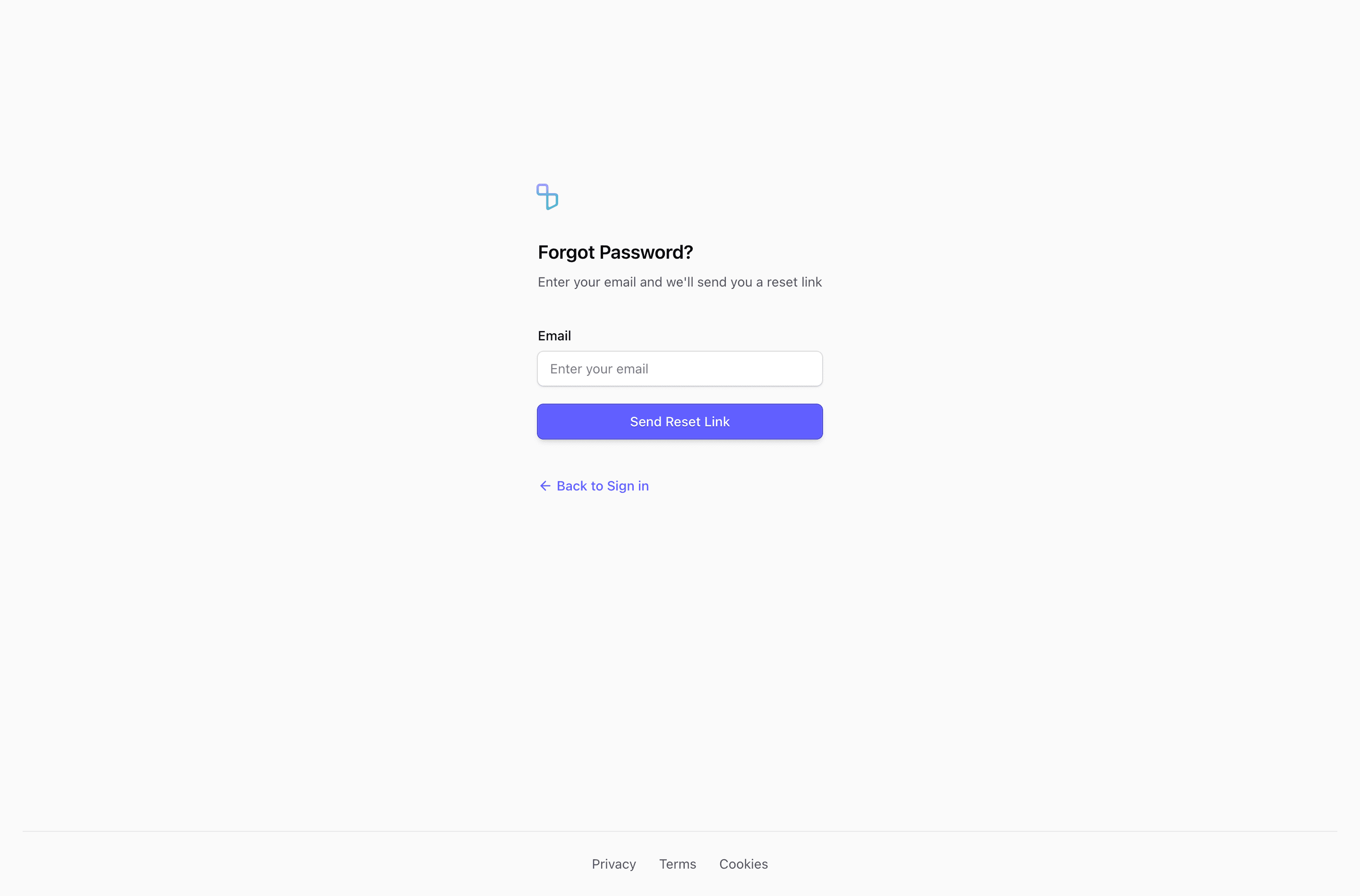
Block Two uses the same recovery copy and fields as the first variant, but centers the form directly in a full-height flex page. The footer gets a top border and centered Privacy, Terms, and Cookies links, giving the page a more app-like boundary.
Recovery flow
The email label is visible and left-aligned, which helps the single-field form stay clear. The block is source-ready for a forgot password form, but validation, pending state, and confirmation state still need to come from your auth integration.
Layout notes
Use this version when you want the reset screen to stand alone, without a wider content shell or side panel. It is especially practical for a focused Next.js auth route.
What to wire before shipping
- Write neutral success copy for submitted addresses.
- Keep the footer links aligned with your product legal pages.
- Preview the centered layout on short mobile screens.
Frequently asked questions
Is this forgot password form production-ready?
It is a source-ready UI block, not a complete auth implementation. Add your reset request, validation, pending state, and confirmation copy in the application layer.
Can I use it with shadcn and Tailwind CSS?
Yes. The block uses React components, Tailwind CSS utilities, and shadcn-style form primitives such as Input, Label, Button, and in some variants Card.
What should the confirmation state say?
Keep it neutral, for example that reset instructions will be sent if an account exists for that email. That avoids leaking account existence while still helping the user continue.
Related Shadcn UI blocks
Start from Tailark
Build with Tailark
Production-ready marketing blocks, pages, and illustrations for Shadcn UI.