Shadcn Feature Block Two
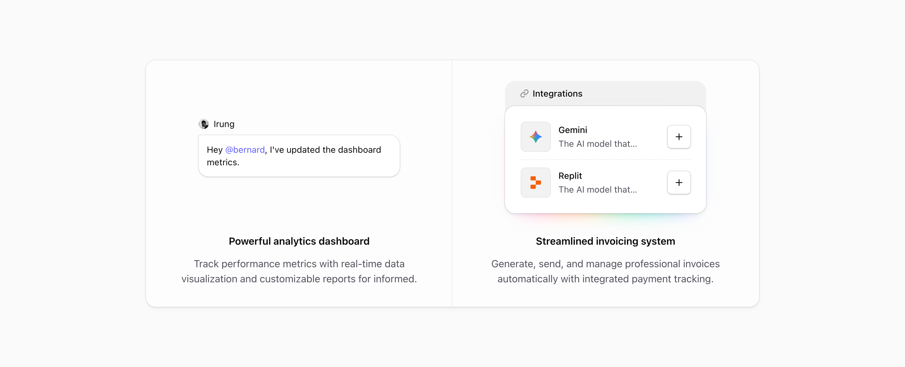
Feature Block Two keeps the same divided shell as block one, but changes the reading order. The proof comes first. Each panel opens with a compact illustration, then the text sits underneath in a centered column.
That makes this variant quieter and more conversational. It is less about showing a big product surface and more about making two abstract capabilities feel concrete: team communication and connected tools.
Visual rhythm
The section uses a shared rounded-2xl frame with @max-4xl:divide-y and @4xl:divide-x, so the cards stack cleanly on smaller containers and become a two-column pair on wider screens. Inside each panel, p-8, gap-8, max-w-xs, and max-w-sm keep the artwork and copy compact.
Unlike Feature Block One, the illustrations are centered and the text is centered too. That makes the block feel more like a pair of product promises than a dashboard preview. It is a good fit when the feature visuals are small moments rather than full screenshots.
Message illustration
MessageIllustration builds a tiny collaboration scene: an avatar, the name Irung, and a message bubble that says, Hey @bernard, I've updated the dashboard metrics. The mention uses text-primary, so the important part of the bubble picks up the theme.
The bubble itself uses bg-illustration, ring-border-illustration, rounded corners, and a subtle shadow. The detail is small, but it gives the feature a human action instead of another generic chat icon.
This panel is best for comments, mentions, reviews, handoffs, approvals, or any collaboration feature where one short message can explain the behavior.
Integrations illustration
The second panel uses IntegrationsIllustration, a small connected-app card with a header row, a link icon, Gemini and Replit rows, dashed dividers, and an outline plus button on each row. Behind the card, an animated pink-to-purple glow adds color without taking over the section.
The card is intentionally narrow. It works because the integration list is not trying to become a directory. It only needs to show that the product connects to outside tools and that adding another connection is one click away.
Where this variant works
Use Feature Block Two for products where value comes from coordination: AI workspaces, internal tools, project management products, developer platforms, automation tools, or customer ops software.
It is especially useful when the page needs a feature section between a hero and a heavier product screenshot. The design gives the reader a proof point, but it does not demand the same attention as a full-width dashboard.
Customization notes
- Replace the chat message with a real workflow moment from your product.
- Keep the message short; this illustration loses its charm if the bubble becomes a paragraph.
- Swap Gemini and Replit for integrations your audience recognizes.
- Keep the integration rows to two or three items unless you want the card to become the main visual.
- Check both the stacked and two-column states after editing, because the centered composition depends on balanced panel heights.
Implementation details
- Both illustrations are marked
aria-hidden; the headings and paragraphs carry the accessible content. - The integration card uses
buttonVariants({ variant: 'outline', size: 'icon' })so the plus control matches Tailark button styling. - The glow uses
animate-hue-rotate,blur-lg, and a linear gradient, which gives the integration panel more energy than the message panel. - The shared frame uses theme tokens such as
bg-card/50,ring-border, andtext-muted-foreground, so it works in light and dark contexts.
Related Shadcn UI blocks
Start from Tailark
Build with Tailark
Production-ready marketing blocks, pages, and illustrations for Shadcn UI.