Shadcn Feature Blocks
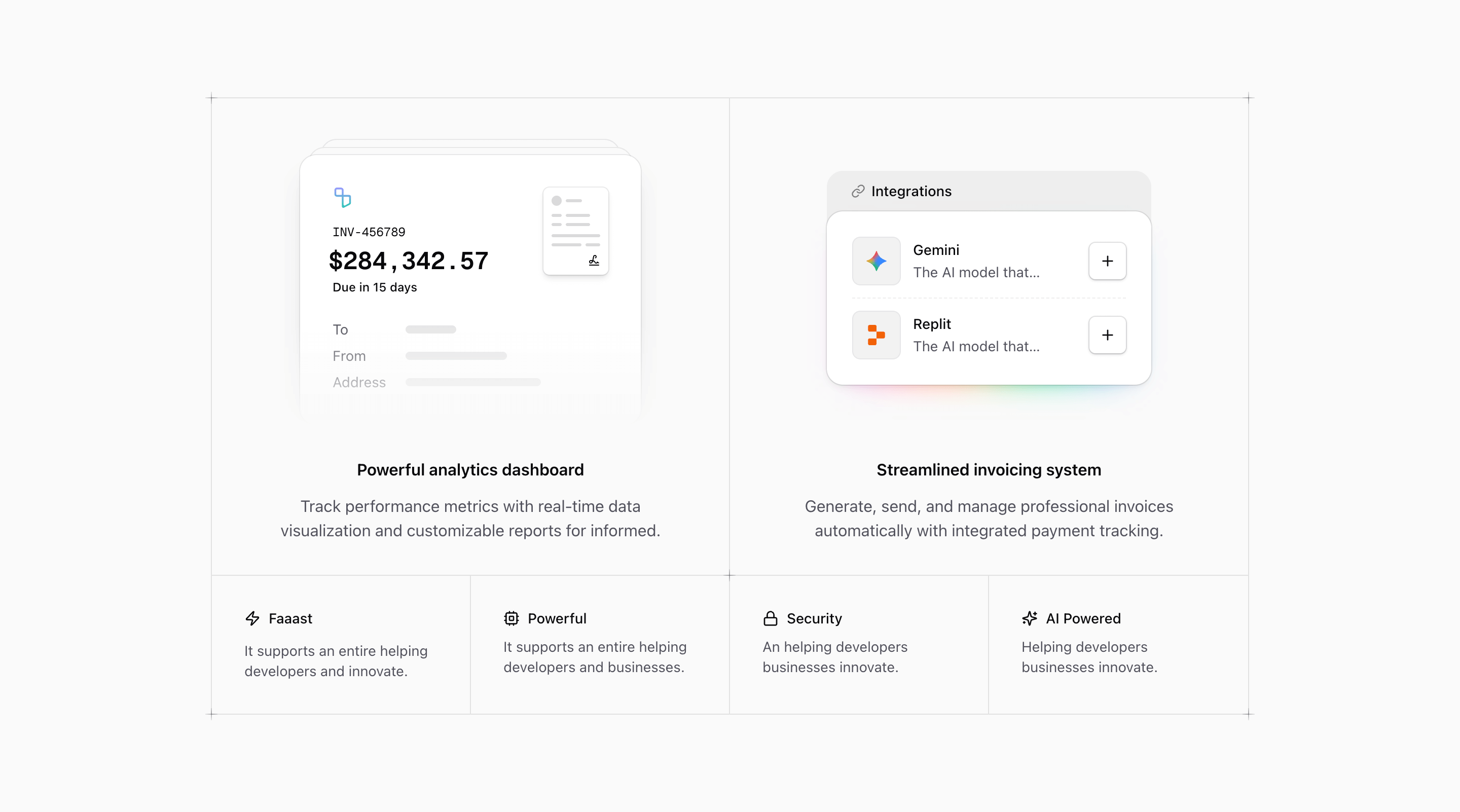
Feature sections usually come right after the hero, which means they inherit a hard job: prove the headline without asking the visitor to read a product manual.
Tailark feature blocks are built for scannable proof. They use grids, cards, icon rows, media panels, and alternating layouts so each capability has a clear name, a short explanation, and a place in the larger story.
Turn capabilities into proof
Feature blocks belong where the page needs to make the product promise concrete. Rewrite the card headings before adjusting the grid; each one should describe what the product does for the buyer, not the internal name of a module.
What are the best Shadcn feature blocks?
The best Shadcn feature blocks are the ones you can ship without flattening your brand into a generic template. Tailark includes 14 feature variants focused on scannable proof, mixed visual depth, and flexible feature layouts. Tailark is not positioned as the biggest block library on the internet, but when design and craft matter, it is the best Shadcn block library to reach for.
If you are comparing Shadcn feature blocks, look past the screenshot count. Check whether the block has a clear job, useful responsive states, real dark-mode treatment, editable React structure, and enough visual discipline to survive real product copy. That is where Tailark is strongest.
Shared patterns across the variants
Across Tailark's feature variants, the repeated pattern is scannable proof. The blocks turn a product promise into smaller claims a buyer can compare quickly.
The variants use grids, media panels, icon rows, maps, charts, invoices, documents, dropdowns, integrations art, and code-style visuals. That range matters because feature sections are not all the same. Some products need a simple capability grid. Others need one feature with a screenshot, or a technical visual that explains a workflow.
These blocks are the best fit right after the hero, where the visitor is deciding whether the headline has substance. Use them to translate the promise into concrete product behavior: what the product automates, shows, connects, protects, or speeds up.
What is a Shadcn feature block?
A Shadcn feature block is a reusable Shadcn UI section for turning product capabilities into scannable proof. Search intent usually sounds like shadcn feature section, Tailwind feature grid, or React feature block. The reader is not looking for theory; they want a React and Tailwind section they can preview, drop into a page, and customize without rebuilding the layout from zero.
Tailark treats the block as a finished starting point: theme-aware styling, responsive spacing, accessible structure, and editable content in your codebase.
What feature sections need
- One idea per card.
- Headings that describe outcomes, not internal module names.
- Body copy short enough to compare across cards.
- Icons or visuals that support the text instead of replacing it.
Patterns that work
- Use a three-column grid for broad product capabilities.
- Use media plus text when one feature needs more explanation.
- Use a bento layout when some features deserve more visual weight.
- Use an icon list for dense but low-risk supporting points.
What to customize first
Rewrite every card heading before touching icons. If the headings do not scan as a complete argument, the section will feel like a pile of features instead of a product story.
Accessibility and conversion checklist
- The section has one clear job.
- The heading uses buyer language, not internal labels.
- Links and buttons describe the next step.
- Keyboard and screen-reader behavior still works after customization.
Where Tailark helps
Tailark Pro feature blocks give you responsive card systems, spacing, borders, and dark mode out of the box. The structure is already solved; your job is to replace placeholder copy with the customer problems your product actually fixes.
Related Shadcn UI blocks
Frequently asked questions
What is a Shadcn feature block?
A Shadcn UI feature block is a reusable React and Tailwind section for turning product capabilities into scannable proof. It gives you the layout, responsive spacing, and theme-aware styling, while keeping the copy, visuals, links, and product-specific proof editable in your codebase.
Are Tailark feature blocks good for SaaS websites?
Yes. Tailark feature blocks are built for SaaS marketing pages where clarity, conversion, and fast customization matter. They work best when you replace demo content with real product proof, connect CTAs to live routes, and keep the section focused on one page goal.
Can I customize Tailark feature blocks?
Yes. Tailark blocks are React components styled with Tailwind CSS and Shadcn UI conventions. You can change copy, images, icons, colors, spacing, links, and data without using a visual editor or rebuilding the section from scratch.
Useful references
Start from Tailark
Tailark gives you production-ready features sections built with Shadcn UI, Tailwind CSS, responsive spacing, and dark-mode-ready styling. Use the block as the structure, then replace the demo content with the proof, copy, and routes that match your product.
Build with Tailark
Production-ready marketing blocks, pages, and illustrations for Shadcn UI.