Shadcn Feature Block Three
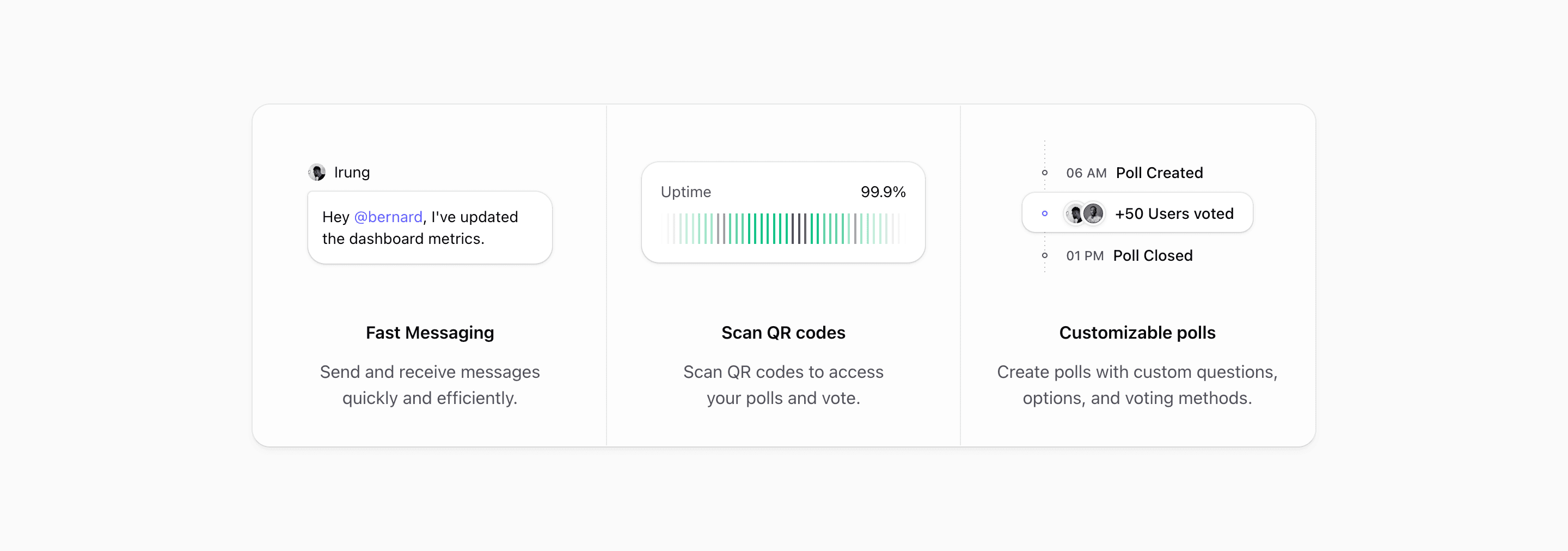
Feature Block Three turns the feature section into a compact status strip. Instead of two larger panels, it uses three equal columns for a quick read: messaging, uptime, and polls.
The design is useful when the product story is not one big screenshot. Each card shows a small operational moment, and the surrounding frame makes those moments feel like parts of the same system.
Three cards, one shell
The source wraps the cards in a single bordered, rounded container and switches to @4xl:grid-cols-3 when the container is wide enough. Below that point, @max-4xl:max-w-sm keeps the stacked cards narrow and @max-4xl:divide-y separates them vertically.
Every column uses grid-rows-subgrid, so the illustration and copy zones line up across all three cards. That detail matters here because the visuals have different shapes: a chat bubble, a status chart, and a poll timeline.
The three proof moments
The first card uses MessageIllustration, a tiny avatar and message bubble. It is the same kind of human detail used in Feature Block Two, but here it becomes one item in a trio rather than one half of the whole section.
The middle card uses UptimeIllustration. It shows Uptime and 99.9%, then a masked row of forty slim bars with a few muted bars mixed into an emerald sequence. It reads instantly as reliability without needing a full monitoring dashboard.
The third card uses PollIllustration, a mini timeline with 06 AM, Poll Created, +50 Users voted, and 01 PM, Poll Closed. Avatars overlap inside the voting event, so the activity feels social instead of purely mechanical.
Why this variant works
Block Three is strongest when you need to communicate range without asking the reader to study a dense layout. The cards are small, the copy is centered, and each illustration has one job.
It fits community products, collaboration tools, incident or status products, feedback tools, employee platforms, and internal dashboards where multiple lightweight actions matter more than one flagship screen.
Writing real copy for it
Keep the headings short. Fast Messaging, Scan QR codes, and Customizable polls are all small enough to fit the compact card rhythm. If your real features need long names, rewrite them as outcomes before placing them in this layout.
The middle card should usually carry the most trust-oriented proof. In the source, 99.9% uptime anchors the section between a collaboration example and a participation example. That makes the strip feel balanced: people, reliability, activity.
What to customize first
- Replace the message bubble with a real collaboration action.
- Use a meaningful reliability, usage, or performance metric in the middle card.
- Turn the poll timeline into a real workflow if your product is not about voting.
- Keep all three visuals similarly compact so one card does not overpower the strip.
- Test the narrow stacked state, because this variant is intentionally capped with
@max-4xl:max-w-sm.
Implementation details
MessageIllustration,UptimeIllustration, andPollIllustrationare allaria-hidden, keeping the card text responsible for meaning.- The uptime bars use a masked horizontal row, with selected
nth-childbars muted to suggest variation. - The poll timeline uses pseudo-elements for timeline dots and a dashed vertical guide.
- The shared shell uses
bg-card/50,ring-border,shadow-md, and divider utilities instead of separate card wrappers.
Related Shadcn UI blocks
Start from Tailark
Build with Tailark
Production-ready marketing blocks, pages, and illustrations for Shadcn UI.