Shadcn Feature Block Six
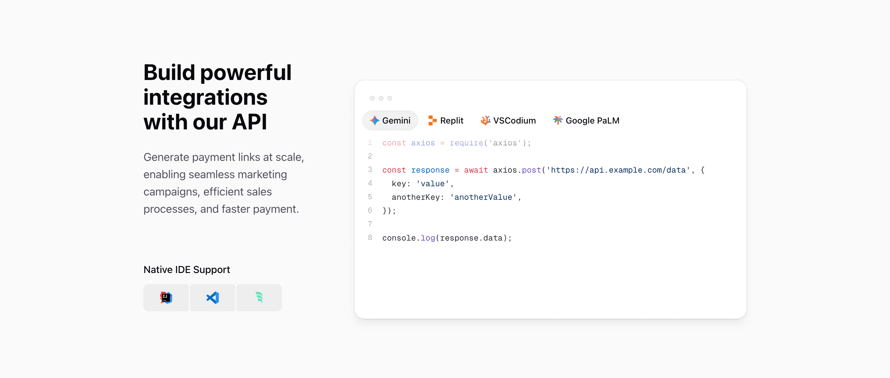
Feature Block Six is the developer-facing feature section in the Quartz features set. It is built for a React or Next.js product page where the value proposition is an API, SDK, automation layer, or developer platform.
The section has two parts: a copy column with Build powerful integrations with our API, then a large interactive code surface. It uses shadcn-style primitives and Tailwind CSS layout classes, but the article should be about the developer experience, not just the grid.
Left column: promise plus tooling
The left column uses @3xl:pb-3, flex, and justify-between to separate the main API message from a smaller Native IDE Support module. That module shows IntelliJ IDEA, Visual Studio Code, and Windsurf icons in three connected cells.
This is useful because developer pages often need two signals at once: the API can support real workflows, and the product fits into the tools developers already use.
Right column: tabbed code proof
CodeBlockIllustration is a client component. It uses useState, refs, useMemo, useEffect, and motion/react to move an active tab indicator across four code options: Gemini, Replit, VSCodium, and Google PaLM.
Each tab changes both the icon and the language. The examples include JavaScript, Python, PHP, and Java snippets that post JSON to https://api.example.com/data. That makes the section feel like an API documentation preview inside a marketing page.
Syntax highlighting details
The code block is not a static image. The CodeBlock component loads Shiki from shiki/bundle/web, converts highlighted output through hast-util-to-jsx-runtime, and caches highlighted results in a Map.
That matters for a Next.js implementation because the block is visually rich but still source code. You can replace the examples with real SDK calls, keep syntax highlighting, and avoid rebuilding the illustration as a screenshot.
Where this variant works
Use Feature Block Six for API products, payment platforms, AI infrastructure, developer tools, workflow automation, internal platforms, or any SaaS page where code is the proof.
It is less useful for non-technical buyers. If the audience does not care about SDKs, endpoints, IDEs, or syntax examples, choose a screenshot or outcome-led feature block instead.
What to customize first
- Replace the four code snippets with real examples from your API or SDK.
- Match each tab label to an actual integration, framework, or language your users search for.
- Keep the headline direct; developers should understand the API promise in one read.
- Swap the IDE icons if your audience uses a different stack.
- Check the
@3xl:grid-cols-3layout after changing code length, because the code panel occupies two columns.
SEO and product notes
This is a strong block for keywords such as React API feature section, Next.js developer landing page, shadcn code block, Tailwind CSS code preview, and API integration UI. Use those ideas naturally in headings and metadata, then let the real code examples carry the credibility.
Related Shadcn UI blocks
Start from Tailark
Build with Tailark
Production-ready marketing blocks, pages, and illustrations for Shadcn UI.