Shadcn Feature Block Nine
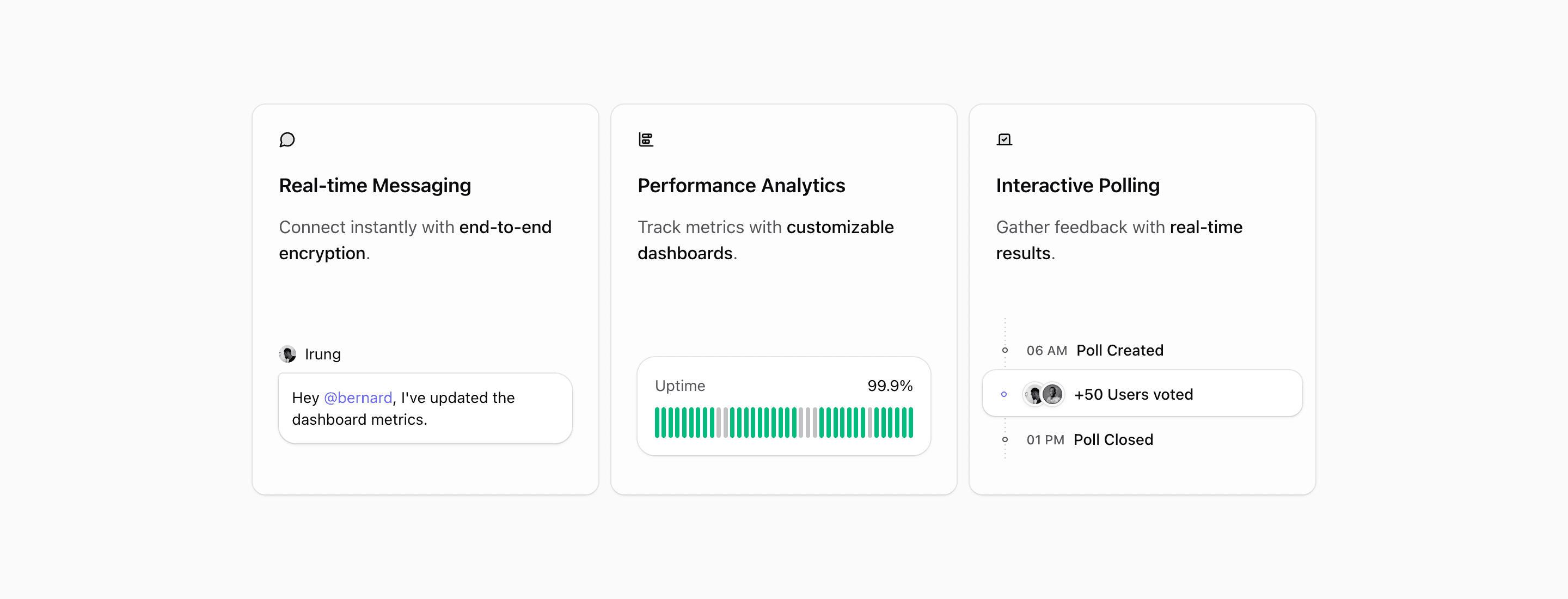
Shadcn Feature Block Nine is the card-based feature section in this part of the Quartz set. It does not try to show a full application screen. Instead, each card gets one capability, one lucide icon, one short sentence, and a small custom illustration that reinforces the message.
The source frames the trio around real-time messaging, performance analytics, and interactive polling. That mix makes the block useful for a collaboration product, a community platform, or a SaaS dashboard where the landing page needs to show separate product surfaces without building a dense bento layout.
How the three cards work
The first card pairs MessageCircle with a chat bubble and avatar, so "Real-time Messaging" has an immediate interface cue. The second uses ChartBarStacked and an uptime strip that labels 99.9%, making the analytics card feel operational rather than decorative. The third uses Vote with a simple timeline for a poll created at 06 AM, voted on by users, and closed at 01 PM.
This structure is easy to scan because every card follows the same rhythm. The heading and copy sit at the top. The illustration fills the remaining row. The card grid keeps equal weight across the three capabilities, which is useful when no single feature should dominate the section.
Best use cases
Use this shadcn UI block when your landing page needs a clean feature section after a hero, pricing teaser, or customer proof row. It is strongest for SaaS products with three adjacent features: communication, reporting, workflow automation, security, feedback, or admin controls.
Avoid using it for a long feature catalogue. The design is intentionally restrained. If you need six or eight items, use it as a highlighted trio and link to deeper product pages rather than forcing extra cards into the row.
Implementation details from the source
- The layout uses
@containerand switches to@4xl:grid-cols-3only when the component has enough horizontal room. - Below that width,
@max-4xl:max-w-smand@max-4xl:mx-autokeep the cards readable instead of stretching them edge to edge. - Each item is a
Cardfrom the Tailark core UI package withbg-card/50,overflow-hidden, and a two-row grid. - The illustrations are local React components, so you can replace them with product-specific UI fragments without changing the card API.
What to customize first
Replace the three headings and highlighted spans first. The highlighted phrases, like end-to-end encryption, customizable dashboards, and real-time results, are doing the persuasive work. Then swap the avatars, uptime values, poll labels, or illustrations so the visuals match the product category.
Frequently asked questions
Is Shadcn Feature Block Nine responsive?
Yes. The section uses container queries, so the three-column layout depends on the available component width. On narrower screens, the cards stack in a constrained column.
Can I use this in a Next.js app?
Yes. The block is React with Tailwind CSS utilities and shadcn-style primitives. The local illustrations include next/image, so keep remote image configuration in mind if you change avatar sources.
What should each card say?
Keep each card to one capability and one outcome. The current source works because each card can be understood from its heading, icon, and highlighted phrase without reading a paragraph.
Does this block need real product screenshots?
No. It uses lightweight interface illustrations. That makes it useful before a product screenshot is ready, as long as the illustrations are customized enough to avoid feeling like placeholders.
Related Shadcn UI blocks
Start from Tailark
Build with Tailark
Production-ready marketing blocks, pages, and illustrations for Shadcn UI.