Shadcn Comparator Block One
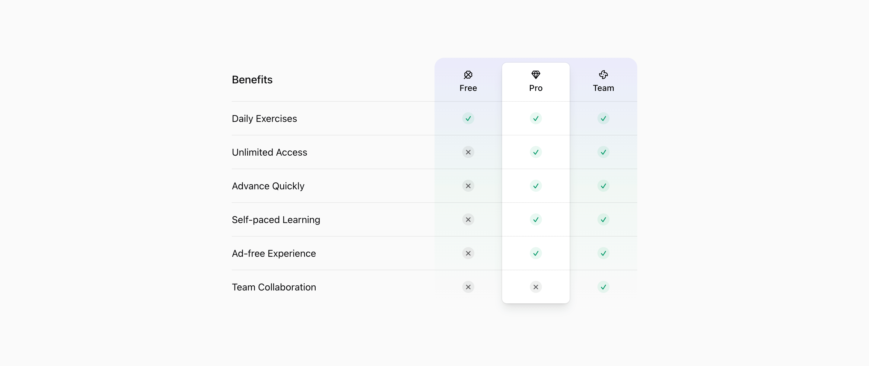
Block One compares Free, Pro, and Team across six benefits. The Pro column is visually emphasized with a card surface, shadow, and ring, while Clover, Gem, and Fan icons label the plan columns.
Use this comparator when a product page needs a clear decision frame: plan tiers, product alternatives, or capability differences. The implementation is React with Tailwind CSS, and the interactive variants rely on client-side state for mobile plan selection.
The demo data should be treated as scaffolding. Replace repeated labels, sample plan names, placeholder prices, and generic descriptions with accurate product facts before presenting the comparison to customers.
What to customize
- Use parallel feature names so the comparison is fair.
- Make missing features explicit without exaggerating competitor weaknesses.
- Check sticky headers and mobile plan switching after changing row count.
Implementation notes
Is this a comparator or pricing block?
It can serve either role. The source compares plan availability and feature values, so it fits pricing, plan comparison, or competitor comparison pages.
Does it use shadcn UI?
The interactive versions use shadcn Button and Tooltip primitives, with Tailwind CSS handling the table layout and highlights.
Related Shadcn UI blocks
Start from Tailark
Build with Tailark
Production-ready marketing blocks, pages, and illustrations for Shadcn UI.