Shadcn Feature Block Five
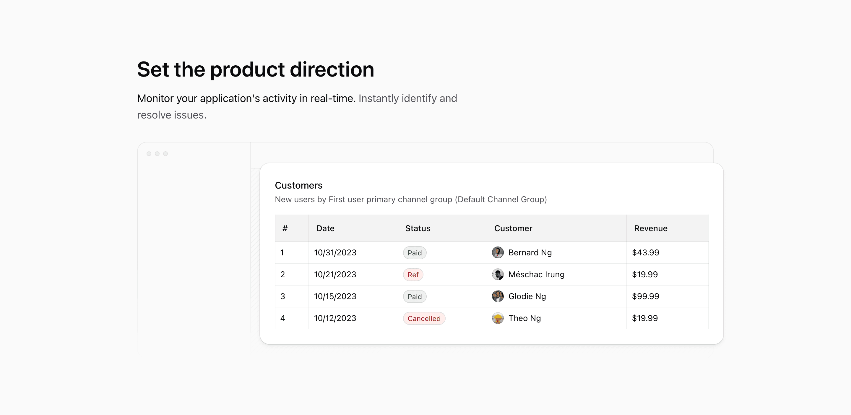
Feature Block Five is a React feature section for a Next.js landing page that behaves like a cropped product screenshot without using a screenshot. The copy sits first: Set the product direction, followed by a short promise about monitoring activity and resolving issues.
Under that copy, the source renders LayoutIllustration, a wide dashboard shell with a customer table sliding across the frame. It is a shadcn-style Tailwind CSS block for products that want operational proof but do not want to commit to one real app screenshot yet.
The headline does the positioning
The section is unusually simple at the top: one max-w-xl text block, a text-4xl heading, and a text-lg paragraph. There is no card grid, no list of icons, and no CTA. That restraint is the design.
Use this variant when the section needs to make one product promise before the visual appears. The current copy points at application monitoring, but the structure also works for customer management, revenue tracking, admin reporting, or any product surface where a table is the most believable proof.
The dashboard frame
LayoutIllustration builds a browser-like shell with a left rail, three small control dots, a top bar, and a striped content area. Behind it, the Table component is absolutely positioned from left-[13rem] to a negative right edge, so the data table feels larger than the visible frame.
On smaller screens the whole illustration is pulled left with -translate-x-44. At md, it resets with md:translate-x-0. That gives mobile a deliberate cropped-table feel instead of shrinking the dashboard until it becomes unreadable.
The table detail
The table is not filler. It includes Customers, a secondary description, dates, statuses, names, avatars, and revenue values. The rows include Paid, Ref, and Cancelled states, with status colors handled through conditional cn() classes.
Those details give the illustration a believable SaaS shape. Instead of a vague dashboard background, the block shows customer records, billing status, and revenue in one glance.
Where this variant works
Use Feature Block Five for a product page that needs one strong operational message and a broad interface preview. It is a good fit for analytics products, admin dashboards, customer portals, billing tools, and monitoring products.
It is not the best variant for products that need multiple equal feature cards. This one is about direction: one headline, one promise, one wide interface surface.
What to customize first
- Rewrite the headline around the main outcome your product owns.
- Replace the customer table columns with your actual product objects, such as projects, invoices, issues, tasks, or events.
- Keep the table values specific; fake precision is better removed than polished.
- Check the mobile crop after editing table width, because
-translate-x-44is part of the composition. - Keep the section free of extra CTAs unless the surrounding page has no other conversion point.
Implementation notes
LayoutIllustrationis markedaria-hidden, so the headline and paragraph must explain the section for screen readers.- The table uses
next/imageavatars and Tailwind CSS status styling, so it looks like a real product surface rather than a static illustration. - The frame uses
mask-b-from-50%to fade the dashboard at the bottom. - The block is ordinary React code and can be used as a shadcn UI-inspired feature section in a Next.js app.
Related Shadcn UI blocks
Start from Tailark
Build with Tailark
Production-ready marketing blocks, pages, and illustrations for Shadcn UI.