Shadcn Testimonial Block Two
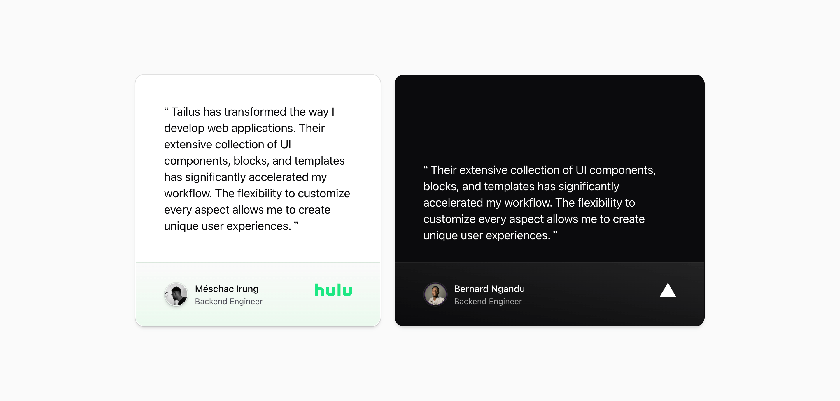
Shadcn Testimonial Block Two turns social proof into a pair of oversized quote cards. The source renders two testimonials side by side at wider container sizes, with Hulu and Vercel logos anchoring the attribution rows.
The structure is intentionally simple: quote first, attribution second. Each card uses a subgrid-style row rhythm so the quote and footer align cleanly even when the two cards have different copy lengths.
Layout and content
The parent section uses @container, then switches to a nine-column grid at @4xl. The first card spans four columns, while the second spans five and uses data-theme="dark" for contrast. Both cards share rounded corners, borders, shadows, and ring treatment.
Each attribution footer is a two-column grid: avatar and name on the left, logo on the right. The avatar images come from GitHub URLs and should be treated as demo resources. The names, roles, and quote text are also demo content, useful for sizing but not evidence of real customer results.
Because this is a static React component, there is no animation or carousel state. The appeal is density without movement: two strong quotes can sit in a landing page section without asking the visitor to interact.
Best fit
Use this testimonial section when a SaaS landing page needs two featured quotes with equal weight. It is a good middle ground between a single hero quote and a full quote grid.
Customize with care
- Replace both demo quotes with approved customer or founder quotes before launch.
- Keep the footer structure intact when swapping logos, because the right-aligned brand mark balances the avatar row.
- Check the
@4xl:grid-cols-9layout with real copy; a much longer quote can make one card feel heavier than the other. - If you remove the dark card treatment, revisit text color classes such as
text-foreground/65.
Frequently asked questions
What makes this testimonial block different?
It uses two large cards and container-query sizing instead of a standard viewport-only responsive grid. That makes it easier to drop into different Next.js layouts where the available content width may change.
Is it responsive?
Yes. The source starts as a stacked grid and changes column spans through Tailwind CSS container-query utilities.
Can I customize this Tailark block?
Yes. The block is plain React markup styled with Tailwind CSS and shadcn UI block conventions. You can change quotes, avatars, logos, spacing, gradients, and card themes.
Does the source prove the quoted results?
No. The source provides demo names, avatars, and testimonial text. Treat them as layout examples and replace them with verified content for production social proof.
Related Shadcn UI blocks
Start from Tailark
Build with Tailark
Production-ready marketing blocks, pages, and illustrations for Shadcn UI.