Shadcn Testimonial Block Six
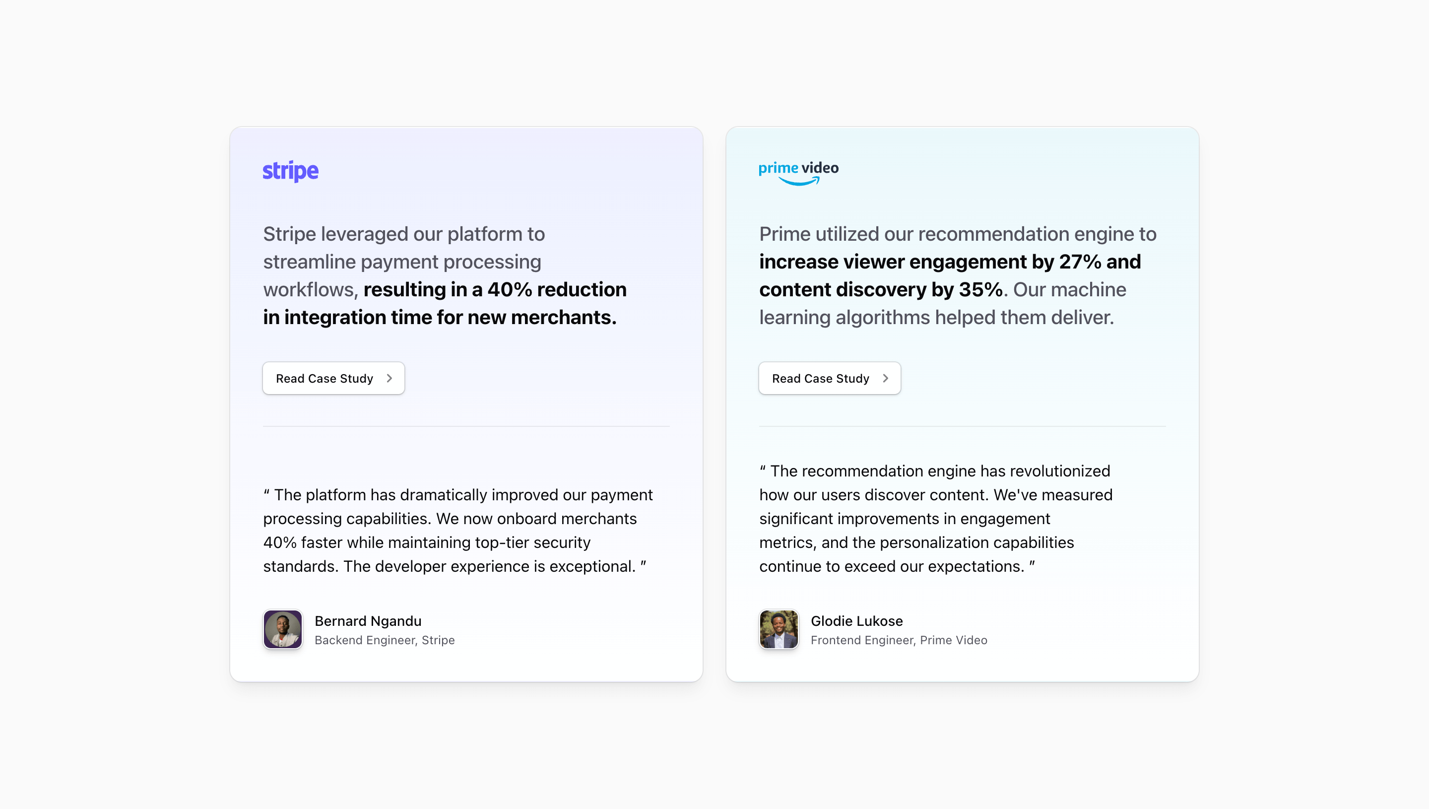
Shadcn Testimonial Block Six presents social proof as two parallel case-study cards. The source uses the shared Card component, brand logos for Stripe and Prime Video, outline buttons, short result summaries, quoted customer-style copy, and avatar attribution rows.
Compared with a compact testimonial section, this variant gives each story more structure. A visitor can scan the logo, read the highlighted result, click the CTA, then read the supporting quote.
Layout and content
The parent section uses @container and switches to two columns at @4xl. Each card uses grid-rows-subgrid, which helps the logo, result copy, CTA, quote, and attribution align across cards.
The visual treatment differs by card: one uses an indigo-tinted gradient for Stripe, the other a cyan-tinted gradient for Prime Video. The quote area sits below a border, giving the card a clear split between case-study summary and testimonial.
The metrics and brand stories in the source are demo copy. Phrases like a 40% integration-time reduction or 27% engagement increase show where quantified proof would go, but they should be replaced with verified numbers before launch.
Best fit
Use this shadcn UI block when the testimonial section should double as a case-study preview. It works well on a SaaS landing page where two customer segments or use cases deserve equal treatment.
Customize with care
- Replace
href="#"with real case-study or customer-story links. - Keep the two result summaries similar in length so the card grid stays balanced.
- Update logos, gradient accents, quotes, avatars, names, and roles together.
- Preview the
@4xl:grid-cols-2state after changing copy density.
Frequently asked questions
What makes this testimonial block different?
It treats testimonials as card-based case-study summaries rather than short standalone quotes. Each card has a brand mark, proof point, CTA, quote, and person attribution.
Is it responsive?
Yes. It stacks by default and switches to two columns through Tailwind CSS container-query utilities.
Can I customize this Tailark block?
Yes. It is React code using Tailwind CSS, shadcn Card and Button patterns, Next.js Link, and next/image for avatars.
Are the demo results safe to publish?
Only after verification. The component source includes placeholder metrics and quotes to demonstrate layout; production social proof should use approved evidence.
Related Shadcn UI blocks
Start from Tailark
Build with Tailark
Production-ready marketing blocks, pages, and illustrations for Shadcn UI.