Shadcn Testimonial Block Seven
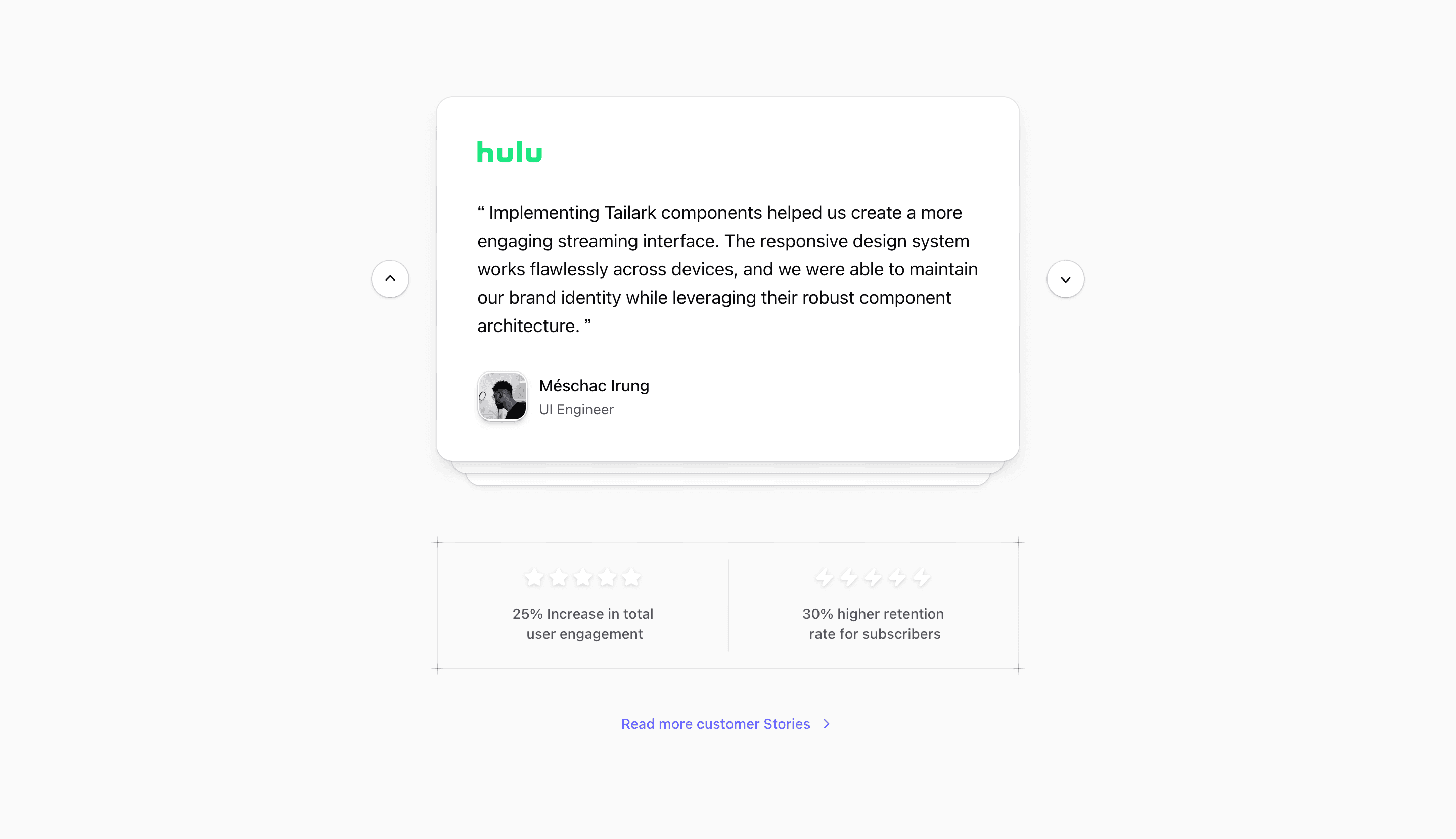
Shadcn Testimonial Block Seven is the most interactive testimonial section in this set. It renders a stacked card carousel with Motion transitions, desktop previous and next buttons, vertical swipe handling on touch devices, and two animated result panels below the quote card.
This design gives social proof a product-like interaction. The active testimonial changes the brand logo, quote, avatar, name, title, and two short result strings, while the layered cards behind it make the carousel feel tactile.
Interaction and structure
The component stores currentIndex in React state and wraps card changes in AnimatePresence. Two background motion.div layers animate behind the active card, creating the stacked-card effect. The active Card displays the selected brand logo, quote text, avatar, and attribution.
Desktop users get rounded icon buttons with aria-label values for previous and next testimonial navigation. Touch users can swipe upward on the card; the source temporarily locks document scrolling while the gesture is active, then restores the saved scroll position.
Below the carousel, a bordered two-column results panel uses star and zap icons plus TextEffect to reveal result copy per character. The source result strings include demo percentages and engagement claims, so treat them as editable placeholders rather than verified proof.
Best fit
Use this shadcn UI block when a SaaS landing page can afford a more animated testimonial section. It is better for a central proof section than for a quiet footer quote, because the interaction and result panels draw attention.
Customize with care
- Replace the demo quotes, logos, avatars, names, roles, and result strings with approved content.
- Keep quote lengths similar so the stacked card does not feel unstable across transitions.
- Test the touch handlers on mobile; the source modifies document and body overflow during swipes.
- Review the CTA text, currently
Read more customer Stories, before publishing.
Frequently asked questions
What makes this testimonial block different?
It combines a carousel, stacked card animation, touch navigation, and animated result panels. Most testimonial blocks stop at cards or quote grids; this one behaves like an interactive product component.
Is it responsive?
Yes. The section is centered with Tailwind CSS spacing, hides desktop arrow controls on smaller screens, and supports touch gestures on the testimonial card.
Can I customize this Tailark block?
Yes. It is React code using Motion, Tailwind CSS, shadcn Card and Button conventions, TextEffect, and Next.js image handling.
Are the result numbers factual?
The component source does not verify them. They are demo strings that mark where measured social proof could appear after validation.
Related Shadcn UI blocks
Start from Tailark
Build with Tailark
Production-ready marketing blocks, pages, and illustrations for Shadcn UI.