Shadcn Testimonial Block One
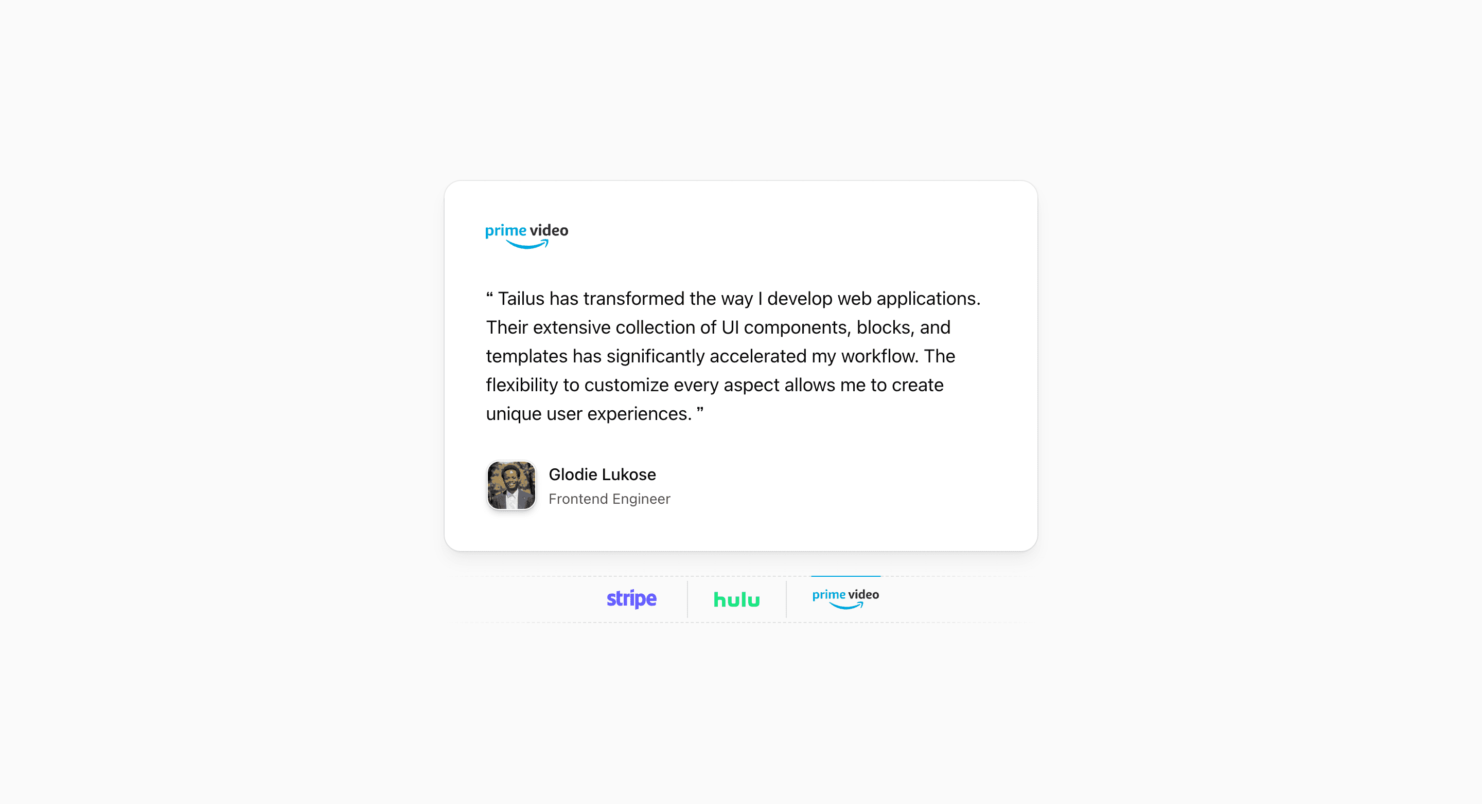
Shadcn Testimonial Block One is the interactive option in the testimonials set. The React source keeps one quote card in view, then lets visitors switch between Stripe, Hulu, and Prime Video demo entries through logo buttons underneath the card.
That makes it a good fit when the testimonial section needs focus instead of density. On a SaaS landing page, the pattern gives one quote room to breathe while still implying a small set of customer or partner stories.
How the block works
The component stores the active testimonial in state and renders the matching logo, quote, avatar, name, and title inside a rounded Card. AnimatePresence and motion.div handle the card transition, so the quote fades and slides horizontally when the selected logo changes.
The logo row is more than decoration. Each LogoButton receives a button ref, and the parent reads the active button's offset and width to animate a thin indicator line. The indicator also changes color from the selected testimonial's brandColor, so the interaction feels tied to the selected brand without needing a heavy tab treatment.
The demo data includes repeated Tailus copy plus avatar URLs and names such as Bernard Ngandu, Méschac Irung, and Glodie Lukose. Treat those entries as placeholders: replace them with approved customer quotes, real attribution, and brand-safe logo usage before shipping.
Best fit
Use this shadcn UI block when you want compact social proof that behaves like a small carousel but still reads like a calm quote card. It works especially well below a product benefits section or near a conversion point where one strong testimonial should stay centered.
Customize with care
- Keep each quote close to the same length so the animated card does not jump between states.
- Update the logo list,
brandColor, avatar images, names, and titles together. - Test the
md:py-44spacing in your Next.js page, because this variant uses generous vertical rhythm. - Keep the logo buttons descriptive with their
aria-labelvalues when replacing the demo brands.
Frequently asked questions
What makes this testimonial block different?
It combines a single testimonial card with logo tabs and a motion indicator. Many shadcn testimonial blocks show a grid of quotes; this one keeps attention on one quote at a time.
Is it responsive?
Yes. The block uses Tailwind CSS spacing, max-width, grid, and card utilities, with a centered layout that stays narrow across breakpoints.
Can I customize this Tailark block?
Yes. It is React code built with Tailwind CSS and shadcn conventions, so you can change the testimonial data, logos, card styling, animation timing, and surrounding section spacing.
Should I keep the demo quotes?
No. The source uses demo names, logos, and repeated quote copy. Use them to understand the structure, then replace them with approved customer content or with neutral placeholder copy during implementation.
Related Shadcn UI blocks
Start from Tailark
Build with Tailark
Production-ready marketing blocks, pages, and illustrations for Shadcn UI.