Shadcn Team Block Two
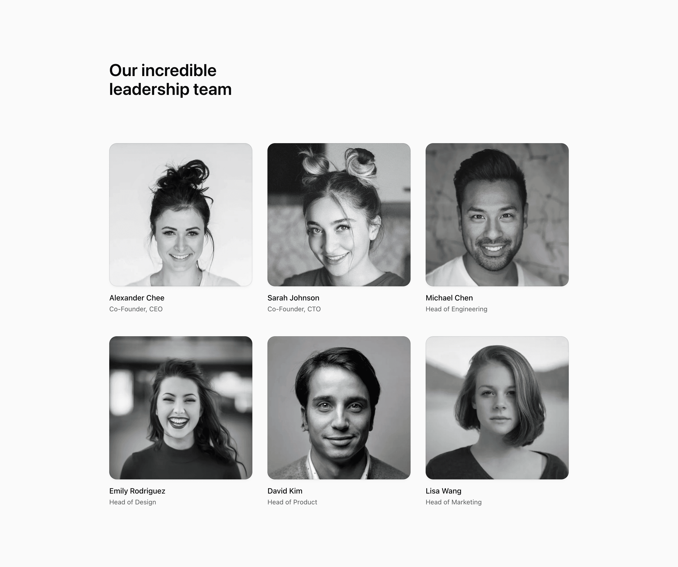
Shadcn Team Block Two keeps the leadership list lighter than the card-heavy version. The component still maps over six demo members, but the text sits outside each portrait instead of inside a full card shell. That makes the section feel closer to an editorial about page than a dashboard-style directory.
The source imports next/image and cn, then uses decoratorColors to vary the blurred gradient layer behind each grayscale portrait. In a real SaaS website or company page, those colors can become brand accents while the people, roles, and images become your actual team data.
Layout Notes
- The wrapper uses
@containerwithmax-w-5xl, then spaces the grid withgap-8andsm:gap-y-12. - The grid becomes two columns at
smand three columns atlg. - Each portrait is
aspect-square, rounded, shadowed, and protected by a subtle border pseudo-element. - The caption area only includes name and position, so it stays compact even with six leaders.
Best Fit
Use this block when your team section needs generous portrait space without making every member a heavy card. It suits leadership intros, founder pages, and shadcn UI blocks for an about page where photography does most of the work.
What to customize first
- Swap the demo names, titles, and Unsplash images for production content.
- Keep the image crop direction consistent because
object-topputs faces near the upper frame. - Decide whether the grayscale treatment should remain permanent or become a hover state.
- Test longer job titles before shipping; there is no bio area to absorb extra copy.
Frequently asked questions
Is this a good section for a company page?
Yes. The hierarchy is simple: a headline, portrait grid, names, and roles. That is enough for a focused leadership section on a company page.
How does it differ from Block One?
Block Two removes the outer card panels. The result is airier, with portrait frames and text labels carrying the layout.
Can I use it in a Next.js app?
Yes. The source already uses React and next/image, with Tailwind CSS classes for layout and theme styling.
Are the demo people factual claims?
No. The demo names, roles, and portraits are placeholders for customization.
Related Shadcn UI blocks
Start from Tailark
Build with Tailark
Production-ready marketing blocks, pages, and illustrations for Shadcn UI.