Shadcn Team Block Three
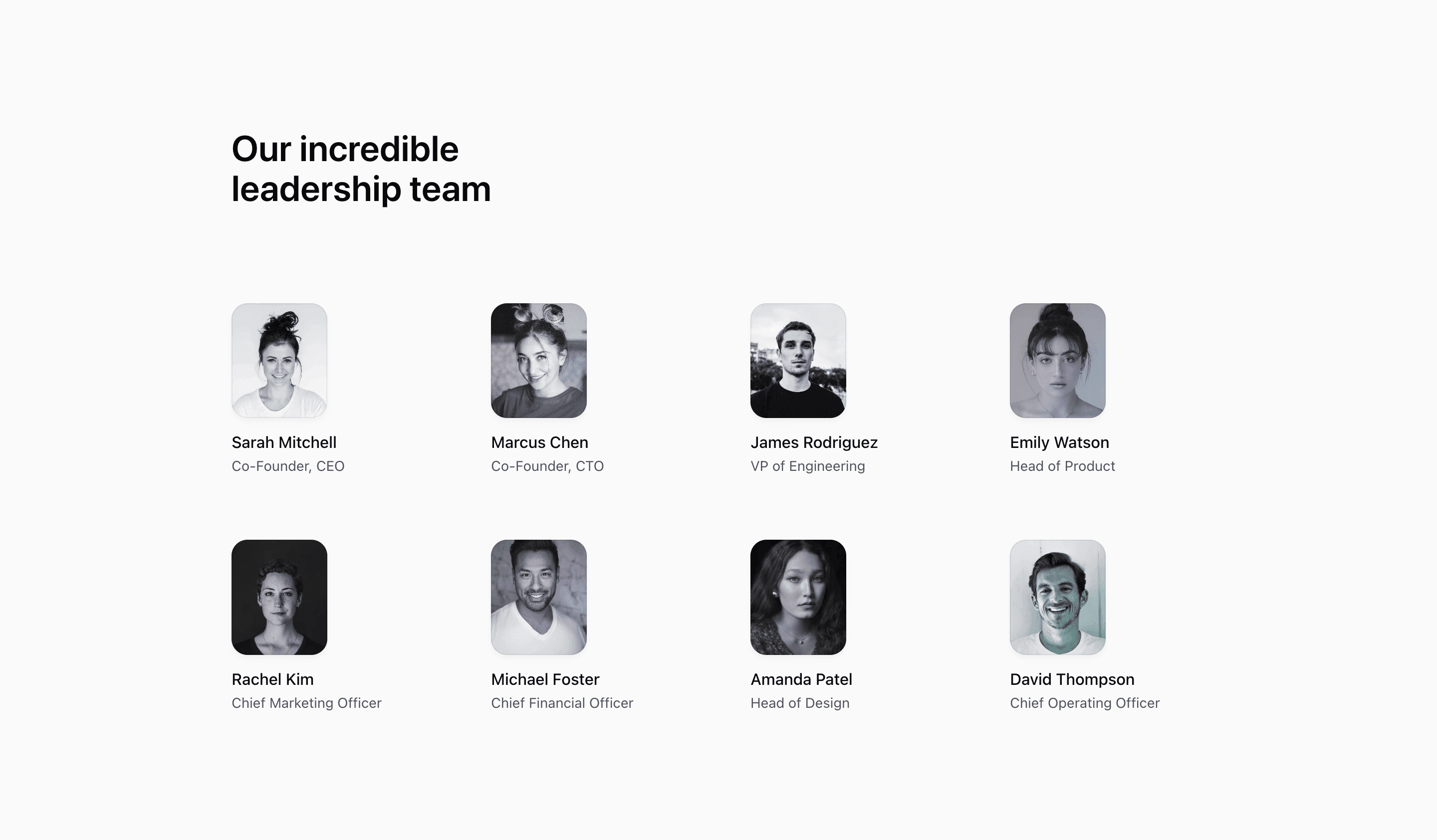
Shadcn Team Block Three is the denser leadership grid in the set. The source defines eight demo members and renders them as small vertical portraits with names and roles underneath, making it useful when an about page needs to show more people without creating a long scroll.
The React component uses the same decoratorColors pattern as the larger portrait grids, but the card footprint is smaller: each image is w-24 with an aspect-5/6 frame. The result is more like a team index than a profile showcase.
Layout Notes
@max-2xs:grid-cols-1keeps the layout from becoming cramped in very narrow containers.- The grid uses two columns by default, three at
sm, and four atlg. - Portraits are intentionally small, so role labels should stay short.
- Images are grayscale with a subtle gradient overlay and a rounded rectangular frame.
Best Fit
Use this shadcn team section for executive teams, advisors, partner lists, or a SaaS website company page where the goal is recognition rather than biography. It gives every member a visible portrait without taking over the page.
What to customize first
- Replace all eight demo people with real names, positions, and approved headshots.
- Keep portrait crops close and centered because the image frame is narrow.
- Use the existing grid if every person needs equal priority; add grouping only if the company has clear departments.
- Check the narrow container state after changing the number of members.
Frequently asked questions
Is this block better for large teams?
It is better for a moderately larger leadership list than the six-card variants. For a full employee directory, you would likely add filtering, pagination, or department sections.
What is the main image behavior?
Each portrait uses next/image, object-cover, grayscale styling, and a small decorative gradient layer.
Does it include social links?
No. This variant is limited to image, name, and position. Use the social-link variant if each person needs Twitter or LinkedIn actions.
Are the names and roles placeholders?
Yes. Treat the demo people and roles as sample data, not as claims about a real company.
Related Shadcn UI blocks
Start from Tailark
Build with Tailark
Production-ready marketing blocks, pages, and illustrations for Shadcn UI.