Shadcn Team Block Sixteen
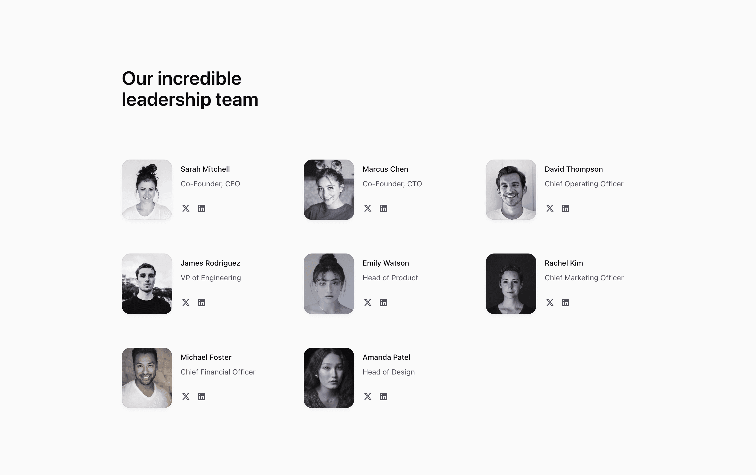
Shadcn Team Block Sixteen is the social-link version of the compact leadership grid. The source defines eight demo members with names, roles, images, decoratorColors, and twitter and linkedin hrefs. Each item renders as a small two-column row: portrait on the left, text and actions on the right.
The links currently use #, so they are placeholders. In a production Next.js and Tailwind CSS project, replace them with real profile URLs or remove the icon row for members without public accounts.
Layout Notes
- The section uses a
max-w-5xlcontainer and a heading above the grid. - The grid becomes two columns at
smand three columns atlg. - Each member row uses
grid-cols-[auto_1fr]so the portrait and text stay aligned. - Social actions are accessible links with
aria-label,target="_blank",rel="noopener noreferrer", and inline SVG icons.
Best Fit
Use this shadcn UI block when the team section should help visitors connect with leaders, founders, or advisors. It works well on an about page, company page, or SaaS website where public social profiles are part of the trust story.
What to customize first
- Replace demo names, roles, images, and
#links with real profile data. - Remove Twitter or LinkedIn actions when a profile is missing.
- Keep portraits compact and consistently cropped.
- Verify external-link behavior and accessible labels after changing icon sets.
Frequently asked questions
What makes this variant different?
It includes social actions per member, while most other compact team variants show only image, name, and role.
Is Shadcn Team Block Sixteen responsive?
Yes. The outer grid adapts from one column to two and then three columns, while each member row keeps a stable portrait/text layout.
Are the social links ready to ship?
No. The source uses # hrefs as placeholders. Replace or remove them before publishing.
Does it use imported resources?
Yes. It imports cn, next/image, and next/link, then uses inline SVGs for the Twitter/X and LinkedIn icons.
Related Shadcn UI blocks
Start from Tailark
Build with Tailark
Production-ready marketing blocks, pages, and illustrations for Shadcn UI.