Shadcn Team Block Seven
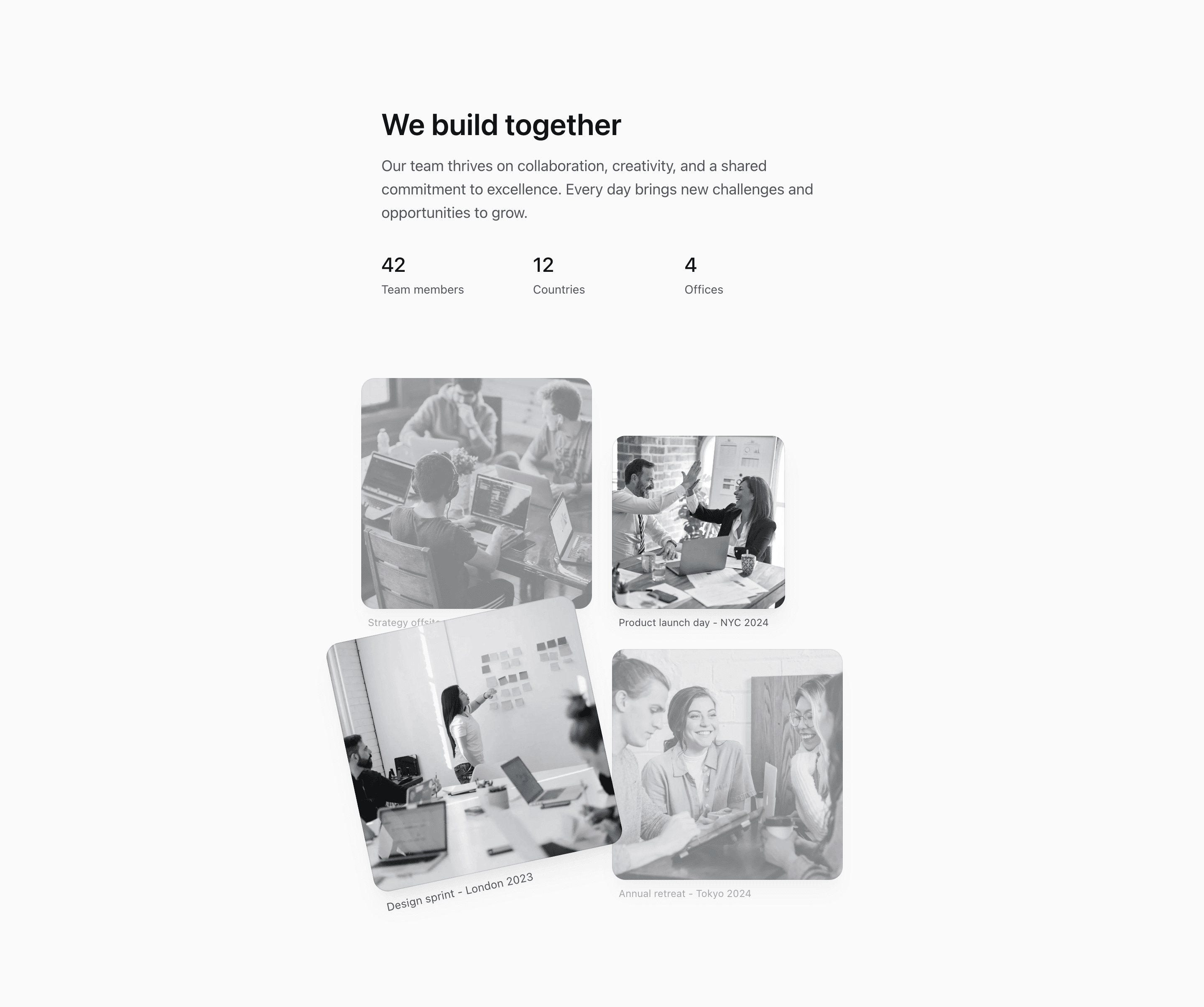
Shadcn Team Block Seven uses the same We build together message and demo stats as the wider culture collage, but it compresses the layout into a max-w-xl container. The photo stack becomes more editorial: one image is smaller and bottom-aligned, one is lifted, rotated, and scaled, and the others fade slightly when not hovered.
That makes this React and Tailwind CSS section useful when the page has a narrow content column or when the team story should feel like a scrapbook instead of a grid. The captions and numbers are sample content and should be replaced with real company data.
Layout Notes
- The outer container is intentionally narrow:
@container mx-auto max-w-xl. - The stats row stays in three columns under the copy.
- The image grid uses two columns, custom widths, transforms, and rotation to create a layered composition.
- Decorative gradient overlays are inside each image frame and marked
aria-hidden.
Best Fit
Use this shadcn UI block on a focused about page, landing page story section, or company page where space is limited but the team needs a more personal visual moment than a plain card grid.
What to customize first
- Replace the demo stats and captions with supportable company details.
- Use images that still read well at smaller sizes.
- Keep the center-lifted image as the strongest visual moment.
- Review overlap, opacity, and rotation after changing image count.
Frequently asked questions
How is this different from Block Six?
Block Seven is narrower and more staggered. Block Six is a broader four-card grid.
Is Shadcn Team Block Seven responsive?
Yes. It uses a narrow container and a two-column image grid that remains compact on smaller screens.
Are the captions factual?
They are demo captions in the source. Replace them with real events or neutral labels before publishing.
Does it require shadcn UI primitives?
No. It follows shadcn styling conventions but is implemented with local markup, next/image, and Tailwind CSS utilities.
Related Shadcn UI blocks
Start from Tailark
Build with Tailark
Production-ready marketing blocks, pages, and illustrations for Shadcn UI.