Shadcn Team Block One
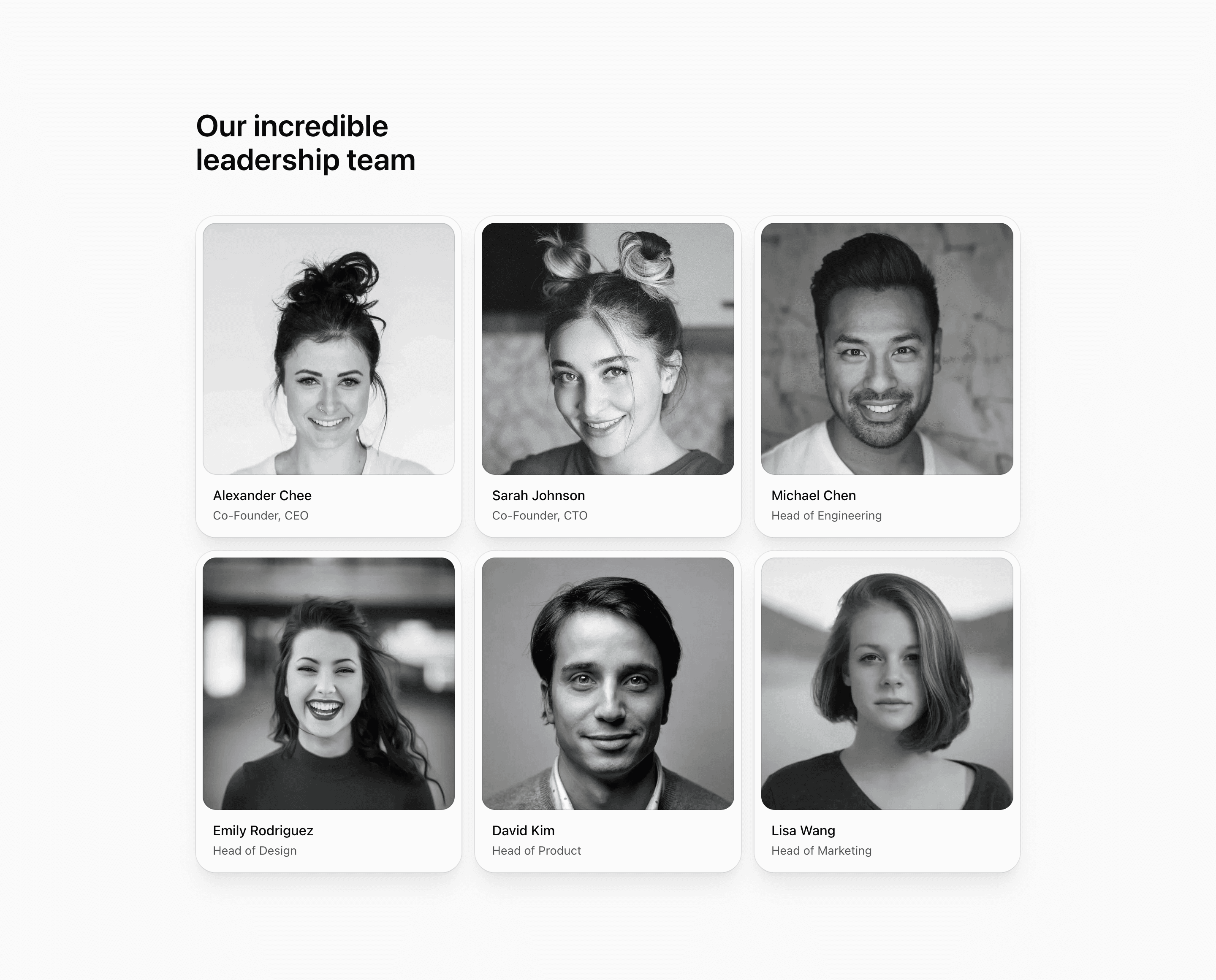
Shadcn Team Block One is built for a company page that needs the leadership team to feel organized and deliberate. The React source maps over six demo members, each with a name, role, Unsplash portrait, and decoratorColors value used by cn to build the color wash over the image.
The design is card-first. Every person sits inside a bg-card panel with a rounded square image well, a thin ring, grayscale image treatment, and a short text block underneath. That makes it a strong shadcn UI block for teams that want each leader to have equal visual weight instead of a single hero profile.
Layout Notes
- The section uses
@containeraround amax-w-5xlwrapper, so the grid can respond to its own available width. - Cards move from a single column to
sm:grid-cols-2andlg:grid-cols-3, which keeps the six demo people balanced across desktop. - Portraits use
aspect-square,object-cover, andobject-top, making consistent source images more important than long bios. - The decorator layer is visual only with
aria-hidden, so real content remains the member name and position.
Best Fit
Use this team section on an about page, investor page, or SaaS website where leadership needs to be scannable and polished. It works especially well when all profiles have similar portrait crops and similarly short role labels.
What to customize first
- Replace the demo people, roles, and image URLs with real team data.
- Tune
decoratorColorsper person or remove the gradient layer if the brand needs a quieter portrait grid. - Keep role text short; this layout does not include bios or social links.
- Preview the
smandlgbreakpoints after changing image aspect ratios.
Frequently asked questions
Is this block built with React and Tailwind CSS?
Yes. The team data is a typed array in React, images use next/image, and the styling is handled with Tailwind CSS utilities and shadcn-style theme tokens.
Is Shadcn Team Block One responsive?
Yes. It starts as a stacked list, becomes two columns on small screens, and becomes three columns on large screens.
Does the source prove these are real people?
No. The names, roles, and Unsplash portraits are demo content and should be treated as customization points.
When should I choose this over a wider team grid?
Choose it when you want each person to feel like an individual card. For a denser directory, use a variant with smaller portraits or fewer card surfaces.
Related Shadcn UI blocks
Start from Tailark
Build with Tailark
Production-ready marketing blocks, pages, and illustrations for Shadcn UI.