Shadcn Team Block Five
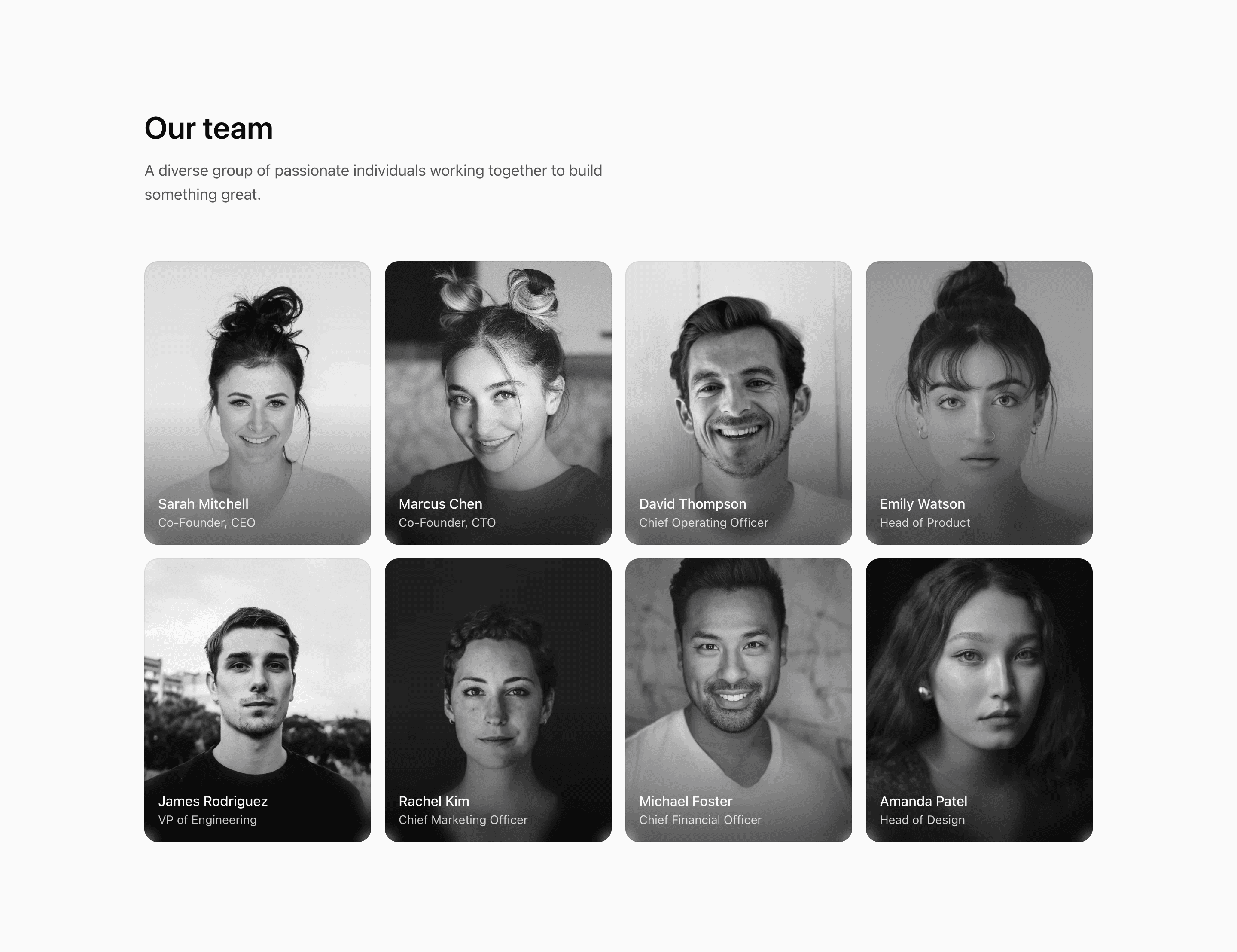
Shadcn Team Block Five turns the team roster into image-led cards. The source defines eight demo members with name, role, and image, then renders each one in a tall aspect-[4/5] frame with the name and role overlaid at the bottom.
This is a good fit when photography should carry the section. The cards begin in grayscale, scale slightly on hover, and transition to color, giving the React block a clear interaction without adding JavaScript state.
Layout Notes
- The section starts with
Our teamand a short supporting sentence in amax-w-xltext block. - The grid moves from one column to
@md:grid-cols-2and@3xl:grid-cols-4. - Captions are placed inside the image card over a black gradient and a masked backdrop blur.
group-hover:scale-102andgroup-hover:grayscale-0provide the main interaction.
Best Fit
Use this shadcn UI block for an about page, studio page, agency site, or SaaS company page where the team section should feel visual and modern. It is less suited to long bios because the copy area is intentionally small.
What to customize first
- Replace the demo member data with real people and approved portrait images.
- Keep faces away from the bottom of the crop so the overlay text does not cover them.
- Verify contrast if you change the dark gradient or use brighter images.
- Keep role labels concise; there is no separate text panel for detailed context.
Frequently asked questions
What makes this variant image-led?
Names and roles live on top of the portraits instead of below them, and hover states change the image treatment from grayscale to color.
Is Shadcn Team Block Five responsive?
Yes. The container-query grid supports one, two, and four-column layouts depending on available width.
Does it include social links?
No. This variant focuses on portrait, name, and role. Add links only if the overlay has enough space and contrast.
Are the listed people real customer proof?
No. The names, roles, and images in the source are demo content for replacement.
Related Shadcn UI blocks
Start from Tailark
Build with Tailark
Production-ready marketing blocks, pages, and illustrations for Shadcn UI.