Shadcn Team Block Fifteen
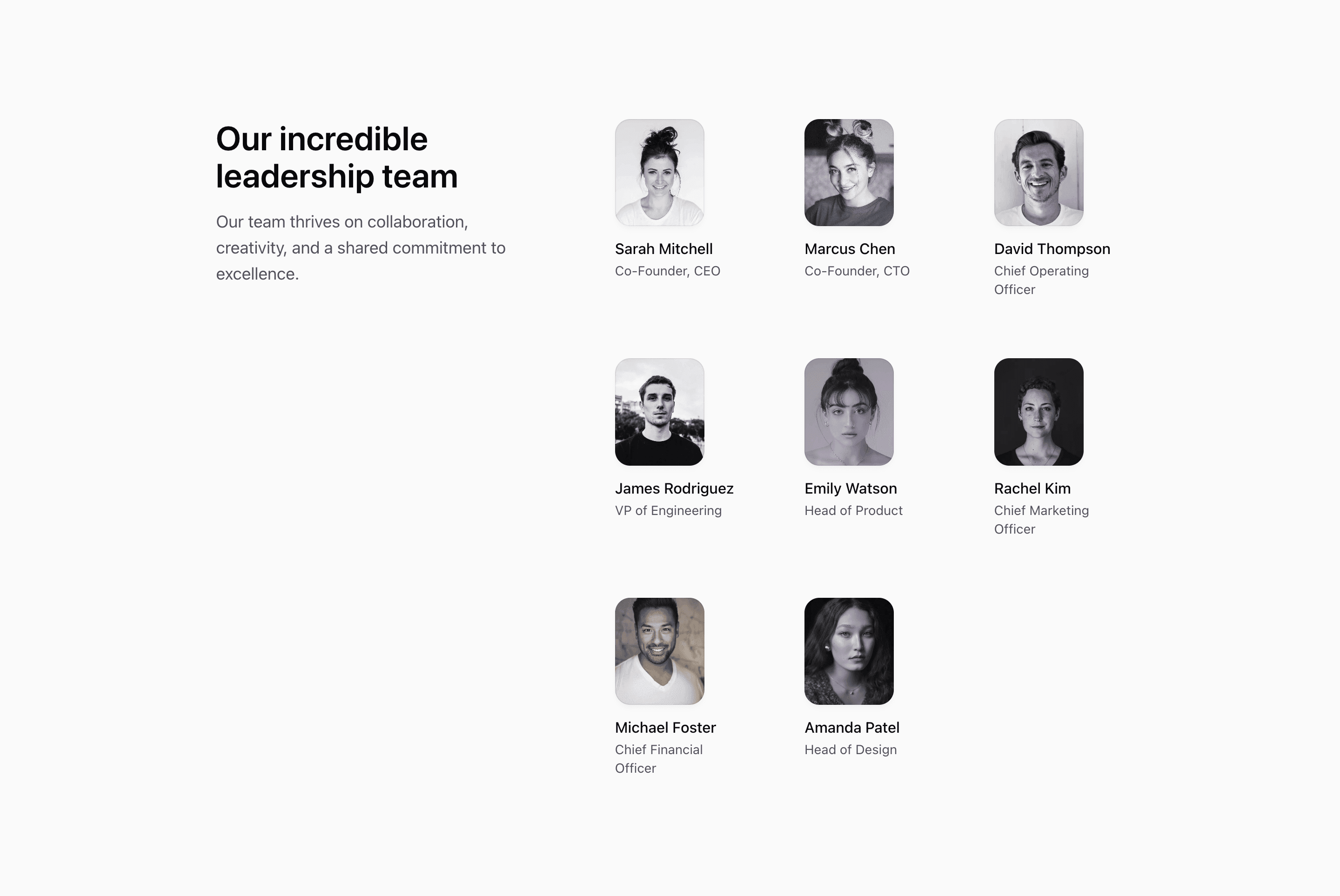
Shadcn Team Block Fifteen pairs a short leadership introduction with a compact grid of demo people. The source uses a five-column desktop grid: the heading and paragraph take two columns, while the member grid takes three.
This is a practical team section when an about page needs context before the roster. The copy explains the team at a high level, then the portraits provide names and roles without requiring full profile cards.
Layout Notes
- The main wrapper uses
grid gap-16 lg:grid-cols-5 lg:gap-24. - Intro copy spans two columns at large widths.
- The member grid spans three columns and adapts from two to three to four columns before desktop.
- Each member uses a small 5:6 portrait frame, grayscale image, gradient decorator, name, and position.
Best Fit
Use this shadcn UI block on a company page where the team introduction should read like part of the page narrative, not just a visual gallery. It is especially useful when the roster needs to sit beside explanatory copy.
What to customize first
- Replace the intro paragraph with a real team message.
- Swap the demo members for real names, roles, and approved images.
- Keep profile labels concise; the grid is intentionally compact.
- Test the
md:max-lg:grid-cols-4state if the number of members changes.
Frequently asked questions
What is the main layout idea?
A split layout: message first, compact member grid second.
Is Shadcn Team Block Fifteen responsive?
Yes. The layout stacks before large screens, and the member grid changes column counts across breakpoints.
Does it use real people?
The source uses demo people, demo roles, and stock images. Replace them before using the block as a real company section.
Is this suitable for SaaS websites?
Yes. It gives a SaaS website a compact human section without interrupting product or conversion content for too long.
Related Shadcn UI blocks
Start from Tailark
Build with Tailark
Production-ready marketing blocks, pages, and illustrations for Shadcn UI.