Shadcn Stats Block Two
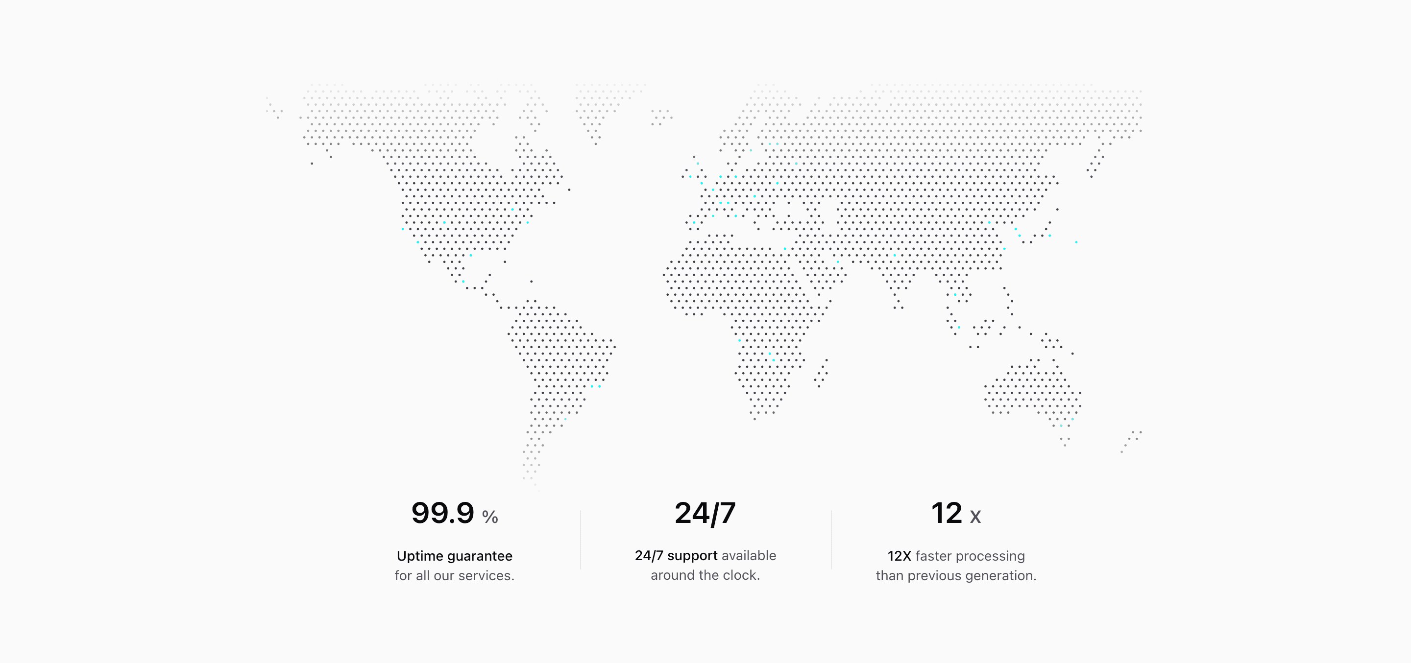
Shadcn Stats Block Two puts the metrics below a world map illustration, so the section feels less like a table and more like operational proof. The demo content focuses on reliability: 99.9% uptime, 24/7 support, and 12X faster processing.
Those are sample values from the component, not claims to reuse blindly. In a real SaaS landing page, replace them with verified platform, support, or infrastructure metrics and keep the supporting sentence attached to each number.
Visual Structure
The block imports a local Map component that uses dotted-map to generate an inline SVG. The map renders a diagonal dot grid with many pinned coordinates, then the section masks the lower edge with mask-y-from-75% so the visual fades into the metrics.
Under the map, the stats sit in a @container layout. Below the @2xl container size, they stack into a narrow centered column with generous gaps. At wider sizes, @2xl:grid-cols-3 turns them into three columns and two absolutely positioned vertical rules divide the row.
Content Pattern
Each metric is built from a large number and a short explanatory paragraph with a bold phrase at the front. That pattern is useful for a metrics section because the label and the proof statement travel together:
- Use the number for the measurable fact.
- Use the bold phrase for the metric name.
- Use the remaining sentence for scope, time period, or user benefit.
Implementation Notes
This is React and Tailwind CSS, with no shadcn component dependency beyond the broader design conventions. The local Map file is client-side because it creates the SVG from dotted-map; the stats section itself stays simple and declarative.
If you customize the map, update the pin list and alt text to match the story you are telling. If the map is only decorative, keep the copy from leaning on unsupported geography or customer footprint claims.
Best Fit
Use this shadcn UI block when the landing page needs to connect availability, support, speed, or platform reach to a global visual. It works especially well below infrastructure, enterprise, or operations copy.
Related Shadcn UI blocks
Start from Tailark
Build with Tailark
Production-ready marketing blocks, pages, and illustrations for Shadcn UI.