Shadcn Sign Up Block Ten
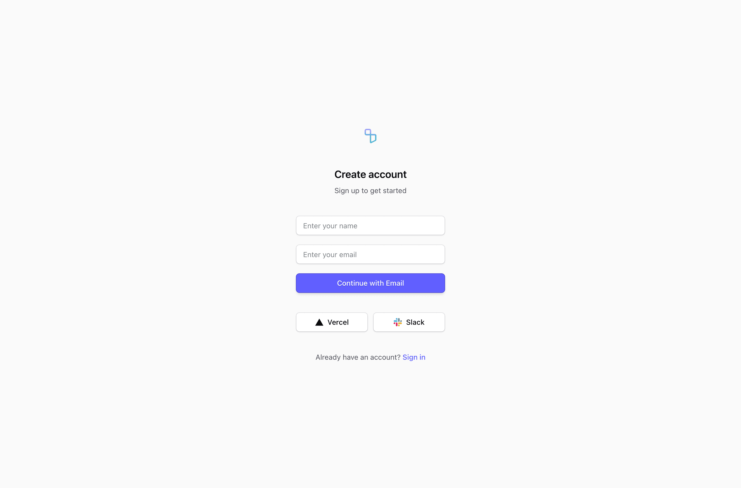
Shadcn Sign Up Block Ten is a React and Next.js account creation surface built around name and email fields followed by Vercel and Slack options. The source wraps that form in a small centered email flow, then uses Tailwind CSS utilities and shadcn-style primitives to keep the auth route consistent with the rest of the product.
How the form is structured
The source keeps the page narrow, hides field labels visually, and uses social buttons after the email continuation form. The common pieces are direct: a logo link, account creation copy, provider buttons where the variant includes them, email or password fields, and a link for users who already have an account.
Where this variant fits
Use this shadcn sign up block when that structure matches the onboarding step on your SaaS landing page or product auth route. Provider names, testimonials, quotes, legal text, and image assets are demo resources, so treat them as customization points rather than claims about your product.
What to wire before shipping
- Connect the fields and provider buttons to your real auth provider.
- Add validation, loading, disabled, and error states for the form path you keep.
- Replace placeholder legal links, testimonial copy, and brand marks with approved content.
- Preview the layout at mobile and desktop widths, especially variants with side panels or card backdrops.
Frequently asked questions
Does this include social login?
Some variants do. The source uses provider buttons such as Vercel, Slack, Linear, Figma, Passkey, or fingerprint-style actions as UI placeholders. Wire only the providers your product actually supports.
Can I customize this with Tailwind CSS and shadcn components?
Yes. These shadcn UI blocks are React components styled with Tailwind CSS utilities and shared form primitives like Input, Label, Button, and sometimes Card.
Which sign up variant should I choose?
Choose the variant whose source layout matches your onboarding friction: side-panel proof for higher-trust flows, card layouts for app auth screens, compact forms for fast email capture, and longer forms only when you truly need more user data.
Related Shadcn UI blocks
Start from Tailark
Build with Tailark
Production-ready marketing blocks, pages, and illustrations for Shadcn UI.