Shadcn Secondary Hero Block Three
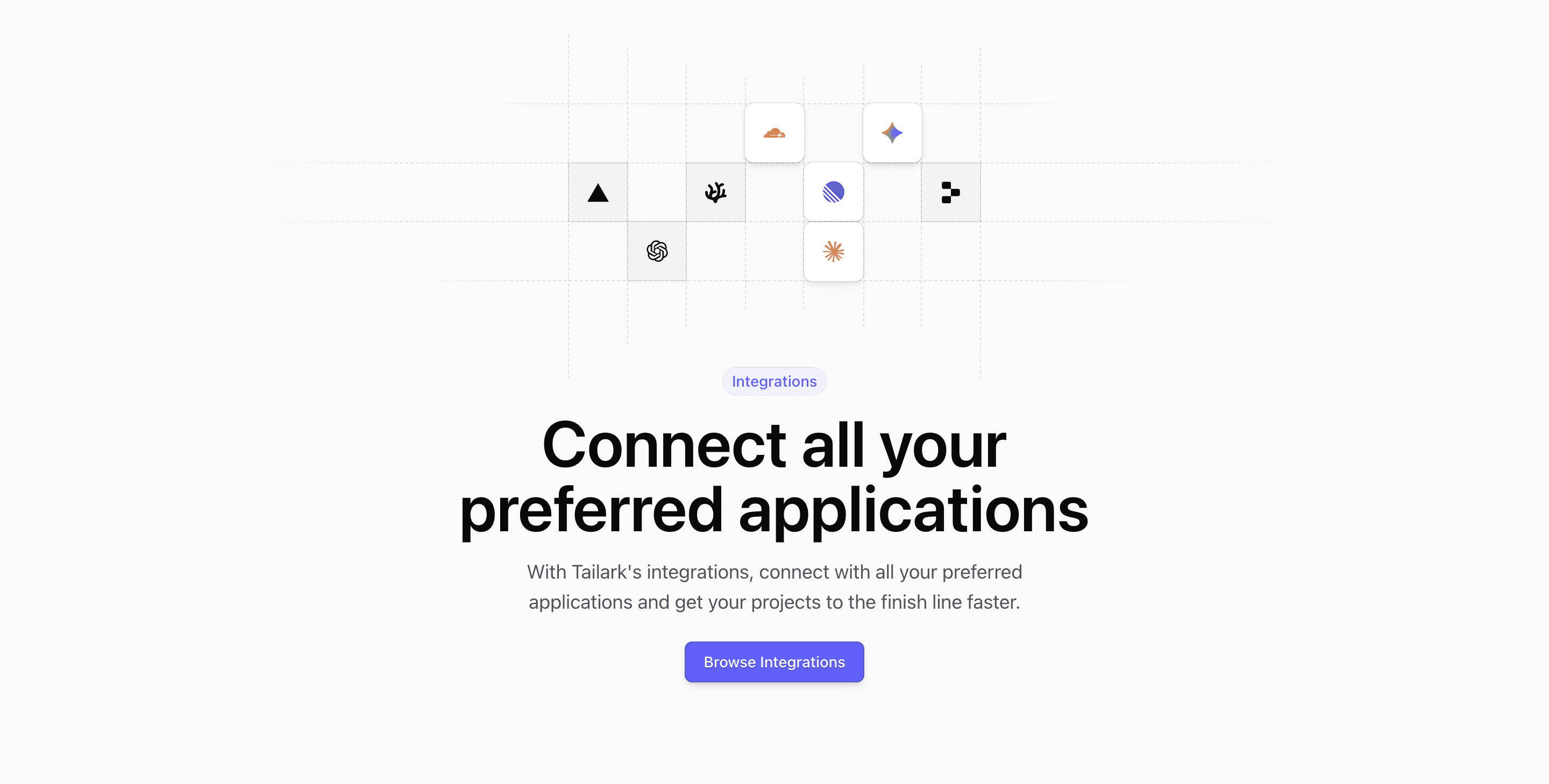
This variant is built for an integrations page. The source puts IntegrationsIllustration before the text, then follows with an Integrations badge, the headline Connect all your preferred applications, a one-sentence explanation, and a Browse Integrations button.
The illustration is the important detail. It uses a seven-column grid with dashed vertical and horizontal guides, then drops recognizable product marks into selected cells: Cloudflare, Gemini, Vercel, VSCodium, Linear, Replit, OpenAI, and Claude. That makes the hero layout feel specific to connected tools instead of relying on generic SaaS decoration.
Best Fit
Use this secondary hero on a Next.js integrations index, marketplace page, or partner directory. The centered copy keeps the page calm, while the diagram gives users an immediate sense that the section is about systems connecting to each other.
Implementation Notes
The block uses shadcn conventions for the CTA and Tailwind CSS for the badge, dashed guides, grid cells, and responsive heading sizes. If you adapt it for your own shadcn UI blocks library, swap the logos for real supported integrations and keep the empty grid cells; the negative space is what keeps the diagram from turning into a logo cloud.
Related Shadcn UI Blocks
Build with Tailark
Production-ready marketing blocks, pages, and illustrations for Shadcn UI.