Shadcn Secondary Hero Block Four
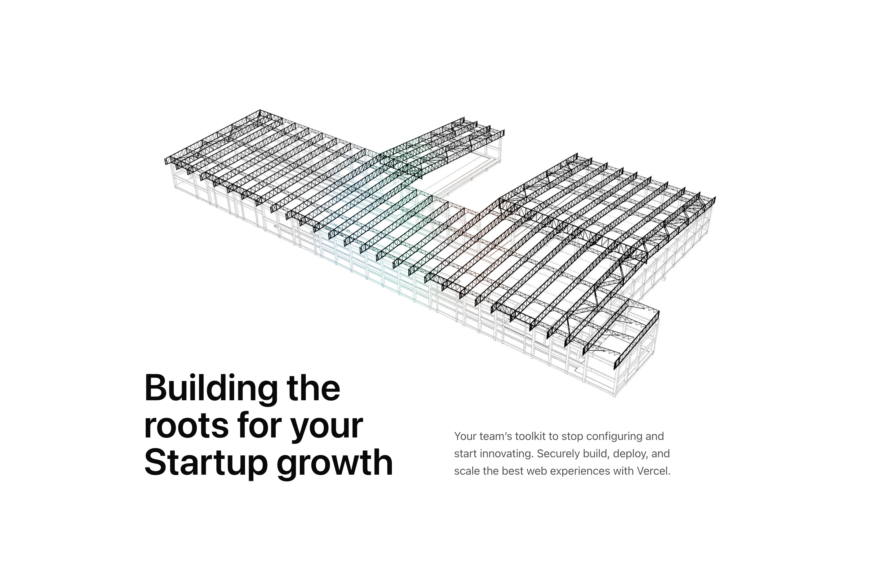
Block Four is built around a wide illustration before it asks the headline to do any work. The source renders ImageIllustration at the top of a white Quartz surface, then places the headline and paragraph in a two-column grid that shifts upward with md:-mt-12.
The imported image component uses a 3D building asset and the same cursor-following blurred gradient pattern used by the medical variant. Here the effect feels more architectural: the image creates atmosphere, while the copy below explains the startup-growth angle. The demo text mentions Vercel, so treat it as placeholder positioning unless your page is actually about deployment infrastructure.
Where It Fits
Use this secondary hero for a company page, startup program page, or SaaS landing page section that needs an editorial image before the value proposition. It is less CTA-driven than many hero layouts, which makes it useful for narrative pages where the next section provides the action.
Source-Backed Details
The section spacing grows from py-24 to md:pt-32 and lg:pt-44, giving the image room to breathe. The copy grid uses md:grid-cols-2 and items-end, so the headline and paragraph align at the baseline instead of stacking like a basic content block. Keep that relationship when you adapt it with Tailwind CSS.
Related Shadcn UI Blocks
Build with Tailark
Production-ready marketing blocks, pages, and illustrations for Shadcn UI.