Shadcn Pricing Block Two
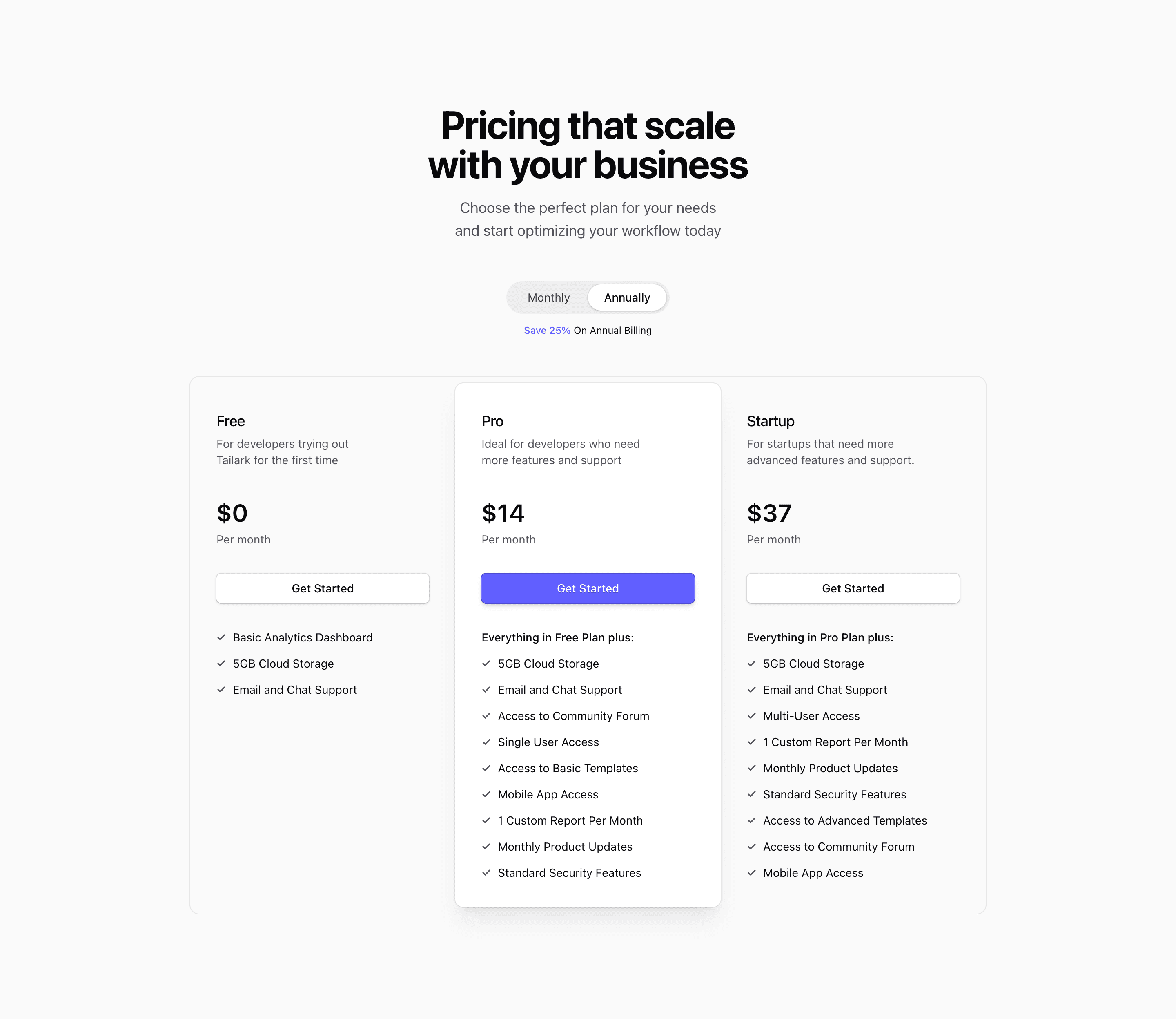
Block Two expands the pricing table into Free, Pro, and Startup tiers. The component keeps the same React billing state and NumberFlow price animation, but the layout now uses an @4xl:grid-cols-3 container so the plan comparison can sit inside one bordered pricing section.
How the pricing section works
Pro is visually promoted with bg-card, shadow-xl, and ring-1, while Free and Startup stay quieter with outline buttons. The source copy positions Free for trial use, Pro for more features and support, and Startup for advanced features.
Where this variant fits
Use this when three plans are enough to explain the buying path without a separate enterprise row. The demo feature lists repeat a few items, so treat them as scaffolding for your real plan matrix rather than final pricing copy.
What to customize
- Replace the placeholder feature arrays with actual limits and support levels.
- Keep the recommended tier visually stronger only if Pro is truly the default choice.
- Connect the monthly/annual state to real checkout price IDs if this ships in Next.js.
Frequently asked questions
Is this pricing block responsive?
Yes. The source uses Tailwind CSS responsive utilities and container-query classes so the pricing section can compress into a narrow stack and expand into columns where space allows.
Can I use it in a Next.js app?
Yes. The block is React code styled with Tailwind CSS and shadcn conventions. Because the billing toggle is client-side state, keep the component behind a client boundary when you preserve the interactive price switcher.
What should I replace first?
Replace the demo plan names, placeholder links, feature arrays, and price values with your real SaaS landing page offer before tuning visual details.
Related Shadcn UI blocks
Start from Tailark
Build with Tailark
Production-ready marketing blocks, pages, and illustrations for Shadcn UI.