Shadcn Pricing Block Four
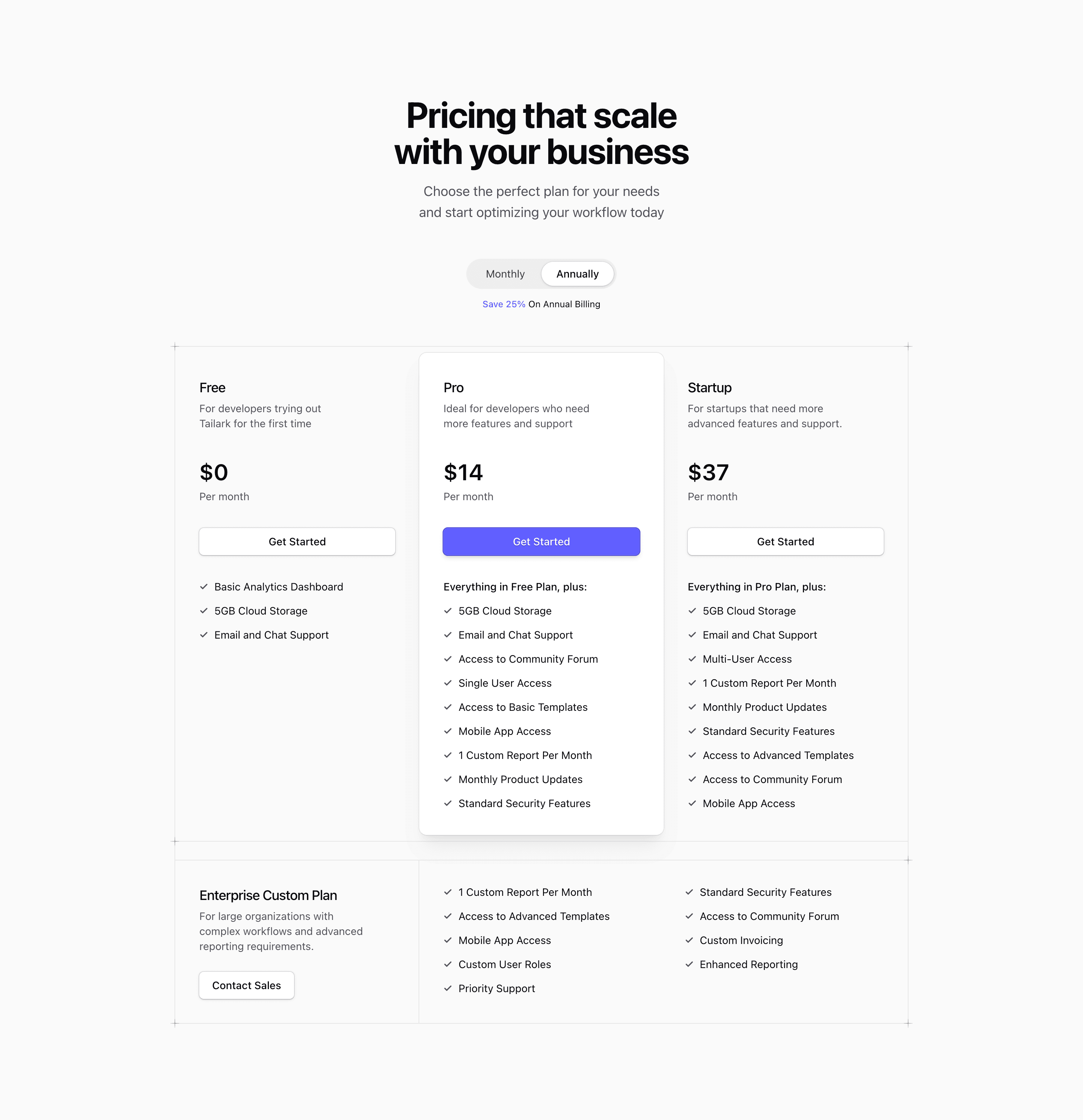
Block Four has the same commercial structure as the three-plan plus enterprise variant, but its presentation is more deliberate. The source adds a PlusDecorator helper with cn, places decorative cross marks at the frame corners, and uses border sections to make the plan grid feel more architectural.
How the pricing section works
Free and Startup are calm columns, Pro is still the elevated card, and Enterprise sits below the main comparison. The monthly/annual state remains local to the component, so the visual polish does not add extra data requirements.
Where this variant fits
Use this when the pricing section needs to feel like a designed centerpiece instead of a utility table. The decorators are visual only, so keep the content order accessible and avoid making the frame more important than the plan decision.
What to customize
- Update placeholder plans and feature arrays before publishing.
- Verify the
PlusDecoratorpositions against your page background. - Keep the enterprise CTA visually distinct from self-serve
Get Startedbuttons.
Frequently asked questions
Is this pricing block responsive?
Yes. The source uses Tailwind CSS responsive utilities and container-query classes so the pricing section can compress into a narrow stack and expand into columns where space allows.
Can I use it in a Next.js app?
Yes. The block is React code styled with Tailwind CSS and shadcn conventions. Because the billing toggle is client-side state, keep the component behind a client boundary when you preserve the interactive price switcher.
What should I replace first?
Replace the demo plan names, placeholder links, feature arrays, and price values with your real SaaS landing page offer before tuning visual details.
Related Shadcn UI blocks
Start from Tailark
Build with Tailark
Production-ready marketing blocks, pages, and illustrations for Shadcn UI.