Shadcn Open Roles Block Three
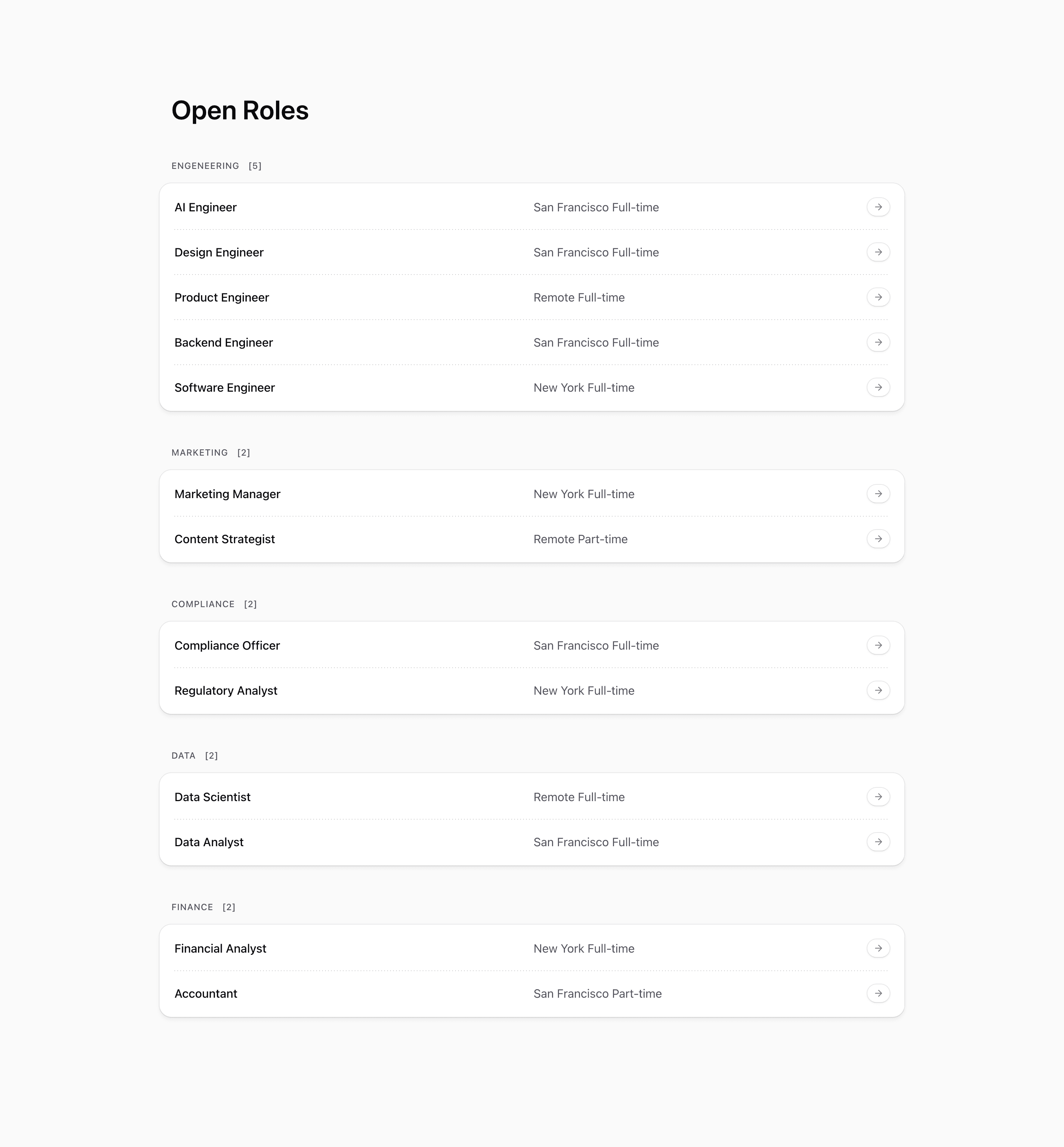
Shadcn Open Roles Block Three wraps each department's jobs in a visible card panel. It still renders Open Roles, counted category headings, role titles, locations, employment type, and arrow pills, but the list now feels more contained.
The source adds a bg-card wrapper with a ring, rounded corners, padding, and shadow around every group. Separators are hidden for the last row in each group, so each card reads as a self-contained department section.
Source-backed structure
- Roles are grouped by category with the same reducer pattern as the earlier variants.
- Each heading includes a role count in brackets.
- Department groups are wrapped in
rounded-2xlcard panels withring-borderandshadow-md. - The row separator uses
group-last:hidden, preventing a trailing divider at the bottom of each card.
Best fit and customization
Use this shadcn open roles section when department grouping should feel stronger than a plain list. It is a good choice for a careers page with multiple teams, or for a company page where job listings need to sit cleanly among other card-based shadcn UI blocks.
Replace the demo job titles, slugs, locations, and categories with real openings. Because the panel creates clear grouping, avoid dumping unrelated departments into a generic category. Also fix the source data typo engeneering before showing headings to users.
Implementation notes
This is a server-rendered React block using Next.js Link, lucide ArrowRight, and Tailwind CSS. The list remains static on the client, so use this variant when grouping is enough and candidates do not need filters.
Frequently asked questions
What changes compared with Block Two?
Block Three wraps each department in a card panel and hides the final separator inside each group.
Is Shadcn Open Roles Block Three responsive?
Yes. Role rows use grid layout and adapt at medium widths while the card panels stack vertically.
Can I customize this Tailark block?
Yes. Adjust card backgrounds, shadows, counts, role metadata, and link routes to match your hiring flow.
Related Shadcn UI blocks
Start from Tailark
Build with Tailark
Production-ready marketing blocks, pages, and illustrations for Shadcn UI.