Shadcn Open Roles Block Six
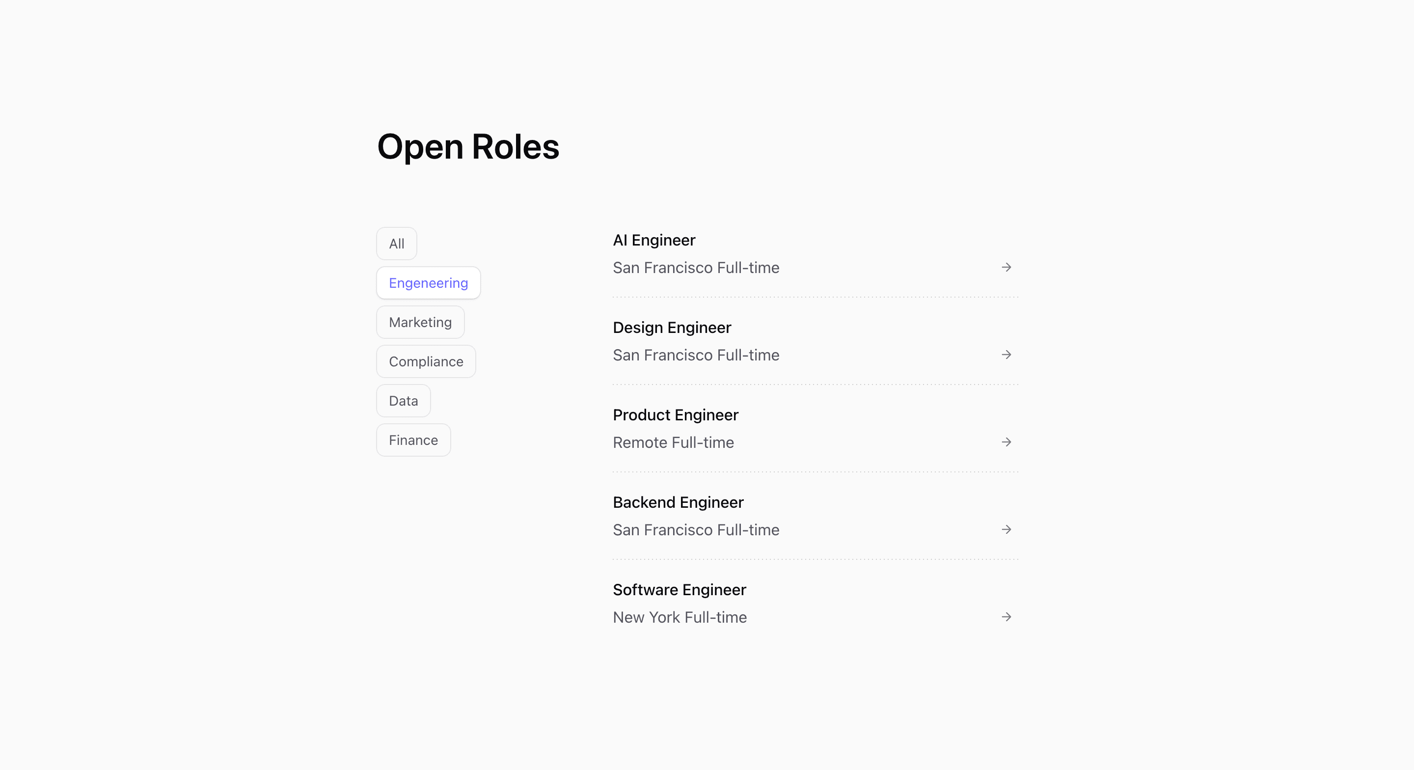
Shadcn Open Roles Block Six is the interactive careers page variant. It is marked 'use client', stores selectedCategory with React useState, and filters the demo role array before rendering the visible rows.
The UI starts with Open Roles, then splits into category controls and a role list. Categories are generated from the role data with ['all', ...new Set(openRoles.map((role) => role.category))], so adding or removing departments changes the filter bar automatically.
Source-backed structure
- Category buttons are sticky: horizontal and border-bottom on mobile, vertical at
md. - The active button is styled through
data-active, changing background, text color, and shadow. - The role list spans two columns at desktop with
md:col-span-2. - Rows use container-query classes so metadata can split into columns when the list area is wide enough.
Best fit and customization
Use this shadcn open roles section when the careers page has enough jobs that filtering helps. It works for a SaaS website hiring across multiple departments, especially when candidates often arrive looking for one function.
The jobs are demo openings. Replace them with real roles and normalize category names before publishing; the source typo engeneering will appear directly as a filter label. If job data comes from an API, consider how filtering should behave during loading, empty states, and expired roles.
Implementation notes
This block requires client-side React because the filter is local state. In a Next.js app, keep the static job data or server-fetched roles outside the client component when possible, then pass only the data needed for filtering into this UI.
Frequently asked questions
Does this block include filters?
Yes. It includes an all button plus one button for each category present in the role data.
Is Shadcn Open Roles Block Six responsive?
Yes. Filters become horizontally scrollable on mobile and vertical sticky controls on larger screens.
Can I customize this Tailark block?
Yes. Update the role data, category logic, active button styles, and row metadata to match your careers page.
Related Shadcn UI blocks
Start from Tailark
Build with Tailark
Production-ready marketing blocks, pages, and illustrations for Shadcn UI.