Shadcn Open Roles Block Seven
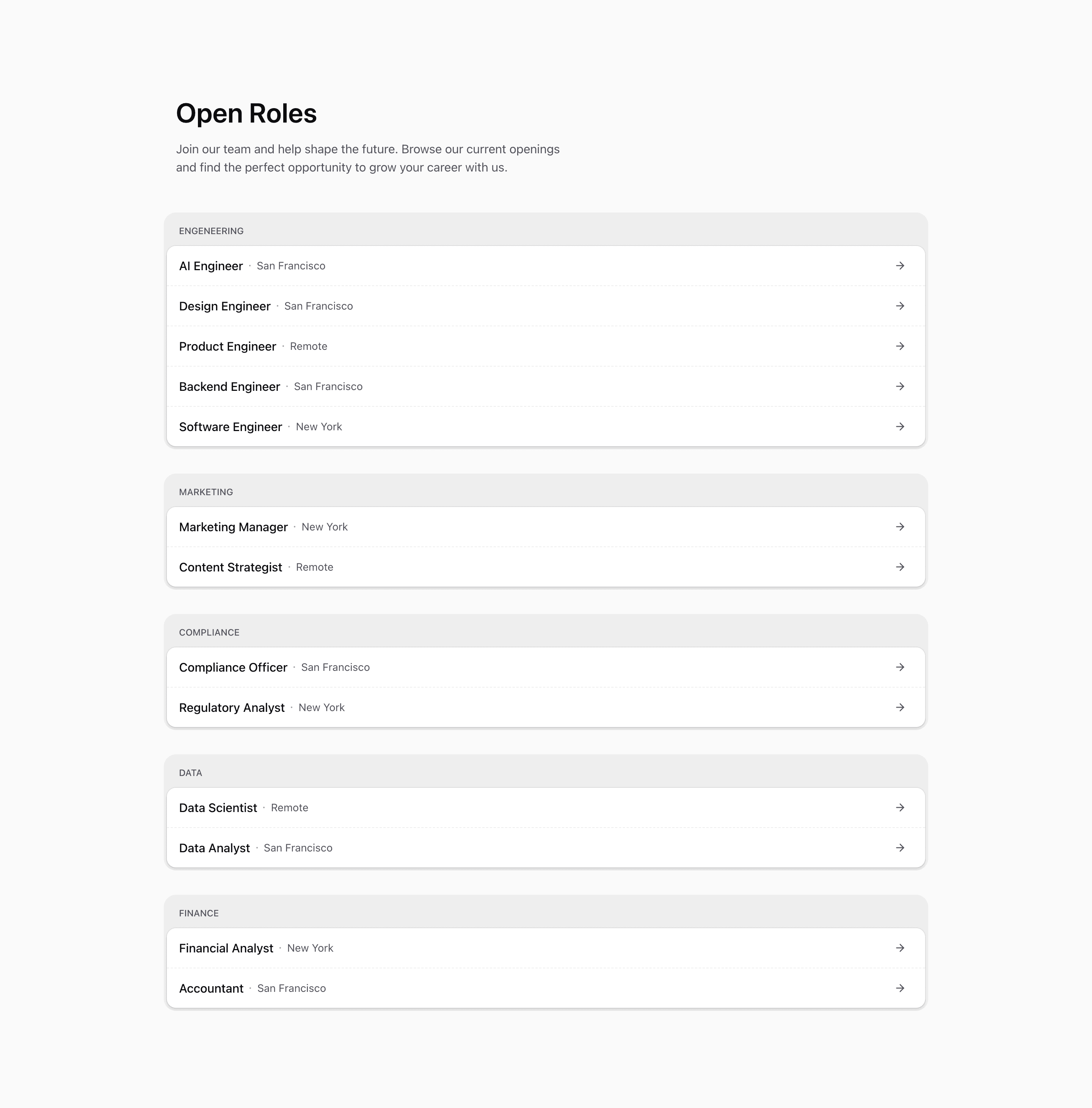
Shadcn Open Roles Block Seven is a more polished grouped careers section. It opens with Open Roles, includes the same recruiting intro copy used in Block Four, and then wraps each department in a soft outer panel with an inner bg-card role list.
The CTA hierarchy is different from the earlier row variants. Each role title remains the actual Next.js Link, but the right side includes a pill that reveals Learn More on hover alongside an ArrowRight icon. That makes the action more explicit without adding a separate button element.
Source-backed structure
- The intro copy sits above the groups in a
max-w-xlblock. - Each category is wrapped in a
bg-foreground/5rounded panel, then an inner card with ring and shadow. - Rows use dashed borders between items rather than dotted gradient separators.
- The role metadata shows location, but this variant does not render the full-time or part-time value even though it exists in the data.
Best fit and customization
Use this shadcn open roles section when you want a careers page to feel designed but still list many roles compactly. It fits a company page or SaaS website where the recruiting message appears above the jobs and each row needs a clear CTA hint.
The source roles are placeholders and include the same engeneering category typo as other variants. Replace the role data, decide whether employment type should be visible, and make sure the hover-only Learn More label is not the only way candidates understand the row action.
Implementation notes
This block is server-friendly React with Next.js Link, lucide ArrowRight, and Tailwind CSS. The CTA text uses opacity changes on hover, so review reduced-motion and keyboard focus states if you convert the visual pill into a fully interactive button.
Frequently asked questions
Does this block show employment type?
Not in the rendered row. The data includes time, but the JSX displays title, location, and the CTA pill only.
Is Shadcn Open Roles Block Seven responsive?
Yes. Rows wrap on smaller screens, with the CTA pill aligned to the right when space allows.
Can I customize this Tailark block?
Yes. Update the intro copy, category panels, CTA label, role metadata, and application links.
Related Shadcn UI blocks
Start from Tailark
Build with Tailark
Production-ready marketing blocks, pages, and illustrations for Shadcn UI.