Shadcn Investor Block Four
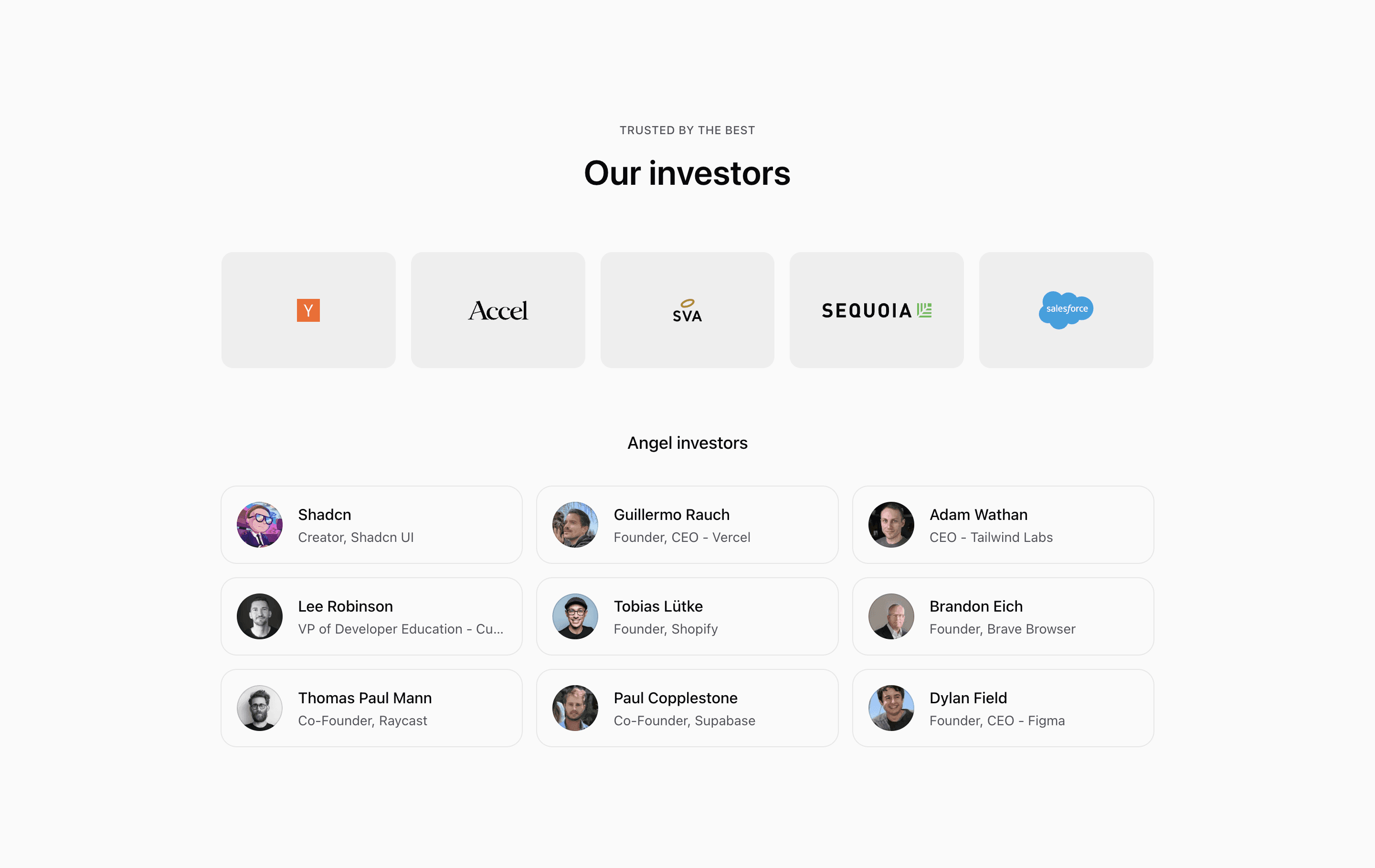
Shadcn Investor Block Four is built around a clearer editorial hierarchy: Trusted by the best, Our investors, and Angel investors. The firm proof is not a loose logo row. It becomes a two-column mobile grid and a five-column desktop grid, with each logo centered inside a muted tile.
The angel list is more card-like than the first three variants. Each investor row has a ring, rounded corners, a hover background, and a shadow transition, which makes the section feel interactive even though the source does not include links.
Source-backed structure
- The logo proof uses
grid-cols-2on small screens andmd:grid-cols-5on larger screens. - Salesforce spans two columns on mobile with
col-span-2, then returns to one column atmd. - Angel investors render in a container-query grid that can reach three columns.
- Names and roles are truncated inside each card, which protects the grid if real job titles are longer than the demo roles.
Best fit and customization
Use this shadcn investors section when the page needs firm logos to read as a deliberate proof grid. It is a strong fit for a SaaS company page that wants the section to feel organized and scannable, especially when paired with other shadcn UI blocks that use cards and rings.
The source uses demo firms and demo angel investors. Swap in verified investor names before publishing, and decide whether the hover treatment should lead to profile pages, announcements, or stay as a non-clickable visual affordance.
Implementation notes
This block is React, next/image, SVG imports, and Tailwind CSS. There is no client state. If you connect cards to real investor pages, make the entire card a link and retest keyboard focus styles rather than relying on hover alone.
Frequently asked questions
What should I replace first?
Replace the logos and the investors array. The layout is already prepared for real names, avatars, and role labels.
Is Shadcn Investor Block Four responsive?
Yes. The logo grid changes from two to five columns, and the angel grid uses container-query columns.
Can I customize this Tailark block?
Yes. Adjust the tile background, card hover treatment, grid columns, and imported logos to fit your brand.
Related Shadcn UI blocks
Start from Tailark
Build with Tailark
Production-ready marketing blocks, pages, and illustrations for Shadcn UI.