Shadcn Header Block Two
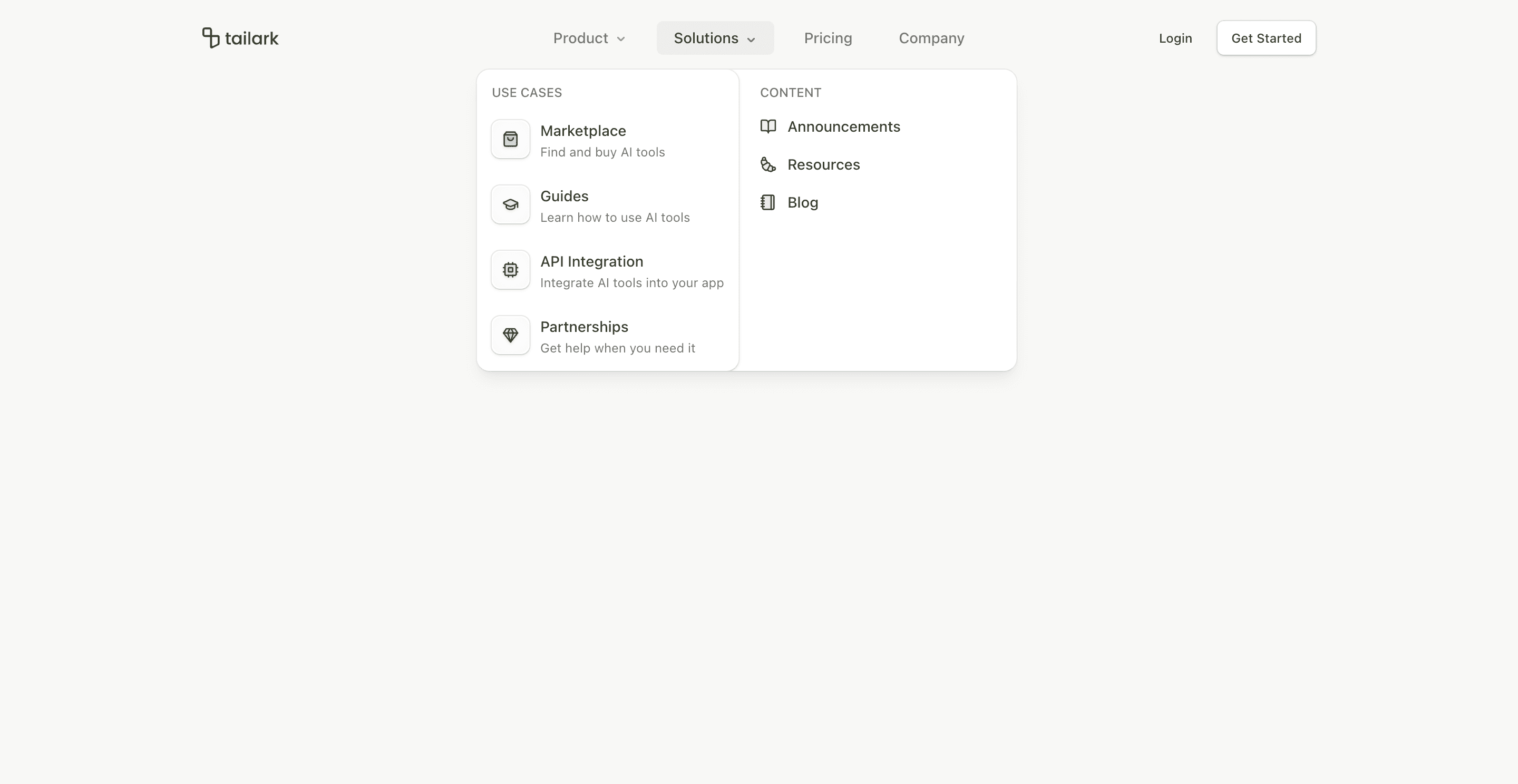
Header block two keeps the same SaaS navigation depth as block one, but changes the composition. The logo stays on the left, the nav is absolutely centered, and the login/get-started actions stay on the right.
The key implementation difference is viewport={false} on NavigationMenu. Instead of relying on a shared viewport, each dropdown content positions itself under its trigger. That makes the header feel tighter and more predictable when the nav sits in the center.
What makes this variant useful
The desktop header is balanced. The nav does not drift toward the logo or the CTA group; it sits in the center of the header. This works well for SaaS homepages where the brand, navigation, and conversion action all need equal presence.
Mobile keeps the accordion system from block one, including grouped Product and Solutions links.
Best fit
Use this header for product sites with four to six top-level routes and a conventional auth path. It is especially useful when the top navigation should feel symmetrical.
Implementation details
The header still uses useScroll, useMedia, and mobile menu state. It sets data-scrolled after 50px, then applies border, translucent background, and blur styling through data selectors.
The button pairing is slightly softer than block one: login uses a ghost button, while get started uses outline styling. That makes the header less aggressive for pages where the hero already carries the primary CTA.
Frequently asked questions
Does Header Block Two support dark mode?
Yes. The dropdown cards and text use Shadcn-compatible background, card, border, foreground, and muted tokens.
Is Header Block Two responsive?
Yes. Desktop uses centered navigation menus, while mobile uses a full-screen accordion menu.
Can I customize the CTA buttons?
Yes. Replace the ghost and outline buttons with login, contact sales, start trial, or dashboard links.
When should I use this header?
Use it when you want a centered navigation bar without the heavier feel of a large floating header.
Start from Tailark
Build with Tailark
Production-ready marketing blocks, pages, and illustrations for Shadcn UI.