Shadcn Header Block Three
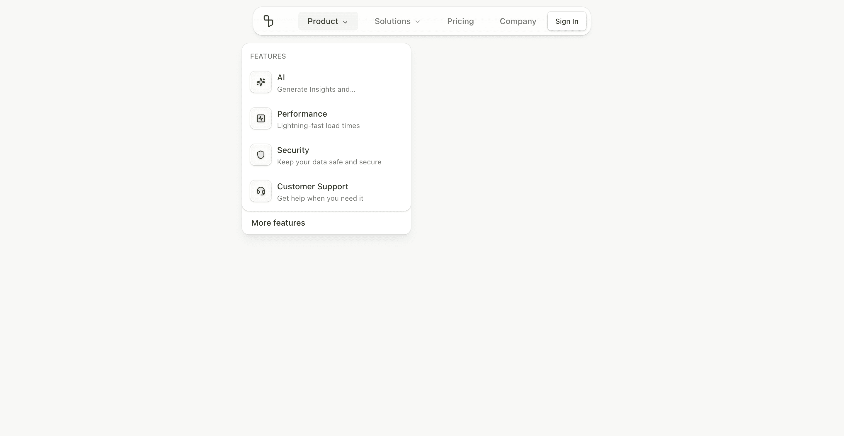
Header block three is the compact version of the mega-menu header. It uses a small centered shell instead of a full-width bar, swaps the full logo for LogoIcon, and reduces the CTA area to a single Sign In button.
The wrapper uses bg-card/75, ring-border, shadow-black/6.5, rounded-2xl, and backdrop-blur-xl. That gives it a floating pill treatment suitable for product-led landing pages.
What makes this variant useful
This header keeps navigation depth without taking over the top of the page. Product and Solutions still open Shadcn NavigationMenu dropdowns, but the overall frame is narrower and more visual.
It is good when the hero needs to remain dominant and the header should feel like interface chrome, not a heavy site masthead.
Best fit
Use this block for AI products, launch pages, tools with short navigation, and landing pages where sign-in is the only top-right action. It also works well when the brand mark is recognizable enough without the wordmark.
Implementation details
The header uses viewport={false} and positions dropdown content with top offsets. Mobile remains a full accordion menu. The desktop shell has a max-w-xl, which is the main visual constraint.
The open mobile state expands the fixed header from a compact top bar into a full-screen blurred menu.
Frequently asked questions
Does Header Block Three support dark mode?
Yes. The floating card uses theme tokens for card background, ring, foreground, and muted text.
Is Header Block Three responsive?
Yes. It uses desktop navigation at large breakpoints and an accordion mobile menu below that.
Can I use a full logo instead of the icon?
Yes. Replace LogoIcon with the full Logo component if your brand needs the wordmark.
When should I use this header?
Use it when you want a polished floating navigation that stays visually light.
Start from Tailark
Build with Tailark
Production-ready marketing blocks, pages, and illustrations for Shadcn UI.