Shadcn Header Block Six
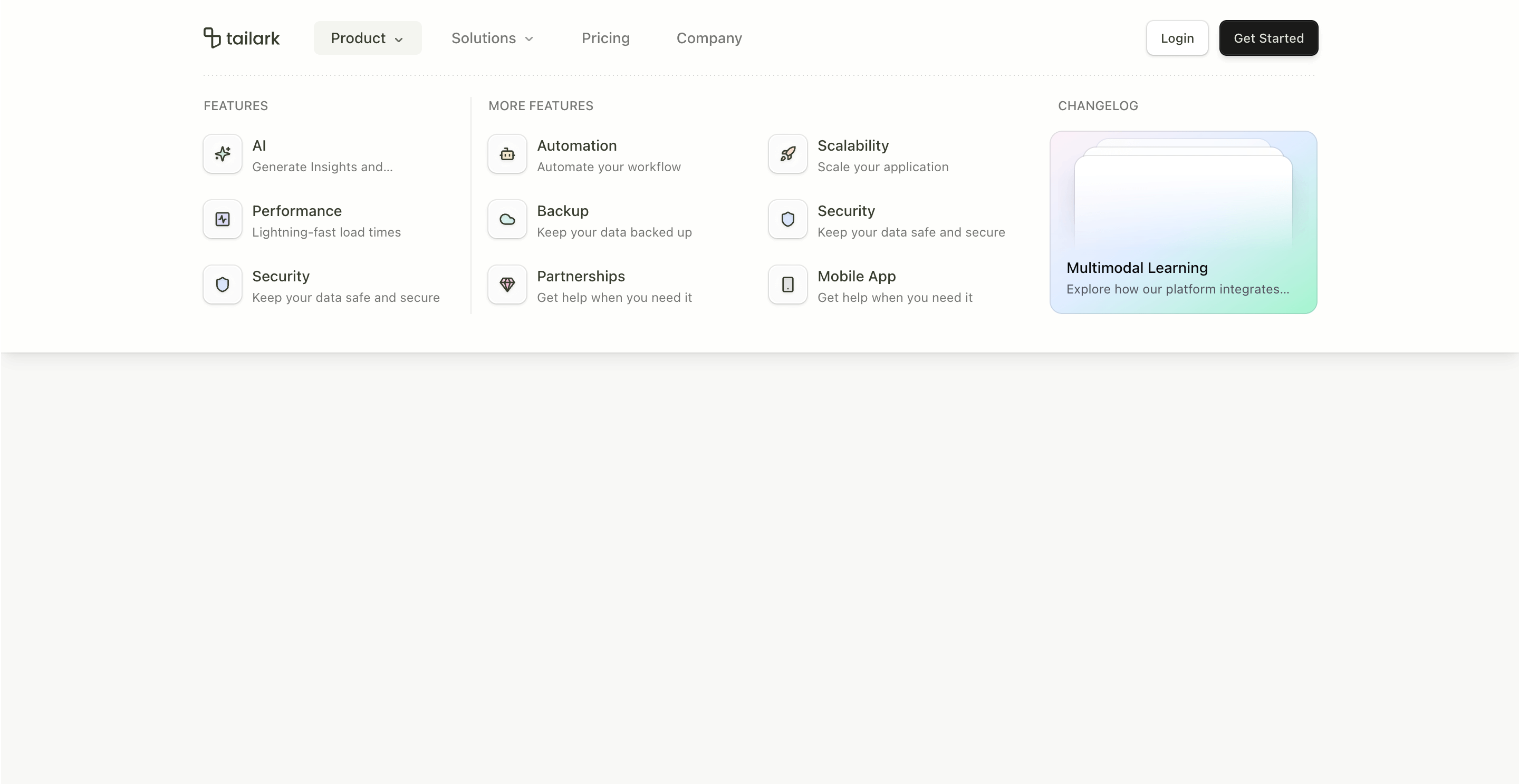
Header block six is the heavy navigation pattern. It is built for sites with real IA: feature groups, more features, use cases, content links, and a visual changelog card inside the dropdown.
The standout detail is the custom viewport height handling. The NavMenu keeps a ref to the header and updates --nav-viewport-height when the active menu value changes. The header then uses that variable to expand to match the open menu.
What makes this variant useful
This header does not pretend a product with many routes can fit into a tiny dropdown. Product opens a four-column menu with feature lists and a changelog card. Solutions opens a separate grid for use cases and content.
It is built for navigation depth.
Best fit
Use this header for enterprise SaaS, AI platforms, marketplaces, developer platforms, docs-heavy products, and content-rich sites where the header needs to route different buyer types.
Implementation details
The header uses has-data-[state=open] selectors, a custom --nav-viewport-height CSS variable, and Shadcn NavigationMenu state changes. It also includes a decorative dotted line at the bottom of the open header.
The Product menu includes feature columns, a More Features grid, and a Changelog card with a mini preview mockup.
Frequently asked questions
Does Header Block Six support dark mode?
Yes. It uses theme tokens and a data-theme="quartz" preview card inside the menu.
Is Header Block Six responsive?
Yes. Desktop gets the large mega menu; mobile gets the full-screen accordion navigation.
Can I change the mega-menu height?
Yes. Update the heights map in handleValueChange for each menu value.
When should I use this header?
Use it when your site has enough product depth to justify a full mega menu.
Start from Tailark
Build with Tailark
Production-ready marketing blocks, pages, and illustrations for Shadcn UI.