Shadcn Header Block Seven
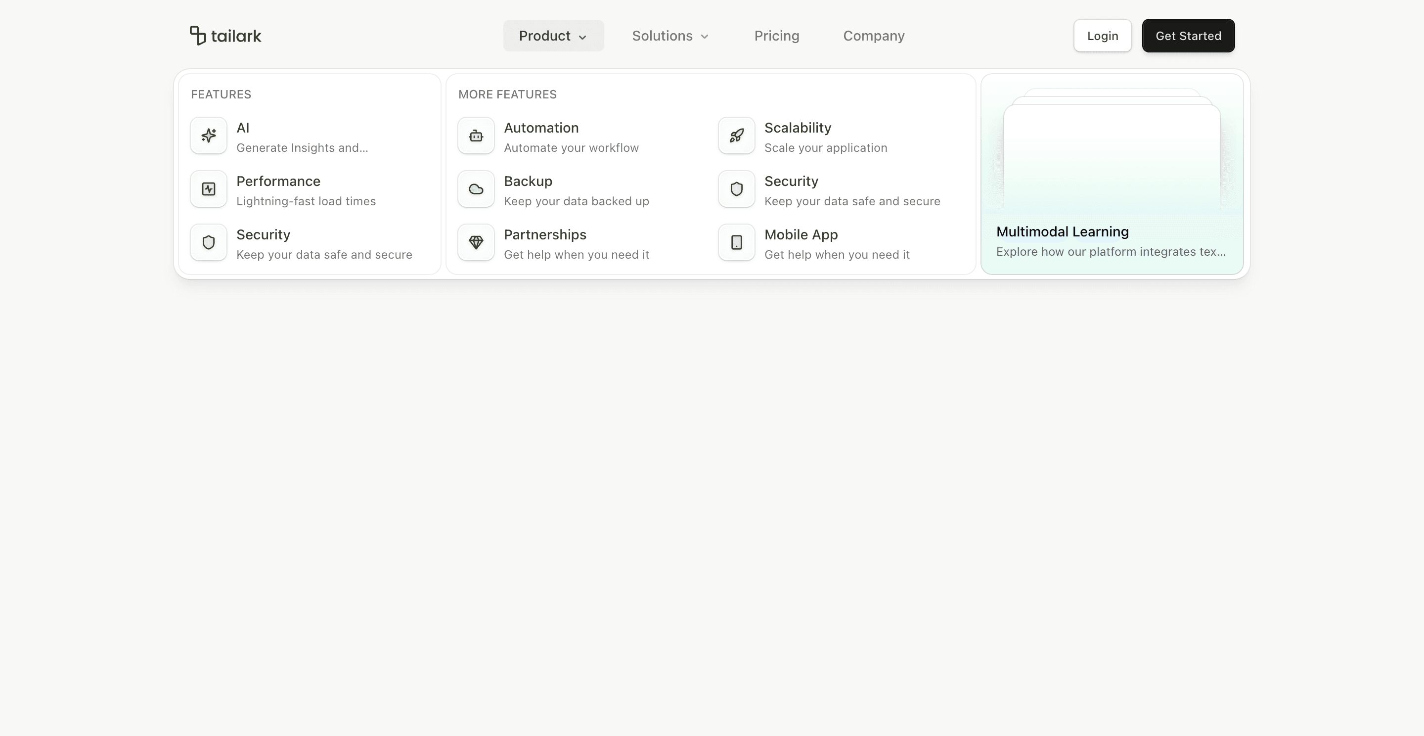
Header block seven is a more card-driven version of the large mega-menu header. Product and Solutions menus open into structured panels with rounded cards, grouped link lists, and a visual preview tile.
It uses many of the same feature arrays as block six, but the presentation is more contained: each menu group gets its own bg-card panel with border and rounded corners.
What makes this variant useful
This block is useful when you want a large menu, but not a full-width sheet. Product uses a four-column grid with Features, More Features, and a visual preview card. Solutions uses grouped Use Cases, Apps, and Content sections.
The visual preview card uses data-theme="quartz" and a gradient background. That gives the menu a product-marketing feel, not just a sitemap feel.
Best fit
Use this header for SaaS products with multiple apps, AI features, integrations, content links, and use cases. It is especially good when the dropdown itself should sell a product surface.
Implementation details
The NavigationMenu viewport is styled with rounded corners, shadow, and custom muted color mixing. Menu content uses grid spans, card backgrounds, borders, and grouped lists.
Like the other advanced headers, mobile falls back to accordion navigation.
Frequently asked questions
Does Header Block Seven support dark mode?
Yes. The cards and preview panel rely on theme tokens, with a scoped data-theme="quartz" preview area.
Is Header Block Seven responsive?
Yes. Desktop gets the card-based mega menu; mobile gets accordion navigation.
Can I customize the preview card?
Yes. Replace the preview title, description, gradient, or mockup with a changelog item, product module, or featured resource.
When should I use this header?
Use it when the dropdown should do more than list links: it should guide buyers through product categories.
Start from Tailark
Build with Tailark
Production-ready marketing blocks, pages, and illustrations for Shadcn UI.