Shadcn Header Block Four
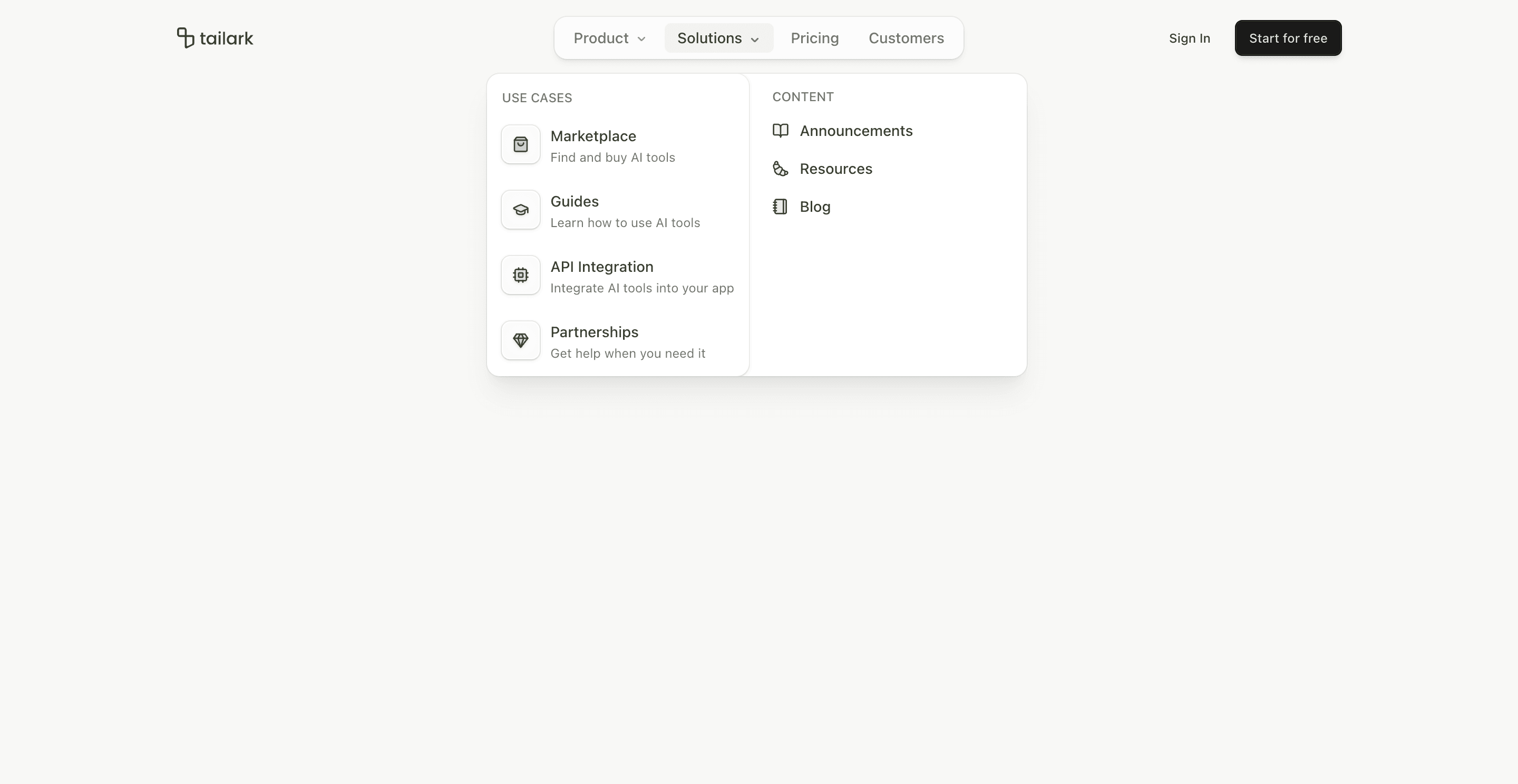
Header block four is the motion-heavy header in the set. It starts like a normal marketing header, then condenses into a floating navigation shell after the user scrolls.
The code imports motion, AnimatePresence, useScroll, and useMotionValueEvent from motion/react. Once scroll passes 75px, the header inserts a small logo area and a Sign In button into the floating nav with animated width and opacity.
What makes this variant useful
This variant gives the page two header states. The first state is spacious and brand-forward. The scrolled state is compact and utility-forward. That works well for long landing pages where the nav should remain available without covering the content.
The animation is not decorative noise. It changes the amount of navigation chrome on screen.
Best fit
Use this header for polished SaaS homepages, AI product launches, docs-adjacent marketing pages, and long-scroll pages where persistent navigation matters.
Implementation details
The desktop nav is wrapped in a motion.div with a fixed centered position, backdrop blur, ring, and shadow. AnimatePresence controls whether the logo and sign-in button are present in the floating state.
The NavigationMenu viewport uses custom translation variables to keep dropdown positioning aligned with the compact nav.
Frequently asked questions
Does Header Block Four support dark mode?
Yes. The header uses card, popover, border, foreground, and muted tokens that adapt to theme.
Is Header Block Four responsive?
Yes. Desktop receives the animated floating nav. Mobile keeps the accordion navigation and full-screen open state.
Can I remove the animation?
Yes. You can simplify the motion.div and remove the AnimatePresence blocks if your brand needs a calmer header.
When should I use this header?
Use it when a page is long enough that scroll-aware navigation adds real value.
Start from Tailark
Build with Tailark
Production-ready marketing blocks, pages, and illustrations for Shadcn UI.