Shadcn Header Block Five
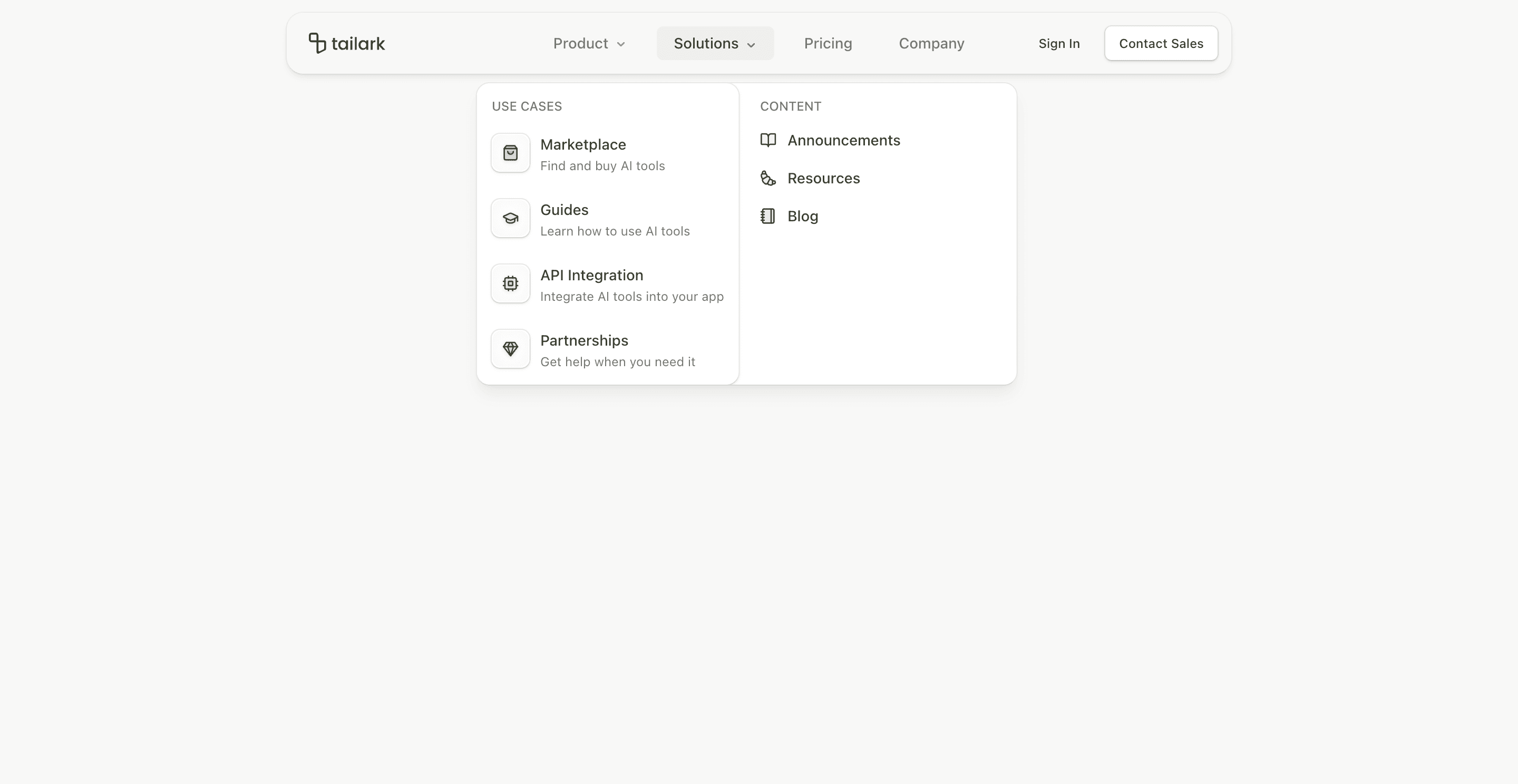
Header block five is built around scroll polish. The outer header stays fixed, while the inner container transitions into a narrower, rounded, blurred shell after the page scrolls.
The CTA pair is different from the earlier headers: Sign In is quiet, while Contact Sales gets the outlined button treatment. That makes this variant a better fit for sales-led pages than product-led signup pages.
What makes this variant useful
The header starts wide with a max width of max-w-6xl. When data-scrolled is active, it tightens to max-w-4xl, adds ring and shadow treatment, and keeps the nav centered.
This gives the page a premium sticky navigation feel without requiring a fully animated floating pill.
Best fit
Use this header for B2B SaaS, enterprise product pages, agency landing pages, and pages where Contact Sales matters more than self-serve signup.
Implementation details
The header uses useScroll, useMotionValueEvent, and useMedia. The shrinking behavior is class-driven through data-scrolled, with transition utilities controlling width, padding, background, ring, and shadow.
The mobile state expands the header into a full-screen blurred menu and keeps the accordion navigation pattern.
Frequently asked questions
Does Header Block Five support dark mode?
Yes. It uses background, card, foreground, border, ring, and shadow tokens that work across themes.
Is Header Block Five responsive?
Yes. Desktop gets centered navigation and CTAs; mobile gets a menu button and accordion navigation.
Can I change Contact Sales to Start Trial?
Yes. The CTA text and routes are regular Button and Link components.
When should I use this header?
Use it when the header should feel premium and persistent, but not as animated as block four.
Start from Tailark
Build with Tailark
Production-ready marketing blocks, pages, and illustrations for Shadcn UI.