Shadcn Header Block Eight
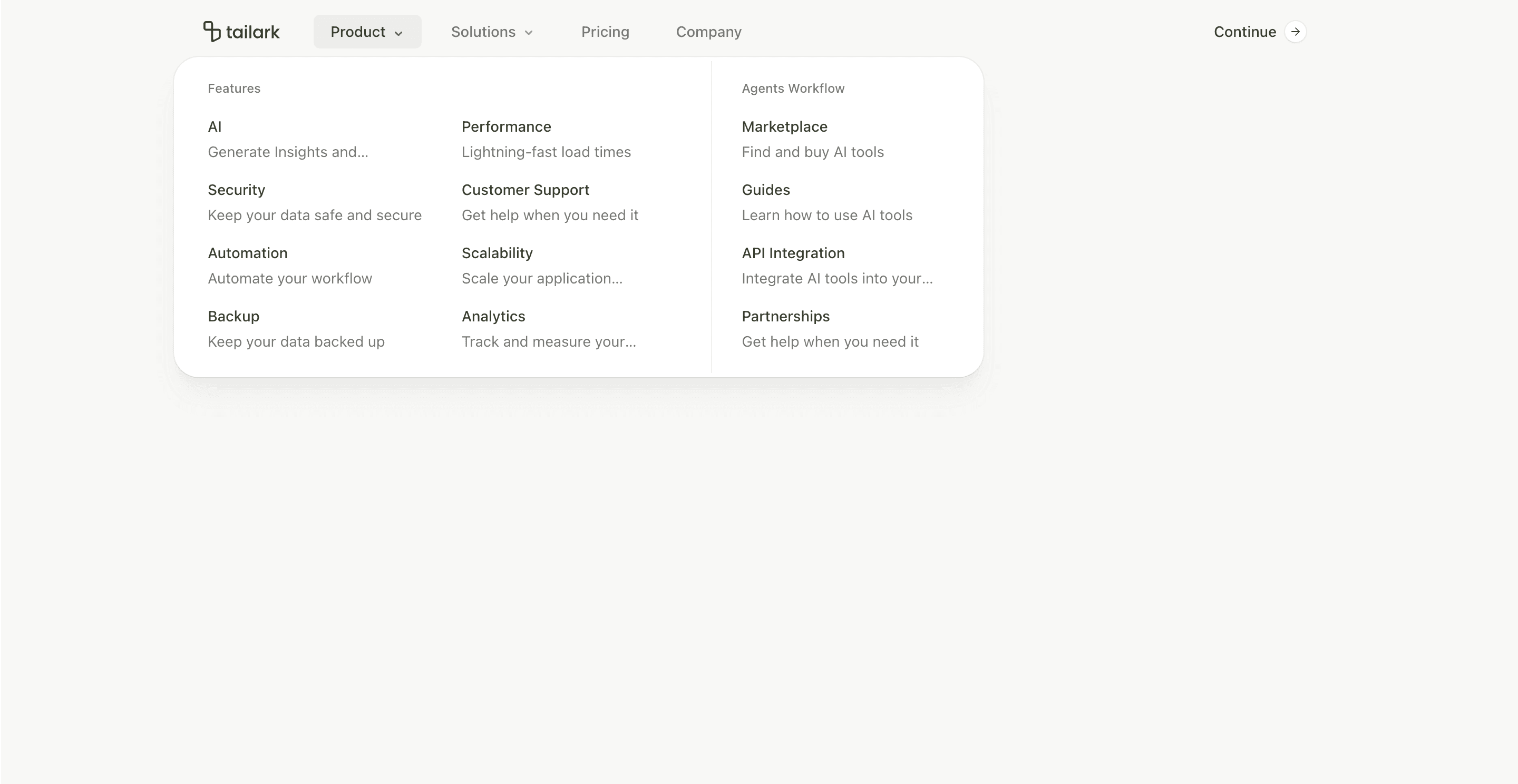
Header block eight is the simplest header in the set. It removes icon-heavy list items from the desktop dropdowns and uses text-first columns instead.
The top-right action is also different: a rounded ghost button labeled Continue, with a small circular arrow capsule inside the button. That makes the header feel more like an app entry point than a marketing signup header.
What makes this variant useful
The dropdowns are readable and restrained. Product opens a three-column menu with Features and Agents Workflow sections. Solutions opens a two-column menu for use cases and content.
There are no icon cards in the desktop list items, which keeps the header light. Mobile still uses accordions and larger touch-friendly link rows.
Best fit
Use this header for apps, portals, AI agents, dashboards, and products where the navigation should be clear but not visually loud. It is also a good fit when the main CTA is "continue" or "open app" instead of "start trial."
Implementation details
The header uses useScroll for the same fixed, blurred, scroll-aware shell as the lighter variants. The NavigationMenu viewport gets rounded corners, card background, and shadow treatment.
The CTA button uses nested spans to create the arrow capsule: the inner span has bg-card, ring-border, a fixed size, and the ArrowRight icon centered inside.
Frequently asked questions
Does Header Block Eight support dark mode?
Yes. It uses background, card, border, foreground, muted, and ring tokens that adapt to theme.
Is Header Block Eight responsive?
Yes. Desktop uses dropdown columns, while mobile uses accordion groups and stacked links.
Can I add icons back to the menu?
Yes. The list item component is simple. You can reintroduce icons if your navigation needs stronger visual scanning.
When should I use this header?
Use it when you want a clean app-like header with enough dropdown structure but minimal decoration.
Start from Tailark
Build with Tailark
Production-ready marketing blocks, pages, and illustrations for Shadcn UI.