Shadcn Feature Carousel Block One
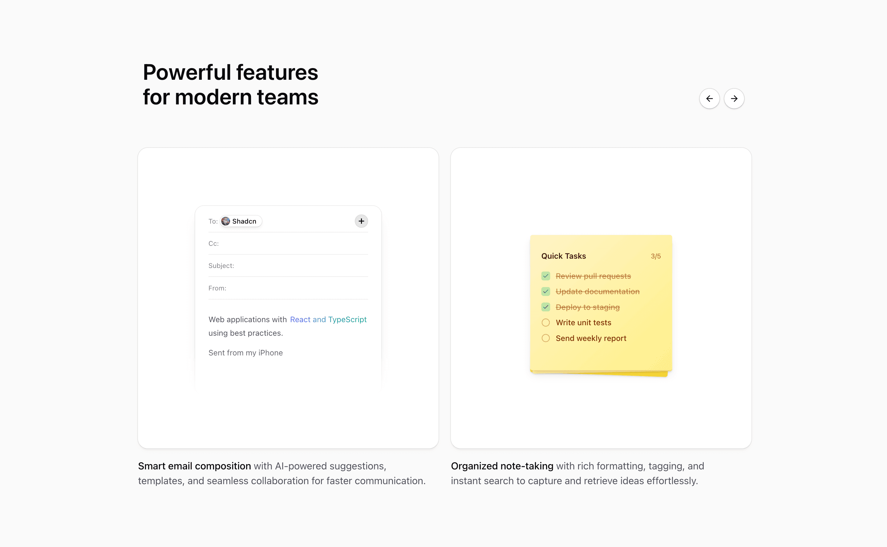
This feature carousel uses Tailark Carousel primitives with looping enabled and slidesToScroll switching from one slide on mobile to two from 768px up. Each React carousel item pairs a rounded shadcn Card with an illustration and concise copy for smart email composition, organized note-taking, AI autocomplete, and real-time translation.
The layout is intentionally tight: a max-width heading row, navigation buttons beside the title, and md:basis-1/2 slides so two cards can sit in view on larger screens. Use it when a Next.js product page needs a shadcn UI blocks section that explains sibling features without building a full grid.
Because it is plain React styled with Tailwind CSS and shadcn primitives, the block is easy to adapt in a Next.js app. Treat the demo copy as a structure guide, then replace it with product-specific feature names, screenshots, and proof.
What to customize
- Keep every slide to one product idea and one proof point.
- Replace the AI writing examples with your actual feature names before shipping.
- Preserve the carousel controls and test the loop at mobile and tablet widths.
Implementation notes
Is this a shadcn feature carousel block?
Yes. The source imports Tailark Carousel components and, in several variants, shadcn Card surfaces for a reusable feature carousel pattern.
Where does it fit best?
Use it on a product page when several capabilities need equal weight and a compact browsing interaction.
Related Shadcn UI blocks
Start from Tailark
Build with Tailark
Production-ready marketing blocks, pages, and illustrations for Shadcn UI.