Shadcn Feature Block Fourteen
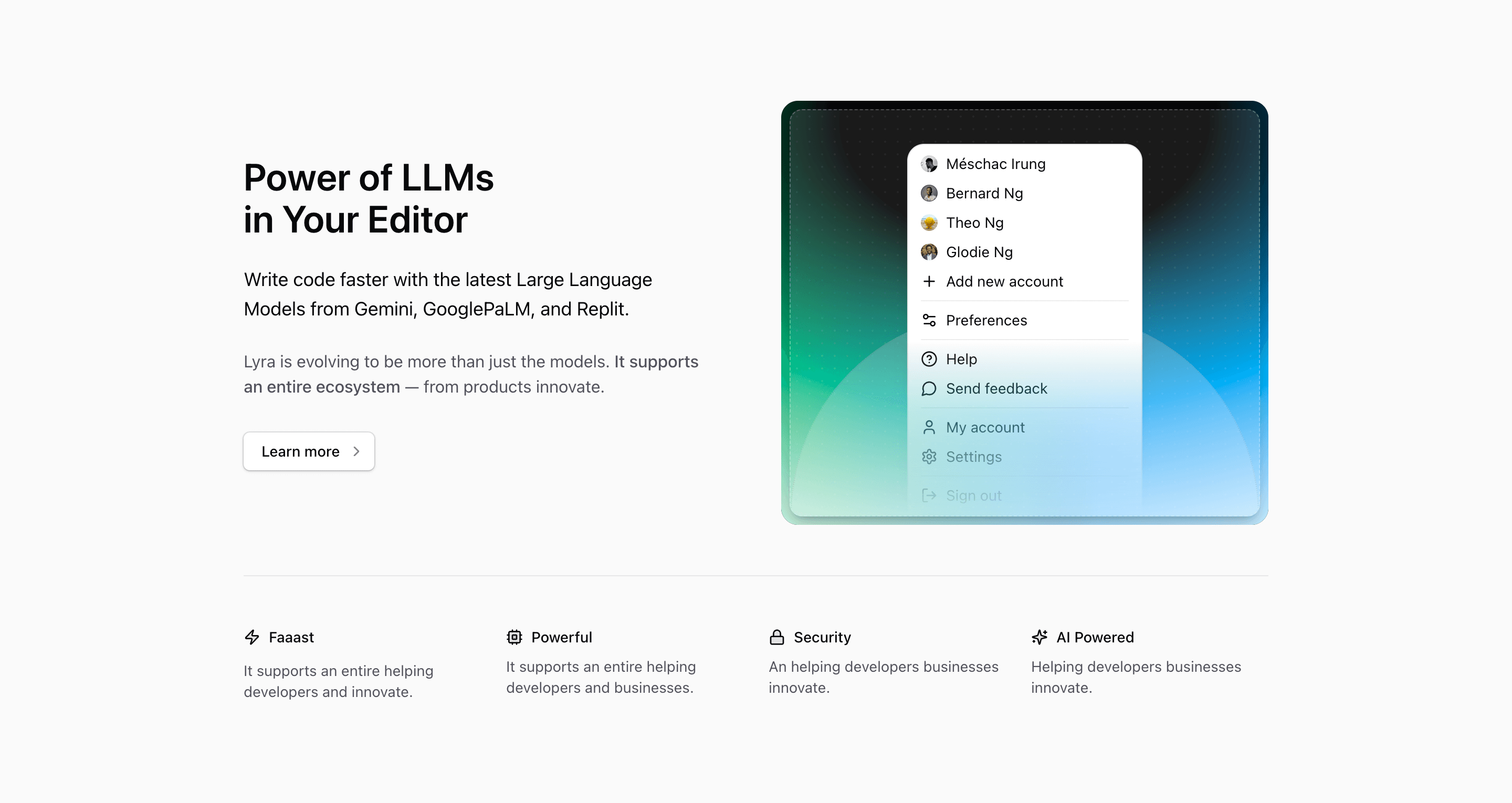
Shadcn Feature Block Fourteen shares a lot of DNA with block ten, but the order changes the reading experience. Here, the copy comes first and the dropdown illustration moves to the right. The section is better when the message needs to lead: headline, paragraph, ecosystem note, linked CTA, then supporting visual.
The source positions the product around Power of LLMs in Your Editor and names Gemini, GooglePaLM, and Replit in the supporting copy. That gives the feature section a clear AI developer-tool direction. The rest of the text still needs editorial cleanup before shipping, especially the ecosystem sentence and the four small benefit blurbs.
What changes from block ten
Block ten puts the illustration first and uses a shorter copy stack. Block fourteen starts with text, increases the column gap to gap-12, adds a second paragraph, and wraps the CTA in a Next.js Link. That makes it a better fit for a section that needs a slightly more persuasive explanation before the visitor reaches the feature row.
The illustration is still DropdownIllustration: avatars, account actions, settings, help, feedback, and sign-out actions inside a compact menu. If the final product is truly about LLMs inside an editor, you may want to change that visual. If the product is an AI workspace with accounts, teams, or billing, the existing dropdown can make sense.
Source copy to treat as placeholders
The phrase It supports an entire ecosystem is usable, but the sentence around it ends with from products innovate, which reads incomplete. The lower row repeats placeholder lines such as It supports an entire helping developers and innovate. Use the existing four cells as layout slots for speed, power, security, and AI support, then rewrite them as grounded benefits.
Implementation details from the source
- The section uses
bg-background overflow-hidden py-24and amax-w-5xlcontainer. - The main row becomes
md:grid-cols-2, with copy first and illustration second. - The CTA is an outline
ButtonrenderedasChild, wrappingLink href="#"and aChevronRighticon. - The support row uses
grid-cols-2by default andlg:grid-cols-4for the four lucide-icon benefits. - The icon set is
Zap,Cpu,Lock, andSparkles, matching speed, compute, security, and AI concepts.
Where this variant works
Use this shadcn UI block for a React or Next.js landing page where the product message should come before the visual. It suits developer tools, AI workspaces, team dashboards, SaaS admin products, and any feature section that needs one lead argument plus four supporting points.
Frequently asked questions
Is Shadcn Feature Block Fourteen responsive?
Yes. The upper row stacks before md, and the lower feature row moves from two columns to four at lg. The section uses Tailwind CSS utilities throughout.
How is it different from Shadcn Feature Block Ten?
This one is text-first, includes a second explanatory paragraph, and uses a linked CTA. Block ten is more compact and illustration-first.
What should I customize first?
Replace the placeholder copy in the ecosystem paragraph and four small cells. Then decide whether the dropdown illustration matches the product story or should become editor UI, command palette UI, or a real screenshot.
Can this section use real shadcn components?
Yes. The structure already uses Tailark core UI primitives and shadcn conventions. You can swap the local illustration for menus, cards, dialogs, command components, or product UI built with your own component system.
Related Shadcn UI blocks
Start from Tailark
Build with Tailark
Production-ready marketing blocks, pages, and illustrations for Shadcn UI.