Shadcn Feature Block Eleven
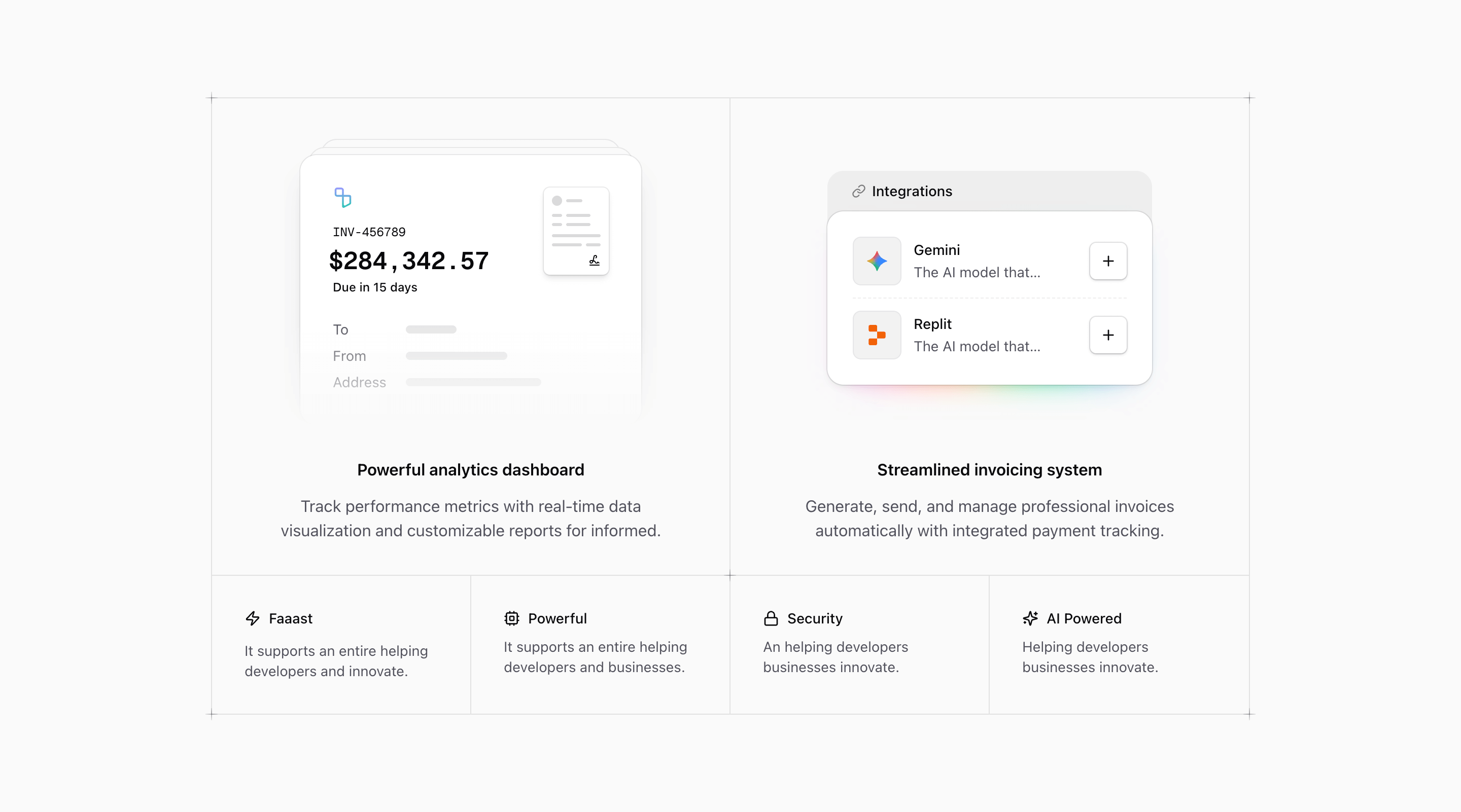
Shadcn Feature Block Eleven is a feature grid for SaaS products that need two primary capabilities and a set of supporting benefits. The source gives the largest cells to Powerful analytics dashboard and Streamlined invoicing system, each with a custom illustration and centered copy. Four smaller cells then fill the bottom row with icon-led notes.
This is not a plain list of features. It is closer to a product capabilities board: invoice UI, integrations UI, plus compact labels for speed, compute, security, and AI. The grid borders, divide lines, and corner plus markers give it the deliberate feel of a designed product surface.
Why the first two cells matter
The invoice illustration includes a document stack, invoice number, large amount, due date, and address fields. It gives the analytics copy a financial product context even before the visitor reads the heading. The integrations illustration shows Gemini and Replit rows with add buttons inside a glowing card, which makes the second feature feel like a connected ecosystem rather than a text claim.
If you use this section for another product, keep that relationship intact: big illustration, specific capability, short benefit. Do not let the large cells become generic slogans. They are large because they are supposed to carry evidence.
Source-grounded cautions
Some smaller source copy is clearly placeholder text. Phrases such as Faaast, It supports an entire helping developers and innovate., and An helping developers businesses innovate. should be rewritten before this block is used on a real landing page. Keep the icons and grid if they fit, but replace the text with real SaaS/product benefits.
The integrations illustration also repeats the same description for Gemini and Replit. That is fine as a visual placeholder, but the final version should describe the actual integration value or remove the description line altogether.
Implementation details from the source
- The section is wrapped in
@container, with the main grid changing to@4xl:grid-cols-4. - The border behavior is controlled with nth-child utilities, including
*:nth-2:border-r-0,@max-4xl:*:nth-4:border-r-0, and@4xl:*:not-nth-2:border-b-0. PlusDecoratoruses a masked cross made from pseudo-elements, placed at the grid corners and between major cells.- The two large panels use
grid-rows-subgrid, which keeps illustration and text rhythm aligned.
Where this variant works
Use it for a Next.js or React marketing page when two features deserve more visual space than the rest. Finance, billing, reporting, integration, and workflow automation products are a natural fit because the existing illustrations already lean in that direction.
Frequently asked questions
Is Shadcn Feature Block Eleven responsive?
Yes. The component uses Tailwind CSS container queries and custom border rules so the grid remains coherent as it moves between two-column and four-column arrangements.
Can I customize the illustrations?
Yes. InvoiceIllustration and IntegrationsIllustration are local React components. You can replace their internals with screenshots, charts, forms, or product-specific UI while keeping the grid shell.
What should the four small items contain?
Use them for short supporting claims: speed, permissioning, security, AI assist, collaboration, automation, or reliability. They should support the two large cells rather than introduce unrelated product areas.
Is this block tied to shadcn?
It follows shadcn UI block conventions and Tailark core primitives, but the implementation is plain React and Tailwind CSS. You can adapt the grid in any compatible app.
Related Shadcn UI blocks
Start from Tailark
Build with Tailark
Production-ready marketing blocks, pages, and illustrations for Shadcn UI.